Creative director Jakob Daschek is Swedish, fashion stylist Barbara Abbatemaggio is Italian, and their overhauled NYC kitchen, designed by architect Lauren Wegel, an Annabelle Selldorf protégé, caters to both of their sensibilities. “Jakob’s aesthetic is modern, while Barbara often prefers rustic, romantic spaces with lots of warmth and comfort,” says Wegel, “so we took a rustic-modern approach.”
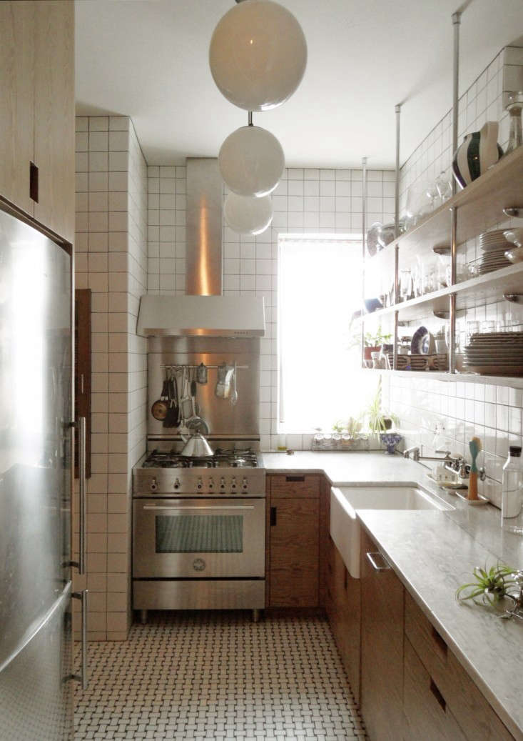
Above: After nixing the idea of opening up the kitchen to the dining room–”it just didn’t work with the prewar apartment layout,” says Wegel–she transformed the 7-by-11-foot space into a bright, spic-and-span galley. Sink, dishwasher, range, and work surfaces are all conveniently within arm’s reach of each other.
The fridge (a Blomberg) and tall cabinets are tucked on the opposite wall. The custom cabinets have an ash veneer–chosen for its open grain and Scandi vibe–with cutout integral pulls (rather than hardware) to streamline the narrow space. The counters are 1 1/4-inch honed Carrara marble–”a bit of home for Barbara,” says Wegel–and the floor is tiled with honed statuary and black marble in a basket-weave pattern from Complete Tile. The range and hood are by Italian company Bertazzoni–”they make great ovens that have a Wolf look but are slightly less expensive,” says Wegel. See 5 Favorites: High-Style Italian Cooking Ranges for sources. The hood came with the integral pot rack, which Jakob and Barbara love.

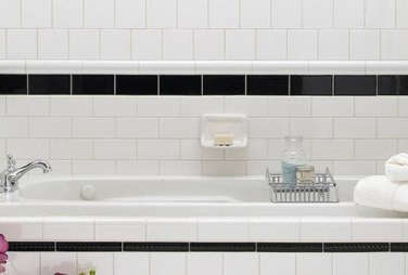
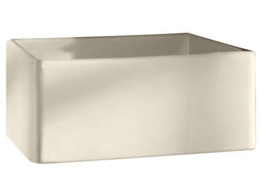
Above: A view from the dining room. To give the kitchen a clean look, Wegel tiled the walls in inexpensive 4.25-by-4.25-inch white Metro squares (about $3.50 per square foot) from Nemo Tile. They have dark grout to play up the grid and because, Wegel says, “white grout reminds me of McDonald’s and doctor’s exam rooms.” The white farmhouse sink, a Porcher design sourced online, has a classic Chicago Wall-Mounted Faucet, a Remodelista favorite–see 10 Easy Pieces: Best Budget Kitchen Faucets. And if you like the look of the chandelier glimpsed over the table, go to High/Low: Arctic Pear Chandelier.

Above: Wegel turned a dumbwaiter into inset shelving: “Because of New York codes, we had to fireproof the hell out of that cavity.”
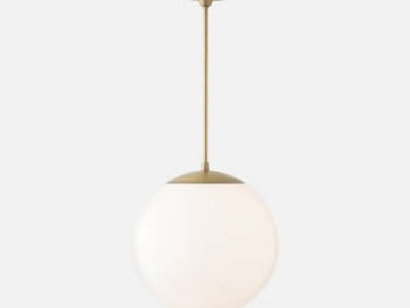
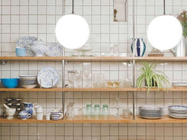
Above: Barbara (who owns Sorelle Firenze with her sister) requested the open shelves; they’re supported by Chrome Rods from Hafele. The globe lights are the Luna design from Schoolhouse Electric.
Before
Above: Untouched for decades, the kitchen had broken-down appliances and faux brick walls. Its galley footprint lives on.
Wegel’s website is under construction. Based in NYC, she specializes in residential work and can be contacted at Lauren@LaurenWegel.com.
Wegel worked on another of our favorite New York remodels: A Hardworking Brooklyn Kitchen by Annabelle Selldorf. See more standout galleys in 10 Favorites: The Urban Galley Kitchen.
Go to Rehab Diaries to explore more kitchen remodels, including:
- Danielle’s DIY Kitchen Remodel for Under $500
- Ikea Upgrade: The Semi-Handmade Kitchen
- The One-Month Makeover: Beth Kirby’s Star-Is-Born Kitchen
- An Ikea Kitchen by House Tweaking
Also don’t miss our recent Rehab Diary, Parts 1 through 4, in which a young couple in London chronicle their small-house overhaul–it starts here.





Have a Question or Comment About This Post?
Join the conversation (5)