Last month on Gardenista, we featured the transformation of a pool and patio by LA architecture practice Simo Design (members of the Remodelista Architect/Designer Directory). The firm’s owners, Alexi Rennalls and Sam Gnatovich, have made a side business out of rehabbing LA houses with “good bones” and putting them back on the market. (See Pool of the Week: A Modern Update in Beverly Hills on Gardenista for more.)
As it turns out, that sprawling estate on Beverly Hills’ Hutton Drive is the former home of Mary-Ann Mobley—actress and 1959’s Miss America—and her husband, talk-show host Gary Collins. The house was built in 1948 in an East Coast–traditional style and had been lovingly cared for, but had also received a few unfortunate injections of glamour over the years. “What was there was extremely dated,” said Rennalls. “The floor plan made sense, but everything else needed a complete overhaul.”
Photography by Jessica Sample.

Above: Visitors enter a dramatic double-height entryway with ash wood paneling, flooded with light from a skylight above. “There wasn’t really an opportunity to do much in terms of staging this space as an entryway,” said Rennalls, “so it was important for the materials here to be special.” The pair replaced the existing staircase—it was heavy and dated, with a carved bannister—with a modern floating staircase of wood, steel, and glass. “You can see these stairs from many perspectives throughout the house,” said Rennalls.

Above: For residents, the main entry is through the mudroom, linked to the garage at left. The triangular room has custom, full-height cabinetry on two sides and an original brick floor.

Above: The brick floor extends into a bar area—existing, but revamped, with a walnut countertop, custom cabinets painted in Dunn-Edwards’ Play on Gray, and lined in green-glazed, thin brick tile.

Above: The dining room, next to the bar. This (and all common areas) is painted in Swiss Coffee from Dunn-Edwards.
Above: The kitchen was the single biggest transformation of the house, said Rennalls. “It was tiny, and everything in it is new.” The designers more than doubled the kitchen’s size by reclaiming an adjacent dining room. (The current dining room was taken from an underutilized den.)
To extend—but modernize—the house’s brick motif, Simo used dark gray brick pavers for the kitchen floor. The backsplash wall is Heath Ceramics Field Tile in vanilla bean.
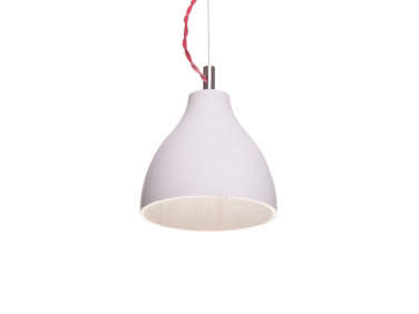
Above: The kitchen island and cabinetry are custom Simo designs, made of solid oak with doors in white oak-finished ply. The stools are from Anthropologie, and the pendants above the island are Heavy lights from Decode London.
Here, and elsewhere throughout the house, the structural ceiling beams were already in place. But they were dark, with “a weird texture,” so Simo wrapped them in pale ash wood.

Above: The living room marks the transition from the house’s high-use zones toward the master wing. Here, Simo made two dramatic updates: They vaulted the ceiling, which “opened it up tremendously.” And they added French doors that open directly onto the patio. “The existing widows were large and beautiful, so we debated keeping them,” said Rennalls. “But it felt so much better to access the pool from the living room.”
Half of the brick fireplace was existing—Simo matched the brick as closely as possible to build it up to the newly pitched ceiling, then painted the entire thing white.

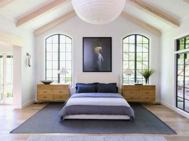
Above: “This room is massive,” said Rennalls of the master bedroom; so big, she reports, that some potential buyers were turned off by its size. It lies along the far edge of the pool and patio. The windows—both the two high arches flanking the bed, and the wall of steel windows overlooking the pool—were preexisting, but Simo had them repainted in Black Tie from Dunn-Edwards. The interior walls are painted in Dove Wing from Benjamin Moore.
To the left, just out of the frame, is a private sitting area that overlooks the lawn. The adjacent French doors open onto the pool and patio.

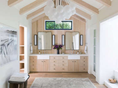
Above: The previous master bath was sprawling, and sported “his and hers” vanities, baths, and toilets. (Mobley even had an extra salon-style sink for having her hair washed at home.) Simo turned the former “his” vanity into a huge walk-in closet, sited off to the left. The door to the right leads to the water closet. The bathtub is at the right of the frame, and not pictured is a shower and shoe closet.
The master bathroom is painted in Benjamin Moore’s White Dove, and the chandelier is Nuage from Troy Lighting.

Above: Two upstairs bedrooms previously shared a closet and bathroom; Simo separated the two with en suite baths and storage spaces.
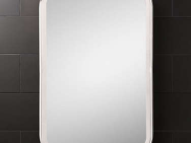
Above: The two upstairs baths make use of the same materials: concrete tile in the shower, honed black marble mosaics on the floor, and Caesarstone countertops. Over the custom vanity hangs an Astoria mirror from Restoration Hardware and a sconce from Schoolhouse Electric.

Above: The front door is immediately to the left of the pool chaises; it had previously been tucked under the covered porch, “which made the entryway really tight,” said Rennalls. “It was just not helping the flow of the house.”

Above: The updated pool and patio, featured in Pool of the Week: A Modern Update in Beverly Hills on Gardenista.
Before

Above: At left, the bar area on the main floor. At right, the powder room with mirrored ceiling.

Above: The entire master wing was covered in neon green carpet. “They might have been going for the inside/outside thing,” said Rennalls. “It looked like it could be grass.”

Above: The “hers” vanity.
Above: The previous entryway shows the front door under the covered porch.
For more from Simo, see:
- Rehab Diary: LA Living, Venice Style
- A Masculine Midcentury Revival in LA
- The Designers Are In: Expert Tips from Remodeling Pros





Have a Question or Comment About This Post?
Join the conversation (5)