Icon - Arrow LeftAn icon we use to indicate a rightwards action. Icon - Arrow RightAn icon we use to indicate a leftwards action. Icon - External LinkAn icon we use to indicate a button link is external. Icon - MessageThe icon we use to represent an email action. Icon - Down ChevronUsed to indicate a dropdown. Icon - CloseUsed to indicate a close action. Icon - Dropdown ArrowUsed to indicate a dropdown. Icon - Location PinUsed to showcase a location on a map. Icon - Zoom OutUsed to indicate a zoom out action on a map. Icon - Zoom InUsed to indicate a zoom in action on a map. Icon - SearchUsed to indicate a search action. Icon - EmailUsed to indicate an emai action. Icon - FacebookFacebooks brand mark for use in social sharing icons. flipboard Icon - InstagramInstagrams brand mark for use in social sharing icons. Icon - PinterestPinterests brand mark for use in social sharing icons. Icon - TwitterTwitters brand mark for use in social sharing icons. Icon - Check MarkA check mark for checkbox buttons.
You are reading

Bathroom of the Week: In LA, a Softer Take on Black and White

Search

Bathroom of the Week: In LA, a Softer Take on Black and White

June 1, 2018

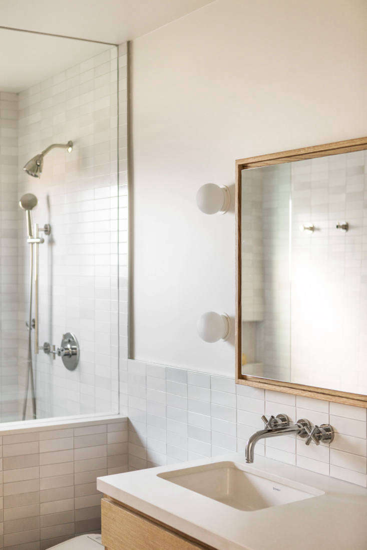
For a recent bathroom overhaul in a 1950s house in Baldwin Hills, LA interior designer Tamar Barnoon had a clear mandate from her client, a fashion executive: a focus on tile, a generous shower, and the color black somehow incorporated.

The house itself was in good shape, Barnoon says—with simple, modern rooms designed to highlight the house’s nature views. “The bathroom was the only room in desperate need of an update:” It was dated, both in finishes and layout—the shower box stood immediately to the right of the bathroom door, with the sink and toilet inconveniently at the far end. To accommodate the requests of her client, who has “incredible taste and a very modern sensibility,” Barnoon used handmade tile from Heath Ceramics throughout, in gray white and warm black “to bring some softness to the otherwise very modern space,” she says. To visually expand the space, she redesigned the layout to “make the room feel elongated, and draw the eye in.” Let’s take a look.

Photography by Laure Joliet, courtesy of Tamar Barnoon.

tamar barnoon bathroom white tile 1
Above: Barnoon opted for mixed, light gray tile from Heath Ceramics on the shower and backsplash, and black Heath field tile on the floor.

“I wanted the design to reflect my client’s minimal, modern aesthetic, while still allowing for some feminine lines,” Barnoon says.

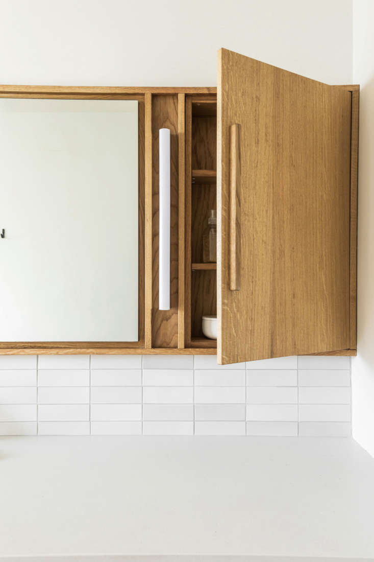
tamar barnoon bathroom white tile 7
Above: Barnoon custom-designed the storage mirror and vanity in collaboration with cabinetmakers EB Joinery.
tamar barnoon bathroom white tile 8
Above: The cabinet houses a vertical light fixture “for close-up makeup and to allow for low lighting at night,” Barnoon says.
tamar barnoon bathroom white tile 9
Above: The cabinet and vanity is made of oak, finished with wax, and the countertop is Caesarstone. When open, the drawers reveal dovetail joints.
tamar barnoon bathroom white tile 10
Above: Two round sconces to the left of the mirror provide ambient light.

The client was originally ambivalent about including a bathtub in the design—but since the room is small, she and Barnoon ultimately decided she’d rather have a generously sized shower than a tub.

tamar barnoon bathroom white tile 3
Above: One thing that didn’t require changing was the scale of the shower window, the only source of natural light in the bathroom: “I felt the scale of the window to the narrowness of the room was right,” Barnoon says, “and the size allowed for some privacy.” She did replace the actual window with a newer model.
tamar barnoon bathroom white tile 4
Above: A storage niche in the shower is lined in elongated tiles.

Before

before photo tamar barnoon bathroom
Above: Before the renovation, the bathroom had dated finishes and an impractical layout.

For more tile-filled rooms from across our sites, see:

(Visited 4,335 times, 1 visits today)
You need to login or register to view and manage your bookmarks.

Have a Question or Comment About This Post?

Join the conversation

v5.0