A newcomer to the booming SF restaurant scene, Barzotto is a 60-seat “fast casual” fresh pasta bar from first-time restaurateur (and longtime industry vet) Marko Sotto. By saving on labor costs—guests order from the counter and seat themselves—Sotto offers lower menu prices which, he hopes, might help revive the concept of the neighborhood restaurant in a city whose prices are out of control. In other words: “We want to see the families again,” Sotto (a parent himself) says.
Lucky for us, Sotto didn’t skimp on the design of the space—”A good dining experience for me is a combination of atmosphere, experience, and quality of the food,” he says—for which credit goes in equal parts to Sotto, interior designer Hannah Collins, and PR maven and close friend Jen Pelka. “I wanted our guests to sit down after ordering and start reacting to what they see around them,” he said. “You’ll feel like you’re in a full-service restaurant where you would be paying two or three times more.”
Photography by Kassie Borreson, courtesy of Barzotto.
Above: A small display at the front of the restaurant offers retail wine, soft-serve gelato sundaes, and fresh and dried pasta for takeaway, sporting graphics by SF designer Danielle Moore—whose logo and branding design helped define the restaurant’s final look. The custom steel and ash wood shelving was fabricated by James Davids and Tesseract Woodworks.
For the order counter, “We wanted concrete,” said Sotto, “but it’s expensive and very porous.” They used Caesarstone instead and lined the front with square ceramic tiles in a diamond pattern.
Above: Before Barzotto, wine bar and gastropub St. Vincent occupied the space, but its original incarnation was as an auto repair shop. “Naturally, the room is going to feel like a factory,” said Sotto, “but I want it to feel like a factory someone moved into and added homey touches to.” CB2’s Globe Pendant Lights hang above the counter.

Above: The trio changed their design direction several times. “Our early renderings looked too monochrome,” said Sotto, and a later track was too industrial. To compensate, they opted for lighting in brass, rather than blackened steel, and whitewashed the floor-joist ceilings exposed by the previous owners. They painted a tall concrete wall (at left) in white, which highlighted its texture and brightened the space.

Above: The righthand wall was lifeless drywall, so Collins brought in Rye Hudak of Level 5 Design to apply Venetian plaster. “The softness and intricacy of the plaster really changed the whole look of the room,” said Sotto. They paired it with a wainscot in Benjamin Moore’s Marina Gray and Granada Tile’s Fez cement tile pattern in dark gray and white.

Above: Carrara marble tables are backed by custom banquettes with brown leather backrests that resemble gym mats and add “comfort and rich color,” according to Collins. Custom walnut mirrors mix with vintage wood chairs. “I think the neutrality of all the woods makes the space feel like it has been there forever,” she said.

Above: “I see a lot of restaurateurs building very masculine rooms,” said Sotto. “The right level of comfort and warmth is hard to achieve.” He credits the women on his team—Collins and Pelka, plus his own wife—with adding a crucial lived-in feel to the restaurant.

Above: The custom bar stools were holdovers from St. Vincent, and Sotto didn’t see a need to replace them. (They’re very sturdy, he says; “They will outlive the city of San Francisco.”) To soften them, they replaced the existing dark wood seats with lighter ash wood.
Above: One of Sotto’s favorite parts of the restaurant is a former bar they converted into “a small pasta factory,” where guests watch chef Michelle Minori and team through a set of paned window dividers. “Mixed with evening light and really good music, it’s a nice effect,” said Sotto.

Above: A bright red hutch reclaimed from St. Vincent is now a server station. Throughout the restaurant, plant and flower installations by Wallflower Design “add a more organic feel,” said Sotto. Walls are painted in Benjamin Moore’s China White.
Above: The bathroom is papered in Fornasetti’s Mediterranea wallpaper from Cole & Son. “We loved the Old World feel of the print and thought the touch of gold was perfect for the space,” said Collins.

Above: The facade is relatively unchanged, save for new trim paint, lighting, and furniture.

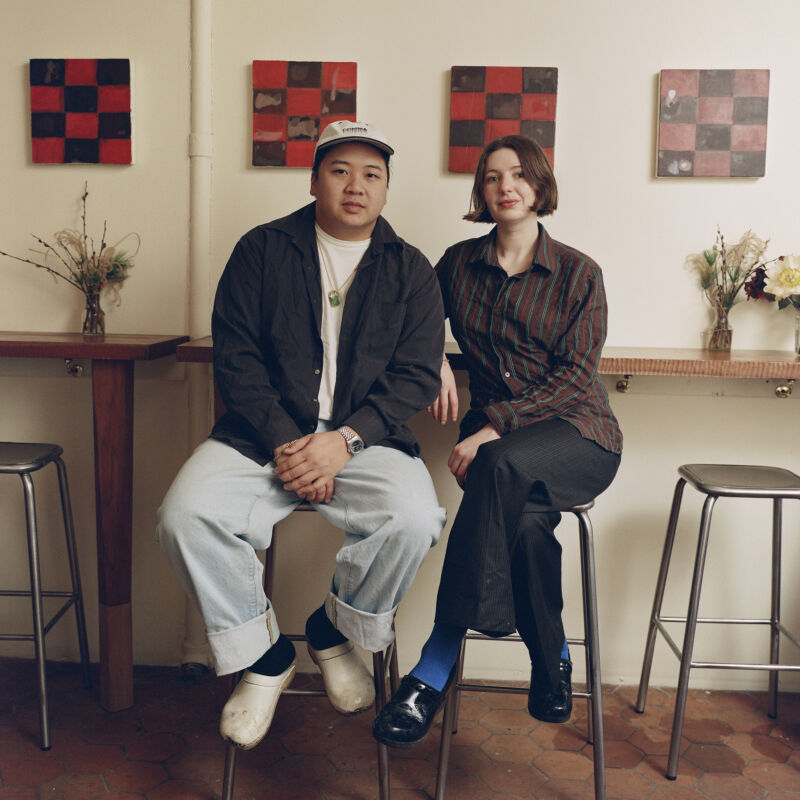
Above: Chef Michelle Minori and owner Marko Sotto.
Sotto had worked with almost everyone on his team in a previous life, Minori, Collins, and Pelka included. “I believe the best decisions are made by consensus,” he said, “so I run my business by gathering people I trust.” Of his team and their product, he said, “I couldn’t be happier. I love walking through this room. It’s beautiful.”
Barzotto is located at 1270 Valencia St. in San Francisco’s Mission District.
Browse all of Remodelista’s Restaurant Visits, including A Whiter Shade of Pale: Petit Crenn in San Francisco and Nix in NYC: Vegetarian Cool with a California 70s Vibe.


Have a Question or Comment About This Post?
Join the conversation (0)