We revisit a moody Victorian in San Francisco for our color-coded week; we've seen it before but it's worth another look.
A collaboration between owner Claire Bigbie and Douglas Burnham, principal of Oakland-based Envelope A+D (and member of the Remodelista Architect/Designer Directory), the project caused a stir a couple of years ago (see When Skaters Grow Up in the New York Times). After spending a mere afternoon in another space designed by the firm, Bigbie knew Burnham was the one to design her home. Bigbie and her partner, Jay Shapiro, are both artists and skateboard enthusiasts, and their home reflects their penchants. The success of the project was such that Burnham offered Bigbie a job three days after it was completed; she is now Envelope A+D's interior designer.
Photography by Todd Hido.
Above: "We were interested in referencing the European tradition of black houses and putting it in a San Francisco context," says Burnham. Read more about the blue-black exterior in Expert Advice: How to Mix a Custom Color.
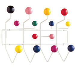
Above: The entryway reflects the Victorian/modern themes at play throughout the home: embossed Victorian wainscoting, modern reflective wallpaper, cyan blue paint, and an Eames Hang-It-All Rack.

Above: A Danish ceramic galosh stands on the home's original Douglas fir flooring.

Above: The kitchen steps outside of tradition, with only lower cabinetry and a reclaimed black walnut panel for a countertop.
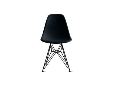
Above: Hemlock veneer plywood wraps from walls to bench, creating an informal dining space complete with Eames Molded Side Chairs.

Above: The pair wanted their bathroom to evoke the feel of skateboarding in an empty swimming pool, a task Burnham tackled with aplomb, using Bisazza tile for a floor-to-wall mosaic with a depth marker.

Above: Though it no longer works, the fireplace is still the visual focus of the former front sitting room, now the master bedroom.

Above: Bigbie requested an orange, pink, and purple color scheme for her office.
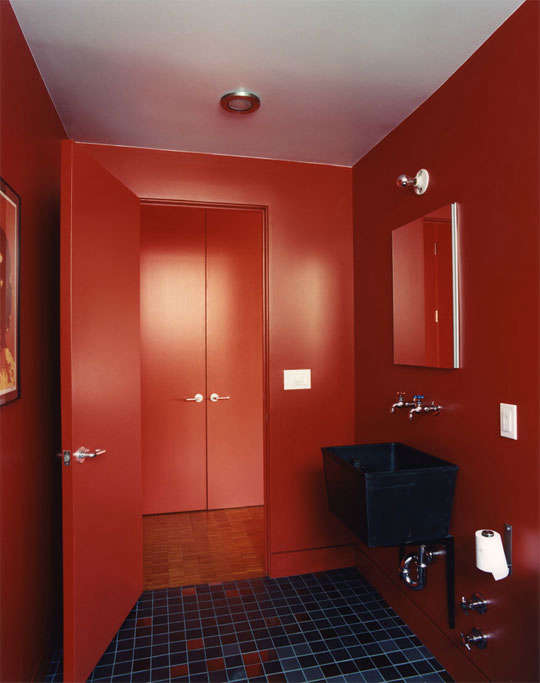
Above: The fiery studio bath, which we previously covered in Steal This Look: Envelope A + D Bathroom.




Have a Question or Comment About This Post?
Join the conversation (0)