Not too long ago, Sarah and I found ourselves having tea with Susie Tompkins Buell, the Democratic fundraiser, Esprit cofounder, and wearer of deep crimson toenail varnish (I know because I once waited in line behind her at Tartine and admired the way she made Tevas look fashionable). We were discussing design in the Bay Area and sustainability, but the whole time Sarah and I were admiring the artful surroundings, so much so that we came back with cameras in hand.
Located on the penthouse level of a 12-floor 1920s apartment tower, designed in 1920s by Conrad Alfred Meussdorffer, Buell’s flat is low key but luxe (she started collecting Prouve furniture long before it was fashionable), and best of all, not over-renovated (the baths are original and the kitchen was last tweaked a couple of decades ago).
The story of how she came to occupy her SF aerie is pure romance: “I had fantasized about living in that very space for years. I really did. For years, I had visions of myself up there with the windows wide open playing opera to the whole city.” In 1988, the apartment came on the market and Buell swooped in. “The layout was perfect and I didn’t want a big redo look. I am more into the original, nicks and all. I did a lot of subtle work that was appropriate to the era; I didn’t want it to look like an Architectural Digest fabulous space. I wanted it to be humble and to honor the view and the building, yet to be a statement. I think it’s notable that after all these years, it still looks fresh and classic in its own way. I have never even thought to ‘remodel.'”
Photos by Laure Joliet for Remodelista.

Above: “My dear friend Greg Turpan (he was a visual director at Esprit) directed and guided me in my choices for the apartment,” Buell says. “He understood my desire to create a respectful tension between the classic splendor of the building and the midcentury modernism of Prouve.”
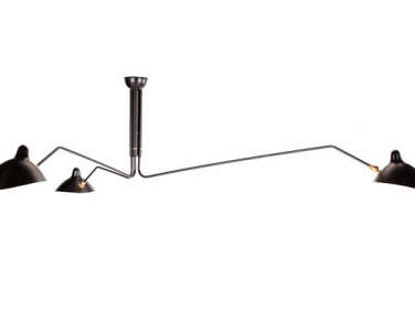
Above L: Prouve armchairs. Above R: Buell’s Serge Mouille light is vintage, but a Serge Mouille Three-Arm Floor Lamp is available from Design Within Reach. “Greg introduced me to Prouve and Mouille; the minute I saw it, I knew it was what I wanted to live with. It was the 1980s, so pieces were much more available and the pricing was friendly compared to what it is now.”

Above: When asked about her predilection for green, Buell says, “My mother loved nature and said, ‘Never put anything on the floor that’s a color not found in nature,” hence the mossy green carpets throughout the flat.

Above: A view from the dining room into the living room; note the unexpected black marble baseboards.
Above: In the dining room, a Serge Mouille Three-Arm Ceiling Lamp hovers over the circular dining table.

Above: The dining room has been the site of many a political fundraising dinner (Clintons included).

Above: French candlesticks from the 1930s; “I’m not sure of their provenance, but people always remark on them,” Buell says.

Above: A view from the kitchen to the dining room and its exalted views.

Above: French rattan stools arranged around the Corian countertop.
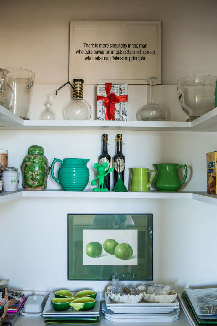
Above: In Buell’s pantry, a collection of green ceramics on display.

Above: Legendary SF columnist Herb Caen described the view from Buell’s flat as “the closest thing to heaven without dying” in the San Francisco Chronicle.

Above: Everything in its place (even the box of PG Tips features touches of green in a shade synonymous with Esprit).
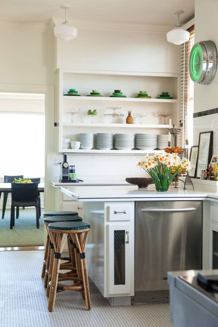
Above: The kitchen palette hews strictly to white and black with dashes of cheerful green.

Above: The Keep Calm and Carry On silkscreen by Maira Kalman was a gift from the illustrator herself long before the poster became fashionable.

Above: Buell’s hallway displays her collection of photos by TIna Modotti and Edward Weston.
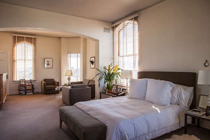
Above: “I grew up in a beautiful San Francisco house where bedrooms and bathrooms were simple and there was one small closet per person,” Buell says.

Above: Buell’s daughter, Summer Tompkins, founded a custom embroidery and monogram shop called Walker Valentine, where Buell sources her guest towels.

Above: “I chose not to do a big new Four Seasons-style bathroom; I wanted the feeling of the 1930s era, when bathrooms were where you did your duties and they weren’t part of the house tour.”
We’re not the only ones with a crush on Esprit; see An SF Bookstore Inspired by Esprit.





Have a Question or Comment About This Post?
Join the conversation (24)