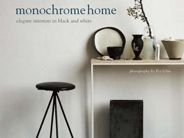
This month, Brooklyn-based British interiors stylist Hilary Robertson comes out with her latest book, Monochrome Home, inspired by Scandinavian Pinterest boards she discovered after digging deep into Scandinavian blogs and noticing a freshness to the timeless appeal of the monochromatic home. We asked her to share her insights.
Photography by Pia Ulin from Monochrome Home, Elegant Interiors in Black and White (see below for details).
Remodelista: Would you describe your own home as monochrome?
Hilary Robertson: It is pretty monochrome, but I can’t quite resist a bit of color. I like tertiary pinks and taupes in different shades and intensities because they add depth to the room.

Above: Furnishings in muted shades in architect Joseph Dirand’s Parisian apartment, which has walls finished in marmorino plaster made of marble dust and lime putty.
RM: How do you approach a new space and decide on a direction?
HR: It depends on the orientation of the room and the light. Whenever I move into a new space, I like to wash the walls and floors in a white paint, then stand back and see what the light does. It’s the least expensive way to approach a space. I think this comes from being a stylist and working in all-white studios.

Above: Parashkev Nachev’s London mews house features brick walls painted inky black.
RM: When would you go with a dark color?
HR: It’s really all about what sort of person you are. Neuroscientist and neurologist Parashkev Nachev [his space is featured in the Night Owl chapter] lives in a completely dark-colored apartment–a greenish black. Of course, he is never there in the daytime; for him, it is a nighttime retreat, so it works well for him. I love to do all dark, but it depends on the space. The middle room in my brownstone does not get a lot of light, and painting it white didn’t help. Instead, I went for a black chalkboard paint and use lots of good lighting. The dark works because of the lack of natural light.
RM: Does psychology play a role with color?
HR: People are very different, and while some people are happy to be in the dark, others want a bright room that will give energy. People are light sensitive and emotionally driven by color, so it really depends on the individual and the space.

Above: A black-and-white kitchen in Lyon, designed by Stephane Garotin and Pierre Emmanuel Martin of Maison Hand, features glossy black tiles and bitter chocolate walls.
RM: How do you work with a single color when designing a monochromatic space?
HR: If you stick to one color, you can add layers with textures, patterns, and pieces from different periods. There are also lots of nuances within the color itself. If you are working with black, it can be greenish hue or a true black, but you can play with these tones. Black can be a very restful color.

Above: The kitchen of Jonas Bjerre-Poulsen–a partner in the Copenhagen firm Norm architects–is a lesson in practical minimalism with its unadorned white cabinets and reclaimed bleached herringbone parquet countertop.
RM: You mentioned a monochrome palette being like the no makeup look. What do you mean?
HR: It’s all about subtlety and the quality of the container. The Norm house is a perfect example of this, where you have good bones and a great backdrop: It has cast concrete floors, white walls, and lots of period detail–which is unified by the monochrome palette.

Above: The temporary home of designer and stylist Annaleena Leino Karlsson, who has taken a 1970s cottage and, with lashings of white paint, created an all-white canvas punctuated by graphic black accents.
RM: Is a monochrome palette a more expensive proposition?
HR: No, it can go high and low. Annaleena’s home is a great example. It’s a rented temporary space where she covered the floors with hardboard and painted them white, then brought in some Ikea furnishings. She’s a good example of how to work with uncompromising ingredients. Monochrome as a strategy is quite flexible and can be quite forgiving.
RM: You define gray as being “in between territory.” Can you discuss its merits?
HR: You have a lot of choices with gray. I prefer the warm ones with brown, green, and violet tones over the bluer, colder ones that can get a little institutional. Dark gray is great with old things, as it is forgiving and makes them look good. Many antique dealers love a Gustavian gray as it is a softer background for patinated pieces and it has a modern association.

Above: A collection of art and white ceramics are highlighted against the dark wall in the home designed by Maison Hand.
RM: Advice on displaying objects in a monochrome interior?
HR: You can do something really interesting by grouping a lot of different objects in one color. It’s less about the objects–they can be quite ordinary–but more about making something sculptural with what you pull together; the whole is greater than its parts. It’s as simple as taking some cheap white vases or glass bottles from Ikea and making a shape out of that. In this case the whole is more important than the individual piece.
A monochrome environment becomes more interesting when you play with scale. With an all-white room you can get something really big and paint it white, or keep it black, and it will make things interesting. I just did this for a client with a tire, which I painted white and hung from the ceiling on a thick rope to make a swing. Adding a large-scale shape floating in space was fun and gave the room a focal point.
Above: Monochrome Home by Hilary Robertson, published by Ryland Peters & Small, comes out April 15; it can be advance ordered from the publisher for $35. If (like me) you are interested in recommended shades, there is a paint directory at the back of the book.
For more on Hilary, see our post on her previous book, The Stuff of Life, devoted to the art of display.
Looking for some ideas for summer entertaining? Read our Expert Advice post with Hilary.


Have a Question or Comment About This Post?
Join the conversation (0)