You are reading

10 Easy Pieces: Architects’ Red Paint Picks

SearchJoinLogin
Icon - Arrow LeftAn icon we use to indicate a rightwards action. Icon - Arrow RightAn icon we use to indicate a leftwards action. Icon - External LinkAn icon we use to indicate a button link is external. Icon - MessageThe icon we use to represent an email action. Icon - Down ChevronUsed to indicate a dropdown. Icon - CloseUsed to indicate a close action. Icon - Dropdown ArrowUsed to indicate a dropdown. Icon - Location PinUsed to showcase a location on a map. Icon - Zoom OutUsed to indicate a zoom out action on a map. Icon - Zoom InUsed to indicate a zoom in action on a map. Icon - SearchUsed to indicate a search action. Icon - EmailUsed to indicate an emai action. Icon - FacebookFacebooks brand mark for use in social sharing icons. flipboard Icon - InstagramInstagrams brand mark for use in social sharing icons. Icon - PinterestPinterests brand mark for use in social sharing icons. Icon - TwitterTwitters brand mark for use in social sharing icons. Icon - Check MarkA check mark for checkbox buttons.
You are reading

10 Easy Pieces: Architects’ Red Paint Picks

SearchJoinLogin
Advertisement

10 Easy Pieces: Architects’ Red Paint Picks

by Published: February 12, 2025

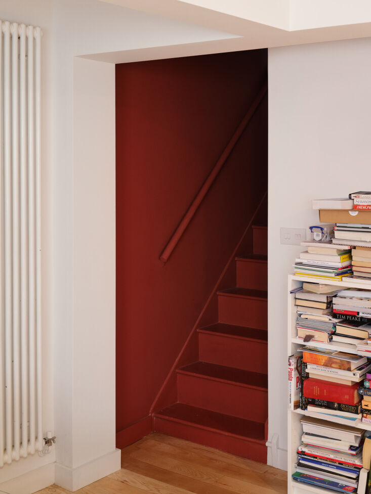
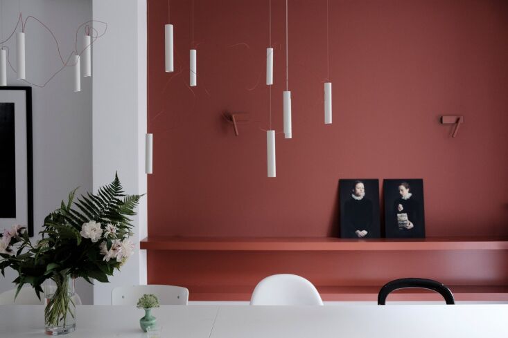
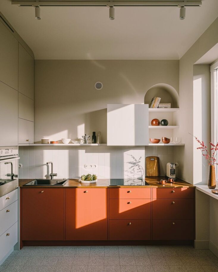
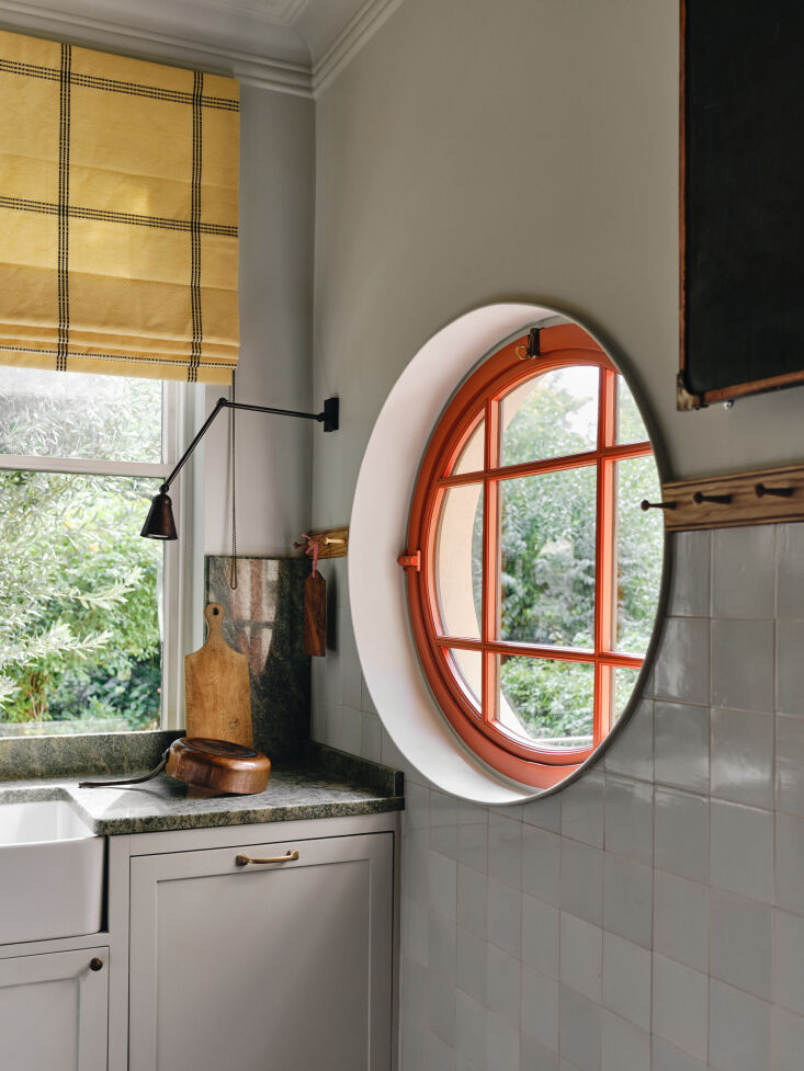
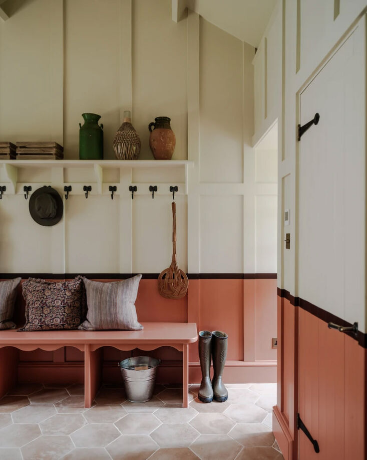
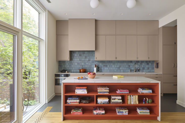
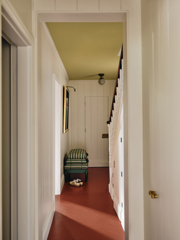
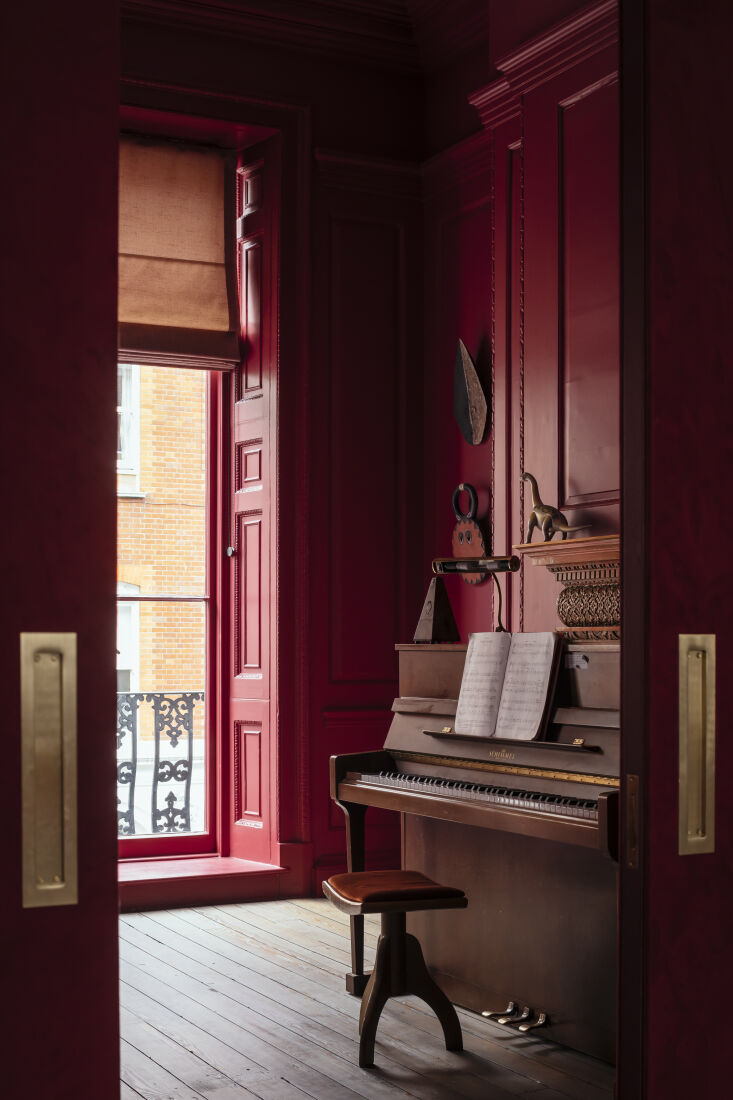
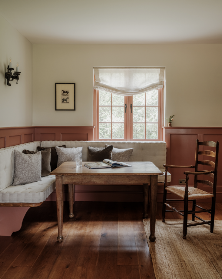
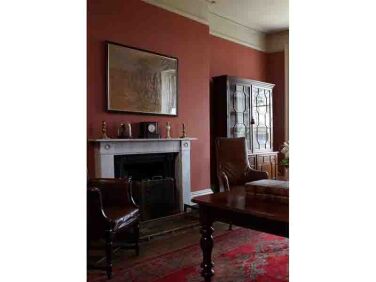
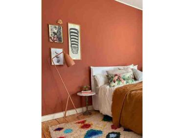
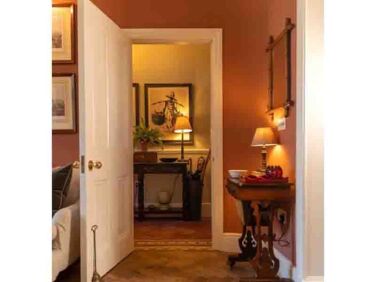
The power of red is undeniable, particularly when it’s the right shade of red. We asked a suite of architects and designers for their favorite red paint color and an example of the shade in-situ. Here are their favorites.

the entirety of the stairwell, from steps to railing and walls, is painted in f 17
Above: The entirety of the stairwell, from steps to railing and walls, is painted in Farrow & Ball Book Room Red 50, in a London Victorian designed by Daab Design. Director Anaïs Bléhaut notes that Book Room Red is her favorite shade of red, and this project is an example of its impact. Photograph by Henry Woide courtesy of Daab Design featured in our post Life, Rearranged: Changing the Layout of This Victorian Changed Everything.
lea korzeczek and matthias hiller of studio oink look to farrow & ball   ga 18
Above: Lea Korzeczek and Matthias Hiller of Studio Oink look to Farrow & Ball Picture Gallery Red 42 :”The shade is particularly suitable for presenting classical art in front of it. Old oil paintings in particular create a modern, and at the same time, opulent image when presented in front of a wall of Picture Gallery Red,” Lea explains. “So the name really says it all here, and we deliberately used it that way. The color sets accents and creates an intimate atmosphere.”
polish architect klara ostrowska of warsaw based kw studio designed a kitchen w 19
Above: Polish architect Klara Ostrowska of Warsaw-based KW Studio designed a kitchen with brick-red cabinets to echo the brick walls of the industrial area of Powiśle where the house is located. The color is Farrow & Ball’s Red Earth 64.
interior designer beata heuman created a paint collection with mylands called t 20
Above: Interior designer Beata Heuman created a paint collection with Mylands called The Dependables among which is Crayfish Party, as seen in the window frame of a kitchen Beata designed. “For the perfect pop of red needed in all rooms to keep things fun, with just the right amount of rusty undertones,” she explains.
another instance of farrow & ball&#8\2\17;s red earth 64 done well: fre 21
Above: Another instance of Farrow & Ball’s Red Earth 64 done well: French interior architect and designer Astrid Houssin designed a boot room in Somerset with two-tone walls (note the bench is also painted in Red Earth 64). “I just love its warmth,” she explains of the terracotta shade. Photograph by Paul Whitbread for Astrid Houssin Interiors from Kitchen of the Week: A Two-Tone Boot Room in Somerset by Parisian Architect Astrid Houssin.
in a recently completed renovation of the parlor floor and kitchen in new york& 22
Above: In a recently-completed renovation of the parlor floor and kitchen in New York’s West Village, architects Jon Handley and Melissa Baker of Pulltab used the lively shade of Farrow & Ball Bamboozle 304 for the kitchen island. “I think the red in Bamboozle brightens up the kitchen, but also lets the other colors come through. It doesn’t try to hog the spotlight,” Jon explains. “The space is flooded with natural light which affected our color choice as well.  We always do multiple color tests on site, and we also ask our clients to look at the color samples both in the daytime and at night.” Photograph by Mikiko Kikuyama courtesy of Pulltab.
another color from beata heuman&#8\2\16;s collection with mylands, a red ca 23
Above: Another color from Beata Heuman‘s collection with Mylands, a red called Henna is utilized here for hallway floors by Beata. “If you could call a red neutral, this would perhaps be it,” says Beata. “A fantastic choice for painted floors.”
another favorite red of firm daab design, this time a favorite of director and  24
Above: Another favorite red of firm Daab Design, this time a favorite of director and co-founder Dennis Austin. The red, Farrow & Ball Rectory Red 217, drenches the walls, trim, and ceiling of a music room in an 18th century Georgian townhouse in central London. Photograph by Jim Stephenson courtesy of Daab Design.
another terracotta red admired by architect astrid houssin, sang de boeuf from  25
Above: Another terracotta red admired by architect Astrid Houssin, Sang de Boeuf from Edward Bulmer is the shade seen in the banquette corner. Photograph by Paul Whitbread for Astrid Houssin Interiors.

For more tried-and-tested paint colors, see our posts:

(Visited 5,121 times, 7 visits today)
You need to login or register to view and manage your bookmarks.

Product summary 1-4 of 7 1-4 of 7

red earth
Paint

Red Earth

More Info from Farrow & Ball
10 Easy Pieces Architects Red Paint Picks portrait 8
Paint

Henna

£5.50 GBP from Mylands

Have a Question or Comment About This Post?

Join the conversation (1)