Icon - Arrow LeftAn icon we use to indicate a rightwards action. Icon - Arrow RightAn icon we use to indicate a leftwards action. Icon - External LinkAn icon we use to indicate a button link is external. Icon - MessageThe icon we use to represent an email action. Icon - Down ChevronUsed to indicate a dropdown. Icon - CloseUsed to indicate a close action. Icon - Dropdown ArrowUsed to indicate a dropdown. Icon - Location PinUsed to showcase a location on a map. Icon - Zoom OutUsed to indicate a zoom out action on a map. Icon - Zoom InUsed to indicate a zoom in action on a map. Icon - SearchUsed to indicate a search action. Icon - EmailUsed to indicate an emai action. Icon - FacebookFacebooks brand mark for use in social sharing icons. flipboard Icon - InstagramInstagrams brand mark for use in social sharing icons. Icon - PinterestPinterests brand mark for use in social sharing icons. Icon - TwitterTwitters brand mark for use in social sharing icons. Icon - Check MarkA check mark for checkbox buttons.
You are reading

Architects’ 8 Favorite Cool-Toned Neutral Paints

Search

Architects’ 8 Favorite Cool-Toned Neutral Paints

October 15, 2019

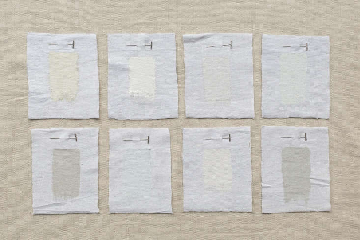
Among the finer points when it comes to choosing a paint: whether it has warm or cool undertones (which can have a surprisingly big effect on a room, adding an extra complication when it comes to choosing a shade). Luckily, we have a panel of paint masters to consult. We asked the experts in the Remodelista Architect & Designer Directory for their favorite cool-toned whites and neutrals, all with undertones of green and blue, rather than red and yellow. Among the benefits of cool-toned whites: They have more dimension than a “pure” white and make walls and ceilings recede more than warm whites do (making spaces feel bigger). Here are eight vetted picks from the experts.

the selection ranges from crisp white to ice colored to distinctly blue toned w 17
Above: The selection ranges from crisp white to ice-colored to distinctly blue-toned when painted on a wall.
mlk studios tends to go for dkc 68 by donald kaufman color when looki 18
Above: MLK Studios tends to go for DKC-68 by Donald Kaufman Color when looking for a cool white paint. (It’s the brand’s “coldest bright white,” they say.)
 scavullo design interiors favors ici paints’ winter&#8\2\ 19
Above: Scavullo Design Interiors favors ICI Paints’ Winter’s Day, which provides a “lovely shade of white with a blue undertone and very clean color.” Note: English company ICI Paints no longer exists (it was bought by Akzo Nobel, which also owns Dulux), but a paint shop can mix the color if you tell them that you want “Winter’s Day 50GG.” We had ours mixed at Lowe’s.
nickey kehoe uses farrow & ball’s james white for a paint that   20
Above: Nickey Kehoe uses Farrow & Ball’s James White for a paint that “has a lovely slight blue-green cast.” (The shade was “first created for the pretty garden room of a discerning Dr. James with a fresh underlying green tone,” the company says. “The slightest hint of green creates a calm, soothing, and airy feel, which is particularly useful for darker interiors. It will look greener when used in contrast with All White and in north-facing rooms.”)
ellen hamilton of hamilton design associates considers farrow & ball’ 21
Above: Ellen Hamilton of Hamilton Design Associates considers Farrow & Ball’s Wevet a favorite cool-toned white.
 michael howells from howells architecture and design recommends farrow &a 22
Above: Michael Howells from Howells Architecture and Design recommends Farrow & Ball’s Cabbage White as a cool-toned white paint “with the slightest hint of blue,” Farrow & Ball says.
patriotic white by benjamin moore is a favorite of kriste michelini interiors. 23
Above: Patriotic White by Benjamin Moore is a favorite of Kriste Michelini Interiors.
 lindsay crozier of brooklyn based made recommends benjamin moor 24
Above: Lindsay Crozier of Brooklyn-based Made recommends Benjamin Moore’s Gray Owl with a greenish cast that comes to light when painted on a wall.
 jon call of mr. call designs in new york city opts for sherwin willi 25
Above: Jon Call of Mr. Call Designs in New York City opts for Sherwin-Williams Lattice, which he describes as “super fresh with a cool, neutral undertone,” a white that is “perfect for any room.” It’s hard to tell out of context, but Lattice has a distinctly blue cast.

And one more: Marie Fischer Interior design prefers Benjamin Moore’s Chantilly Lace, describing it as simply “the best.” (It was also Medium Plenty and Amy A. Alper‘s pick in Architects’ 8 Favorite Pure White Paints.)

N.B.: For white paints with a creamy, old-fashioned bent, see Architects’ 8 Favorite Warm Gray Paints.

More in the world of neutrals:

(Visited 1,206 times, 1 visits today)
You need to login or register to view and manage your bookmarks.

Have a Question or Comment About This Post?

Join the conversation

v5.0