You are reading

10 Easy Pieces: Architects’ Yellow Paint Picks

SearchJoinLogin
Icon - Arrow LeftAn icon we use to indicate a rightwards action. Icon - Arrow RightAn icon we use to indicate a leftwards action. Icon - External LinkAn icon we use to indicate a button link is external. Icon - MessageThe icon we use to represent an email action. Icon - Down ChevronUsed to indicate a dropdown. Icon - CloseUsed to indicate a close action. Icon - Dropdown ArrowUsed to indicate a dropdown. Icon - Location PinUsed to showcase a location on a map. Icon - Zoom OutUsed to indicate a zoom out action on a map. Icon - Zoom InUsed to indicate a zoom in action on a map. Icon - SearchUsed to indicate a search action. Icon - EmailUsed to indicate an emai action. Icon - FacebookFacebooks brand mark for use in social sharing icons. flipboard Icon - InstagramInstagrams brand mark for use in social sharing icons. Icon - PinterestPinterests brand mark for use in social sharing icons. Icon - TwitterTwitters brand mark for use in social sharing icons. Icon - Check MarkA check mark for checkbox buttons.
You are reading

10 Easy Pieces: Architects’ Yellow Paint Picks

SearchJoinLogin
Advertisement

10 Easy Pieces: Architects’ Yellow Paint Picks

by Published: January 29, 2025

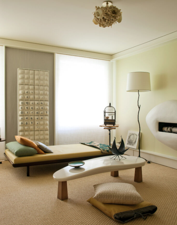
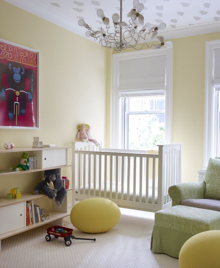
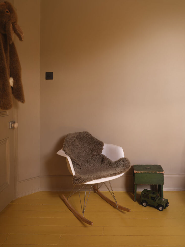
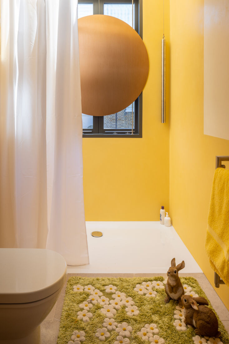
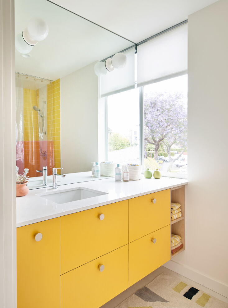
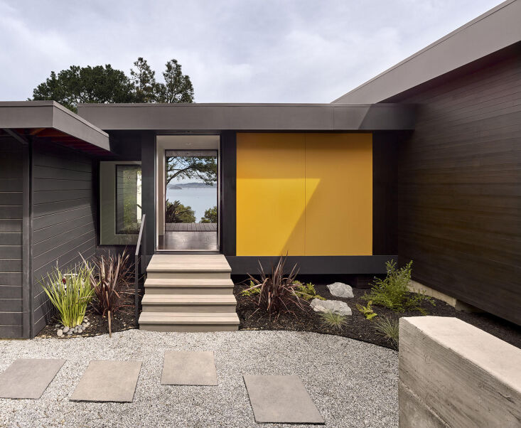
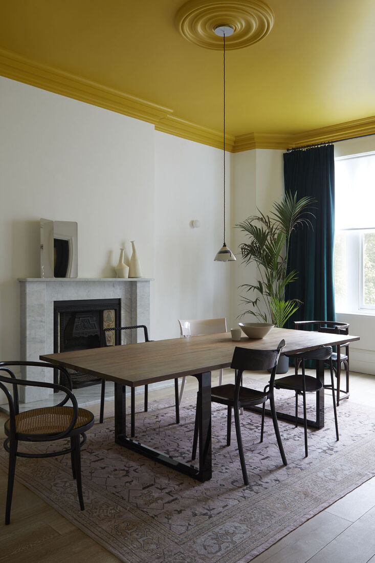
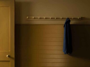
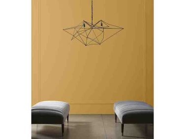
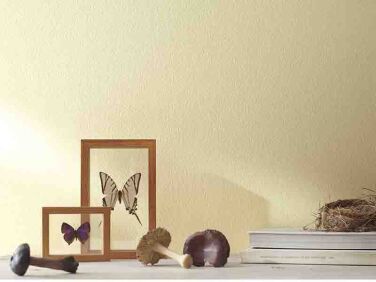
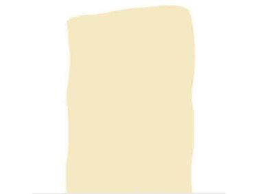
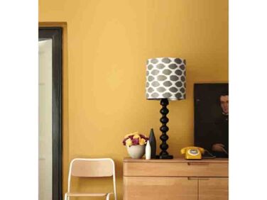
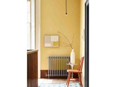
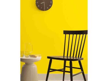
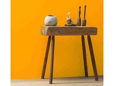
Every architect has a favorite shade of white, but what about the bold, specific shades that stand out? Take yellow for example, a shade we’ve been drawn to recently in the more buttery vein, but also in the electric, the sunny, and the mustardy of them all.

We consulted a selection of architects and designers for their favorite shades of yellow and/or for moments when a certain shade of yellow suited the project quite well. Here are their picks.

jayne michaels of new york based \2michaels favors benjamin moore mellowed ivor 17
Above: Jayne Michaels of New York-based 2Michaels favors Benjamin Moore Mellowed Ivory 2149-50, a “muted yellow with hints of green and beige” as seen here on the walls of a project in Manhattan’s Kips Bay. Photograph by Trevor Tondro for 2Michaels.
designer alexandra loew likes donald kaufman dck 4\2 seen here on the walls of  18
Above: Designer Alexandra Loew likes Donald Kaufman DCK-42 seen here on the walls of a boy and girl nursery in New York City: “Tranquil, buttery, and fresh like morning’s first light is what came to mind when selecting this hue for this gender-neutral nursery.” Photograph by William Waldron for Alexandra Loew.
los angeles based designer frances merrill of reath design loves the yellow uti 19
Above: Los Angeles-based designer Frances Merrill of Reath Design loves the yellow utilized in a Los Feliz kitchen she designed: Benjamin Moore French Horn 195. For more of the kitchen, see our post Kitchen of the Week: ‘SMILF’ Creator Frankie Shaw’s Newfangled Old-Fashioned Remodel by Reath Design.
for a rich combination of bright yellow and brown, london designer jill macnair 20
Above: For a rich combination of bright yellow and brown, London designer Jill Macnair selected Little Greene Yellow-Pink 46 on the floor for a boy’s bedroom in Peckham, London. It’s paired with Farrow & Ball London Stone. “Yellow and brown look fabulous together in my view, and the naturally dark room looks moody and enlivened now,” says Jill. Photograph by Beth Evans for Jill Macnair.
the reception room of a four story dalston townhouse by architect jessica willi 21
Above: The reception room of a four-story Dalston townhouse by architect Jessica Williamson of Bradley Van Der Staeten is painted with Farrow & Ball India Yellow . “I think it’s a slightly murky but still punchy yellow that has rich, mustard tones,” she describes. Photograph by French + Tye for Bradley Van Der Straeten from Two Become One: A Colorful Townhouse for an Actor and a Cinematographer.
in a new london homestead by tuckey design studio, project designer, architect  22
Above: In a new London homestead by Tuckey Design Studio, project designer, architect Dan Stilwell designed a shower with yellow polished plaster walls that are painted with Little Greene Light Gold 53. “The clients wanted an element of surprise for their main bathroom,” explains Dan. Photograph by Dirk Lindner for Tuckey Design.
&#8\2\20;we typically gravitate towards more earthy, mustard tones, but for 23
Above: “We typically gravitate towards more earthy, mustard tones, but for this room we needed a sunny, vibrant yellow but not too-acid-y” says architect Oonagh Ryan of Los Angeles-based ORA. “After testing a few options in the various brands we use, we landed on Benjamin Moore’s Sun Porch Yellow [2023-30]. While bright, it feels surprisingly sophisticated when paired with birch, soft white, and a little pink the shower curtain.”
architectural designer lonika chande designed a shaker style kitchen in london  24
Above: Architectural designer Lonika Chande designed a Shaker-style kitchen in London with Paint & Paper Library Muga Yellow 445. “One of my favorite yellows” she says of the shade. “There’s an earthiness to it, which makes it super versatile. It works well as an accent color alongside more muted tones.” Photo by Simon Brown for Lonika Chande Interior Design from A London Designer’s Apartment Remodel for a Demanding Client (Her Mother). Architect Jessica Williamson of Bradley Van Der Staeten is another admirer of Muga Yellow: “We haven’t had the chance to use in a project but I’ve been waiting for the right space,” she says.
the façade of a project in tiburon by san francisco architect cary bernste 25
Above: The façade of a project in Tiburon by San Francisco architect Cary Bernstein is treated with a yellow-orange panel in contrast with the dark exterior. The color Cary selected is Benjamin Moore Orange Sky 2018-10. Photograph by Cesar Rubio for Cary Bernstein.
another project from jill macnair, a primrose hill house features another of th 26
Above: Another project from Jill Macnair, a Primrose Hill house features another of the designer’s favorite shades of yellow on the ceiling. She has used Paint & Paper Library Gamboge 484 in a few projects; here it was selected for its “great depth of tone and ability to work off the darker, jewel shade” of the velvet curtain already in place. Photography by Beth Evans for Jill Macnair.

For more architects’ favorite paint colors, see our series to date:

(Visited 3,426 times, 25 visits today)
You need to login or register to view and manage your bookmarks.

Have a Question or Comment About This Post?

Join the conversation (1)