London architect James Macdonald Wright posed himself a challenge when he designed a home for his own family: "Take a historical building and figure out how to completely modernize the interior." Wright's starting point was an 1893 late-Victorian terrace house. "I wanted to create a feeling of surprise," says Wright. "From the outside, it looks like every other house on the street. You walk in, and suddenly it becomes a very different environment." Wright accomplished this by stripping the interiors (save for a few choice details, including a gloomy Victorian mantelpiece), installing a German-made Bulthaup kitchen, and replacing the floors with timbers from Danish company Dinesen.
Photography courtesy of Macdonald Wright Architects.

Above: The brick terrace house was in a conservation district, so the facade had to stay the same.

Above: "The most interesting thing about the original house is that there's a change in level," Wright says. "You come into the house and then step into the belly of the structure."

Above: Wright created 14 different niches around the house, each lit with a strip of LEDs. "I wanted to create background lighting throughout the communal areas of the house, so there's a low level of light all the way through," he says.

Above: The wide-plank Douglas fir flooring from Dinesen was treated with lye and soap. "The soap finish brings out the grain, and the floor becomes a sculptural element in its own right," Wright says. "The finish is completely impermeable—my children draw on it with permanent marker pens and the marks come right off."

Above: The kitchen opens onto a small but verdant garden.

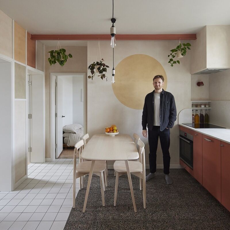
Above: The kitchen table is from Bulthaup, and the chairs are Hans Wegner's classic wishbone chairs. The home's original hearth (painted white) now accommodates a wood-burning stove from Morsø.

Above: The kitchen cabinetry is from Bulthaup.

Above: The Bulthaup system of kitchens includes options such as hanging knife racks.
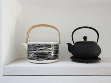
Above: Teapots occupy one niche; on the left is the Rasymatto Teapot, designed by Sami Ruotsalainen and available from Marimekko; on the right is the cast iron Arare Teapot from Mariage Frères.

Above: The shadow gap between the edge of the staircase and the wall is deliberate. "It was important to show that we were creating a contemporary addition. There's also a two-millimeter gap between the planks, so you really have a sense of how big they are," says Wright.
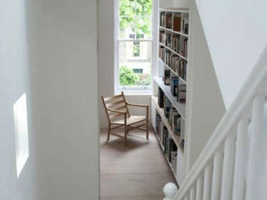
Above: Wright added a curved landing to the staircase, making the narrow space feel more expansive. The chair is another Hans Wegner, the CH44.

Above: M.C. Escher would have loved this image; the stair appears to have a rounded bottom step, but it's the wall that is curved.

Above: A stairway niche holds a drawing by one of Wright's young children. "The light comes in handy when I have to go downstairs in the middle of the night because someone is crying," says Wright.

Above: The master bedroom; a horizontal strip of wood functions as a door handle.

Above: The guest bedroom features a vintage rocker (an eBay find).

Above: An original mantel in the guest room stands in contrast to the pale wood Scandinavian flooring.

Above: The bathroom features some of the house's original stained-glass windows, carefully restored. "It's nice to have some of these original details crop up in odd spaces," says Wright.


Have a Question or Comment About This Post?
Join the conversation (18)