This weekend Perla Delson and Jeff Sherman of New York based firm Delson or Sherman Architects talk about creating a loft home on one entire level of a former manufacturing building in Chelsea, New York. They are available for the next 48 hours to answer your questions, so ask away!
The brief was to convert a 5,000-square-foot loft from a dark warren of rooms into an airy, light-filled apartment for a family of five. With four exposures, one might assume this would be easy and straightforward, right? Guess again. According to Jeff Sherman, a founding partner of Delson or Sherman Architects (a member of the Remodelista Architect and Designer Directory), if your building is square, you will inevitably end up with a large central zone that is far from any window. “Our strategy was one of concentric squares,” he says. “The outer square would be the habitable rooms like bedrooms, living room, and dining room, to make the most of the sunlight and views; the middle square would be a ring of circulation (which the kids ended up using as a racetrack); and finally, the dark central square was filled with storage and bathrooms.” Thoughtful and well executed, any architect will tell you that it’s all in the plan.
Photography by Catherine Tighe.

Above: Beginning in the elevator and entry vestibule, the architects use the same floor material, Brazilian walnut, throughout the apartment. The oversized pocket doors are for added security: The elevator vestibule can be locked off entirely or the doors can be slid out of sight.

Above: The built-in cabinets that run the length of the space unify the space architecturally while hiding various pipes and radiators. They also serve as convenient storage and additional seating.

Above: The bookshelves and cabinets in the living area are constructed out of zebra wood and have concealed lights for illuminating objects on the shelves.

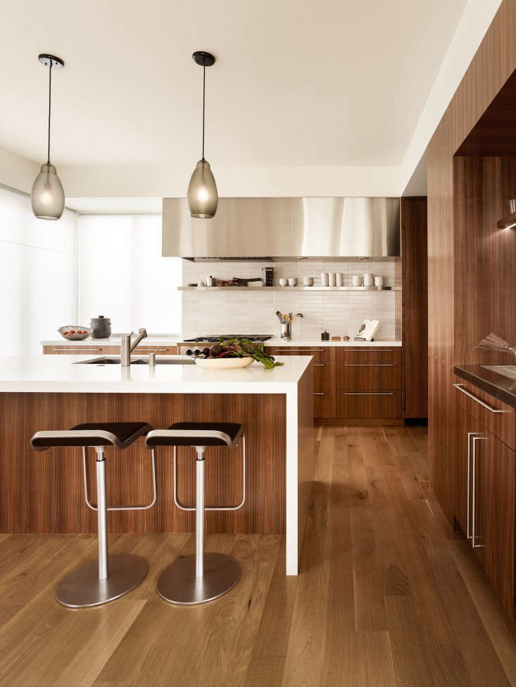
Above: The dark wood of the Brazilian walnut floors is used for the kitchen island and shelves while the cabinetry is high-gloss white lacquer. Stainless steel was used for the countertops and backsplash. “The kitchen was an exercise in simplicity,” Sherman says.

Above: The architects added a new opening in the wall at the end of the suite of public spaces, which serves as the breakfast area and has the best view in the house.

Above: The Brazilian walnut baseboard turns into the wine room and seamlessly becomes the kick of the wine racks, which are also made of Brazilian walnut.

Above: Full-height sliding wall panels made of stainless steel and etched glass can be closed to create acoustical privacy in the music room, while still allowing daylight to filter in. When fully open, they slide completely into the pocket walls.

Above: “The owners are minimalists, but they had large storage requirements,” Sherman says. “Thickening the walls and recessing the cabinets flush with the walls allows a great deal of cabinetry to recede almost to the point of invisibility.”

Above: Mosaic stone tiles (polished Laurel Lapideum from Country Floors) line the bathroom. The sink is a custom design made of seamless limestone on a solid teak base.

Above: “Outside the bedrooms, we widened the circulation ring enough to create a space for TV watching,” Sherman says. “Doubling the functions of spaces is a trademark of ours.”

Above: The translucent sliding panels provide privacy and block sound while allowing daylight into the deep space.

Above: “The zipline celebrates the huge scale of the apartment while making it clear that this is as much a home for children as it is for adults,” Sherman says. The architects ordered the zipline kit online but custom fabricated the anchors at each end out of stainless steel.

Above: A trough-like sink with three individual taps is further proof that this is also a home for children. The architects floated the sink off the floor to keep the bathroom from feeling too narrow and countered any potential structural problems of climbing children with a steel beam hidden inside.

Above: Color is brought into the children’s room through textiles and soft furnishings.

Above: The white on white palette in a narrow bathroom with a narrow window helps to keep the space from feeling too cramped.

Above: The floor plan of the loft illustrates the architects’ strategy of concentric squares, ensuring that the habitable rooms would benefit most from the access to daylight and views.
For another thoughtfully executed floor plan in New York, see Platt Dana in The Architect Is In: Making the Most of Your Floor Plan.


Have a Question or Comment About This Post?
Join the conversation (25)