When NYC interior designer Ellen Hamilton undertook the renovation of a 1970s beach cottage in Chilmark, Massachusetts, she knew it would be neither the biggest project she’d ever undertake, nor the most dramatic transformation—but its modesty is exactly what appealed to her.
Chilmark is a town on Martha’s Vineyard, a small island near Cape Cod that’s both undeniably beautiful and undeniably wealthy. “When you see a coastline like this,” says Hamilton, “everyone’s initial instinct is to overbuild—to have a glamorous and big house.” (The next-door neighbor is a well-known billionaire.) But her client wanted to keep both the footprint and the character of her small abode: “She could have torn it down and put up a big number,” says Hamilton. “Instead, she used restraint all around, and I think that’s pretty great.”
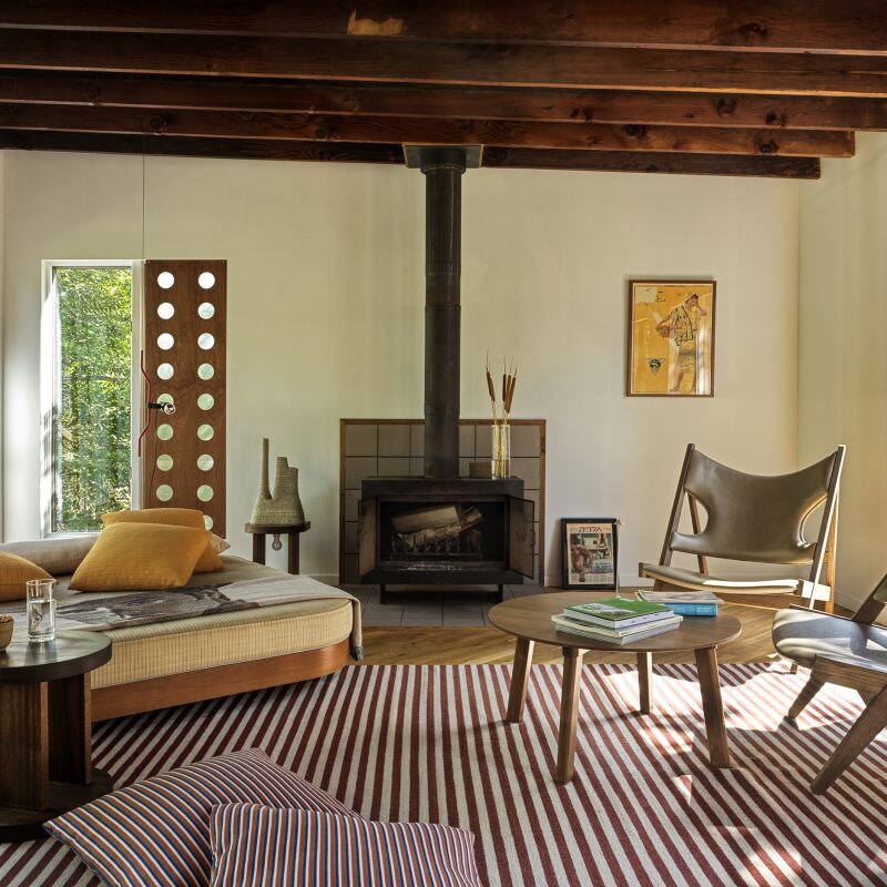
What did need changing about the house—which serves as guest quarters to a new home next door—was the interior finishes. The house hadn’t been updated since it was built and flaunted a color scheme of turquoise, purple, and green. The renovation required a fast turnaround—work began in mid-January and the first guests arrived July 4, so Hamilton made quick work of tailoring the cottage to her client’s “clean, Scandinavian” taste. They retained the existing windows to keep costs down, and added shiplap paneling, a coat of white paint, and Scandinavian modern furnishings—many from the 1970s—throughout. “This house is so special because it’s so simple,” says Hamilton. “We let it keep its character and took the ‘under-improvement’ approach. In other words, it was bad seventies, and we turned it into good seventies.”
Photography by Max Kim Bee, courtesy of Ellen Hamilton.


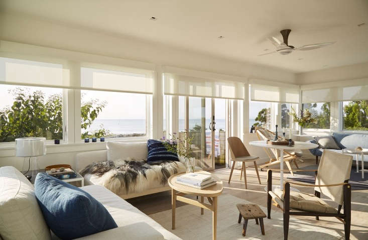
Hamilton was able to incur a huge cost savings by keeping the cottage’s original windows—which had white screens, brass handles, and heavy oak trim. She swapped in unassuming white handles and a thinner, white-painted trim, saving time and money while “lightening the room substantially,” she says.
At the other end of the price spectrum, says Hamilton, “there were a few pieces of furniture we really splurged on”: specifically, a Hans Wegner Circle Chair and Kaare Klint for Carl Hansen Safari Chair, both shown here.
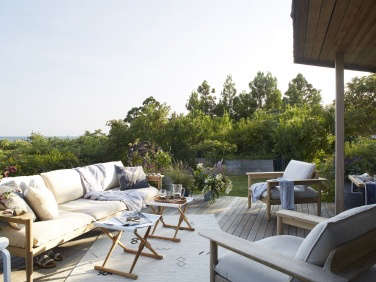
A small deck off the living room serves as a “lookout point” for viewing across the water.


“We really gutted everything,” says Hamilton, even requiring some structural changes. A “bizarre” beam in the center of the bedroom precluded a king-size bed, so the contractor redistributed the weight so the center of the bedroom could be post-free.

The whole house is painted in Farrow & Ball All White, “our client’s favorite,” Hamilton says.


The horizontal windows on the landing frame the beachy meadows as you ascend the stairs, says Hamilton.


- A Surf-Inspired House in Charleston, SC, for Barefoot Living
- Summer Escape: A Seaside Rental in Cornwall
- The Browsable Beach House: The Line Hits the Hamptons











Have a Question or Comment About This Post?
Join the conversation (2)