Icon - Arrow LeftAn icon we use to indicate a rightwards action. Icon - Arrow RightAn icon we use to indicate a leftwards action. Icon - External LinkAn icon we use to indicate a button link is external. Icon - MessageThe icon we use to represent an email action. Icon - Down ChevronUsed to indicate a dropdown. Icon - CloseUsed to indicate a close action. Icon - Dropdown ArrowUsed to indicate a dropdown. Icon - Location PinUsed to showcase a location on a map. Icon - Zoom OutUsed to indicate a zoom out action on a map. Icon - Zoom InUsed to indicate a zoom in action on a map. Icon - SearchUsed to indicate a search action. Icon - EmailUsed to indicate an emai action. Icon - FacebookFacebooks brand mark for use in social sharing icons. flipboard Icon - InstagramInstagrams brand mark for use in social sharing icons. Icon - PinterestPinterests brand mark for use in social sharing icons. Icon - TwitterTwitters brand mark for use in social sharing icons. Icon - Check MarkA check mark for checkbox buttons.
You are reading

Kitchen of the Week: A Clever Kitchen Built from Affordable and Recycled Materials

Search

Kitchen of the Week: A Clever Kitchen Built from Affordable and Recycled Materials

November 19, 2020

How to create a spacious, affordable—and memorable— kitchen in a small apartment destined to be rented out and then sold? Architects Ruth Mandl and Bobby Johnston of CO Adaptive in Brooklyn were still getting their firm off the ground back in 2014 when this commission came their way. They set out to make use of reclaimed materials—they dubbed the project The Recycled Content Apartment—and have since built an eco-minded practice around creative retrofits.

We think their solution for the kitchen still looks fresh and is filled with ideas worth considering. Movie industry apple crates as overhead storage and a transformer island, anyone? Join us for a look, action shot included.

Photography by Peter Dressel, courtesy of CO Adaptive.

the architects began by opening up the space to the living room—the kitc 17
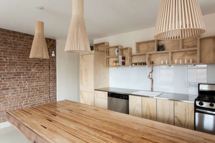
Above: The architects began by opening up the space to the living room—the kitchen/dining half is now approximately 100 square feet and includes a peninsula that works as both a food-prep counter and table.

Set in an 1868 Cobble Hill, Brooklyn, structure—at the time a new model of worker housing—the apartment had been modernized over the years and came with a worn-out galley kitchen. “We were engaged by a client who wanted to renovate the space as a rental income property with the eventual aim of selling it,” explains Ruth. “She was interested in keeping the budget very minimal and in maximizing the overall spatial efficiency.”

the back wall is unified by cabinets faced in grade a architectural plywood tha 18
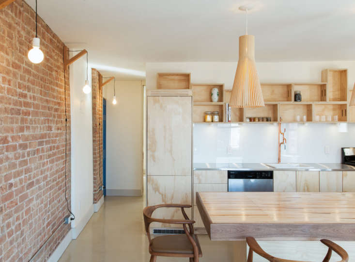
Above: The back wall is unified by cabinets faced in Grade-A architectural plywood that the architects paired with wall-hung crates from New York Apple Boxes, a local workshop founded by a photographer-carpenter who makes use of scrap wood. Full apple boxes, as shown here, are $33 each. The dishwasher was bought used from Build It Green, now Big Reuse, in Brooklyn. The stove is a G.E.

Thanks to the proximity of the existing window, the owner opted out of installing a range hood. Ruth says that though grime can build up in open storage, “especially over the cooktop,” it’s easy to access the inside of the crates for cleaning. “This solution is not for everyone: it works best to store cups, dishware, and sealed food containers like Mason jars that get regular use, and yes, there’s some surface cleaning required.”

the architects had their plumber build the copper piping faucet: &#8\2\20;c 19
Above: The architects had their plumber build the copper piping faucet: “cost-effective and surprisingly functional.” (See Trend Alert: 10 DIY Faucets Made from Plumbing Parts.)

The counter is stainless steel and has a backsplash of back-painted glass. one of CO Adaptive’s go-to materials: “It has a clean aesthetic,” says Ruth, “and though glass costs more upfront than tile, the installation is less labor intensive and therefore cheaper.”
the tabletop may strike a familiar chord: it&#8\2\17;s salvaged bowling all 20
Above: The tabletop may strike a familiar chord: it’s salvaged bowling alley flooring found at Big Reuse that was milled to a 1-inch thickness, sanded smooth, and finished, like the crates, with a food-safe natural oil.
the peninsula is \10 feet, 4 inches long and designed to be used as a worktop a 21
Above: The peninsula is 10-feet, 4-inches long and designed to be used as a worktop as well as a dining table. The chairs are Organic Modernism’s Peking B Dining Chair. The pendant lights are the Secto 4200 in beech.

The exposed original brick wall is lined with Dino Sanchez Bracket Sconces with Philips LED A19 Soft White bulbs.

they set out to make use of reclaimed materials—they dubbed the project  22
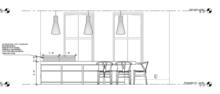
Above: To make the dual-function peninsula work, the architects designed the top to shift forward and back: when it’s in “kitchen mode,” the counter is flush with the storage compartments underneath. In “table position”,  it has an 11-inch overhang on each side and can seat up to 11.

the island/table is six inches lower than counter height. two custom chopping b 24
Above: The island/table is six-inches lower than counter height. Two custom chopping blocks (with their own-under the-counter storage slot) make up the height difference and protect the bowling alley marquetry.

recycled content kitchen, brooklyn, by co adaptive architecture. 25

CO Adaptive aren’t the one ones using crates as affordable kitchen storage: see Two London Creatives Shore Up a Tiny Beach Shack and Förstberg Ling‘s House for Mother.

For more ideas,  go to 13 Favorite Cost-Conscious Kitchen Remodels from the Remodelista Archives.

(Visited 2,593 times, 1 visits today)
You need to login or register to view and manage your bookmarks.

Product summary  

Have a Question or Comment About This Post?

Join the conversation

v5.0