Icon - Arrow LeftAn icon we use to indicate a rightwards action. Icon - Arrow RightAn icon we use to indicate a leftwards action. Icon - External LinkAn icon we use to indicate a button link is external. Icon - MessageThe icon we use to represent an email action. Icon - Down ChevronUsed to indicate a dropdown. Icon - CloseUsed to indicate a close action. Icon - Dropdown ArrowUsed to indicate a dropdown. Icon - Location PinUsed to showcase a location on a map. Icon - Zoom OutUsed to indicate a zoom out action on a map. Icon - Zoom InUsed to indicate a zoom in action on a map. Icon - SearchUsed to indicate a search action. Icon - EmailUsed to indicate an emai action. Icon - FacebookFacebooks brand mark for use in social sharing icons. flipboard Icon - InstagramInstagrams brand mark for use in social sharing icons. Icon - PinterestPinterests brand mark for use in social sharing icons. Icon - TwitterTwitters brand mark for use in social sharing icons. Icon - Check MarkA check mark for checkbox buttons.
You are reading

Before & After: In Maine, a Seaside Midcentury Split-Level Gets a Moody Makeover

Search

Before & After: In Maine, a Seaside Midcentury Split-Level Gets a Moody Makeover

August 11, 2023

Things aren’t always black and white. Unless, of course, you’re standing inside a home designed by Abigail Shea, founder of Studio Eastman. Tempered with texture, Abigail’s trademark neutral interiors blend California cool with East Coast ingenuity, a combo that makes monochrome feel anything but narrow-minded.

Take Abigail’s latest project with architect Kevin Browne, for example. Nestled into the craggy, coastal crook of Rockport, Maine, what was once a cavernous and choppy mid-century home is now a (mostly) airy retreat. “The layout left some really tight spaces with tiny windows,” Abigail says. “Instead of trying to force those areas to comply with the rest of the home’s bright palette, I chose to embrace the darkness.” Washes of earthy, near-black hues—like muted green and charcoal blue—imbue areas like the back portion of the kitchen with tension and intrigue.

The result, as Abigail puts it, is “a fresh family home that, although mid-century inspired, isn’t too on the nose.”

Let’s take a look.

Photography by Erin Little.

After

above: introducing depth through texture, rather than color, is abigail’ 17
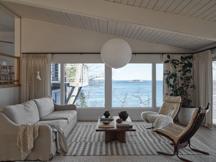
Above: Introducing depth through texture, rather than color, is Abigail’s calling card. In the open living space, Sherwin Williams’ Toque White acts as a serene backdrop for a sumptuous blend of textiles and furniture, including plush chairs from Lulu + Georgia, and locally crafted custom curtains.
above: the original brick fireplace got a modern makeover, including a glass fa 18
Above: The original brick fireplace got a modern makeover, including a glass-faced wood stove from Rocky’s Stove Shop. A vintage painting and mirror complete the vignette.
above: “i’m really drawn to layered, comfortable spaces over form 19
Above: “I’m really drawn to layered, comfortable spaces over formal, fancy ones,” Abigail says. Here, a jute rug from Pottery Barn sections off a snug sitting area furnished with vintage chairs, and sofa from Sixpenny. A paper lantern from Hay adds a playful touch.
above: a custom staircase, crafted in collaboration with maine based architect  20
Above: A custom staircase, crafted in collaboration with Maine-based architect Kevin Browne, creates a striking split between the living and dining spaces. Chairs from Pottery Barn and a custom light from Etsy play well with the client’s original table.
above: the home’s unobstructed views of the working waterfront inspired  21
Above: The home’s unobstructed views of the working waterfront inspired the nautical rope handrail—a feature original to the house that Abigail updated for modernity.
above: abigail has an unofficial rule of thumb when it comes to color: “ 22
Above: Abigail has an unofficial rule of thumb when it comes to color: “If the space is small and dimly lit, make it dark.” In the back half of the kitchen, deep green cabinets are topped with soapstone counters by MorningStar; the walls are painted in Thunderous by Sherwin Williams. A custom cafe-style curtain pulls the palette together.
above: in the kitchen, white santorini quartzite and dark soapstone countertops 23
Above: In the kitchen, white Santorini quartzite and dark soapstone countertops collide for a particularly dramatic effect.
above: the lofted home office features sculptural sconces from etsy and a vinta 24
Above: The lofted home office features sculptural sconces from Etsy and a vintage chair.
above: a domed light sourced on etsy steals the show in the primary bedroom. th 25
Above: A domed light sourced on Etsy steals the show in the primary bedroom. The bed—a custom design—is unfussy, with bedding from Zara Home, flanked by nightstands from Burke Decor.
above: sherwin williams’ thunderous makes a second appearance in a subdu 26
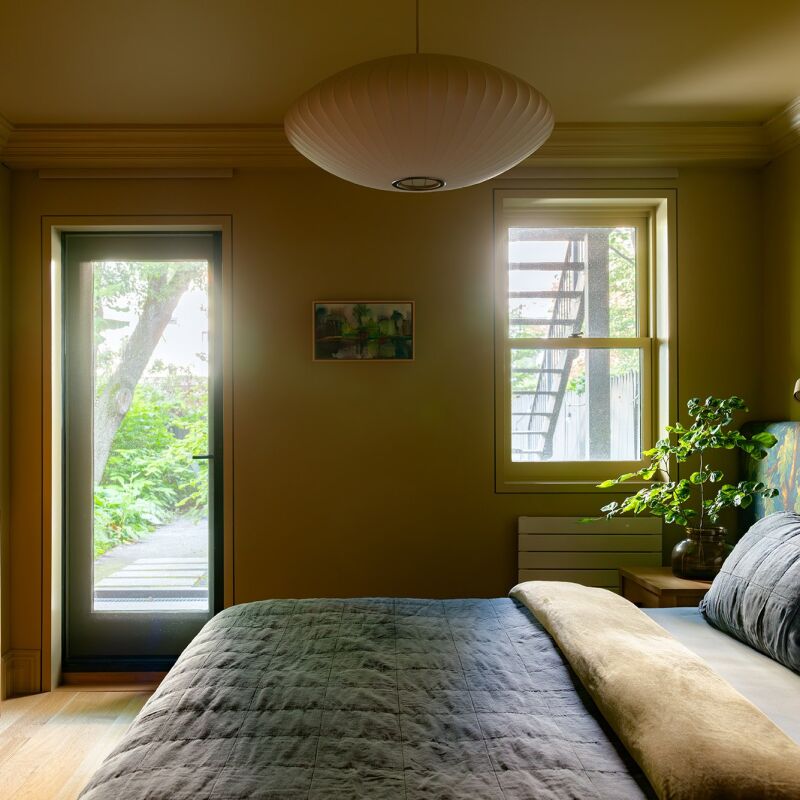
Above: Sherwin Williams’ Thunderous makes a second appearance in a subdued guest bedroom, which features a Tuft + Needle bed and bedding from Zara Home. Abigail scored the vintage-style sconce on Etsy.
above: by color wrapping the guest bedroom, abigail created a cocoon like space 27
Above: By color-wrapping the guest bedroom, Abigail created a cocoon-like space for visitors to unwind and relish the waves beyond the window. (For more on the topic, see 7 Color-Drenching Paint Tips from Farrow & Ball.) An overhead light from Mullan Lighting punctuates the muted palette.
above: in the ensuite primary bathroom, a freestanding kohler tub shares space  28
Above: In the ensuite primary bathroom, a freestanding Kohler tub shares space with a walk-in shower, finished in zelige-style tile by Bedrosians.

Before

above: the living room, before. “we redesigned the whole floor plan and  29
Above: The living room, before. “We redesigned the whole floor plan and gutted every room to the studs,” Abigail says.
above: the back half of the kitchen was formerly a tight utility space. 30
Above: The back half of the kitchen was formerly a tight utility space.

For more in Maine:

(Visited 19,365 times, 3 visits today)
You need to login or register to view and manage your bookmarks.

Frequently asked questions

Where is the Abigail Shea House located?

The Abigail Shea House is located in Rockport, Maine.

What was the condition of the house before the remodel?

Before the remodel, the house was in poor condition with outdated interiors and structural issues.

Who was responsible for the remodel?

The remodel was done by Abigail Shea, an experienced interior designer, in collaboration with a team of contractors and architects.

What were the major changes made to the house?

The major changes made to the house include opening up the floor plan, adding a new kitchen, bathrooms, and bedrooms, as well as updating the exterior facade.

Were there any challenges faced during the remodel?

Yes, there were challenges such as dealing with structural issues, working within a limited budget, and coordinating various contractors and suppliers.

What is the design style of the remodeled house?

The design style of the remodeled house is a combination of modern and traditional elements, with a focus on natural materials and a neutral color palette.

What was the inspiration behind the design?

The design was inspired by the natural beauty of the surroundings in Maine, as well as the desire to create a comfortable and inviting space for family and friends.

Are there any unique features in the remodeled house?

Yes, there are several unique features, such as a custom-built fireplace, a spacious outdoor deck, and large windows to maximize natural light and scenic views.

Has the remodel increased the value of the house?

While the specific increase in value is not mentioned in the article, a well-executed remodel generally has the potential to increase the value of a property.

Can I visit the Abigail Shea House?

As the Abigail Shea House is a private residence, it is not open for public visits. However, you can view the before and after photos in the article.

Product summary  

download 3
Paint

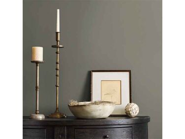
Toque White

More Info from The Sherwin-Williams Company

Have a Question or Comment About This Post?

Join the conversation

v5.0