Icon - Arrow LeftAn icon we use to indicate a rightwards action. Icon - Arrow RightAn icon we use to indicate a leftwards action. Icon - External LinkAn icon we use to indicate a button link is external. Icon - MessageThe icon we use to represent an email action. Icon - Down ChevronUsed to indicate a dropdown. Icon - CloseUsed to indicate a close action. Icon - Dropdown ArrowUsed to indicate a dropdown. Icon - Location PinUsed to showcase a location on a map. Icon - Zoom OutUsed to indicate a zoom out action on a map. Icon - Zoom InUsed to indicate a zoom in action on a map. Icon - SearchUsed to indicate a search action. Icon - EmailUsed to indicate an emai action. Icon - FacebookFacebooks brand mark for use in social sharing icons. flipboard Icon - InstagramInstagrams brand mark for use in social sharing icons. Icon - PinterestPinterests brand mark for use in social sharing icons. Icon - TwitterTwitters brand mark for use in social sharing icons. Icon - Check MarkA check mark for checkbox buttons.
You are reading

A Warm, Minimalist Duplex in Brooklyn by Architect Elizabeth Roberts

Search

A Warm, Minimalist Duplex in Brooklyn by Architect Elizabeth Roberts

February 19, 2018

When a young family, headed by an “amazingly creative couple,” according to their architect, bought half of a period townhouse in Brooklyn’s Prospect Heights, they saw the potential in their petite duplex, despite its decrepit state from years of neglect and a “careless, 1980s renovation.” They thought it might someday become a simple and elegant space, and had fallen hard for a mature, flowering dogwood tree in the backyard.

When architect Elizabeth Roberts was brought on board, she tore down walls to give the two-bedroom, two-bath duplex some breathing room. On the main, 580-square-foot level, she designed a new eat-in kitchen that opens to the living room, and replaced the back facade with a wall of custom steel windows to visually bring the family’s beloved dogwood into the kitchen. On the lower level, another 580 square feet, she placed the kids’ bedroom and bath next to the master suite, to which she added new doors and windows so it opens onto the backyard. The nearly all-white space is not splashy, but its minimalism is “warmed by all the small details, personal touches, and hard work” that the architect, clients, and artisan collaborators poured into the space, Roberts says. Let’s take a closer look.

Photography by Dustin Aksland, courtesy of Elizabeth Roberts.

elizabeth roberts prospect heights townhouse 3
Above: Roberts replaced the building’s back facade with a full wall of steel windows and a door to access the backyard—the custom glazing was the project’s biggest spending “splurge.”
elizabeth roberts prospect heights townhouse 5
Above: The kitchen cabinets were fabricated by Reliquary Studios in upstate New York.

Roberts counts the details among the most important features of this project. “In my opinion, minimalism requires great care in order for it to come off as warm and personal,” the architect says. “Everything is visible, and everything matters.”

elizabeth roberts prospect heights townhouse 8
Above: At right is a Bosch dishwasher fronted in a custom cabinet panel. The brass cabinet pulls are by Peter van Cronenburg.

“The house lives really well for the young family,” says project architect Elliot Meier. “It’s not huge, but the connection to the garden with the flowering dogwood makes both the main parlor and the master bedroom feel very open.”

elizabeth roberts prospect heights townhouse 4
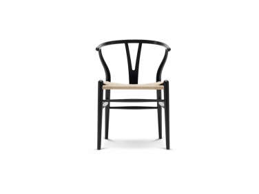
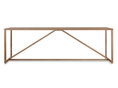
Above: The combined kitchen and dining is anchored by a white Strut Table from Blu Dot, with Wishbone Chairs surrounding.
The flooring is Heritage White Oak from LV Wood, installed in a chevron pattern. One lesson Roberts imparts from the project is the importance of ordering more flooring than you think you’ll need: “When working with a floor pattern like chevron, it’s critical to make sure you have enough of both the right- and left-hand cuts for installation,” she says. (Not sure you know your chevron? Test yourself in Remodeling 101: The Difference Between Chevron and Herringbone Patterns.)

elizabeth roberts prospect heights townhouse 6
Above: A wall of white cabinetry hides the Sub-Zero fridge.
elizabeth roberts prospect heights townhouse 7
Above: To create a “necessary, open, and airy portion of the house,” the new eat-in kitchen is completely open to the living room. “Therefore, every angle of the kitchen needed to look good,” Roberts says.
elizabeth roberts prospect heights townhouse 9
Above: The living room fireplace surround is treated in tadelakt, a traditional Moroccan wall finish made of lime plaster and black olive soap. (For a primer on the technique, see Remodeling 101: Moroccan Tadelakt Plaster Finish.)

Roberts worked with plaster artist Sean O’Tyson to create the tadelakt finish.

elizabeth roberts prospect heights townhouse 10
Above: Roberts cites the tadelakt (also used in the master bath, below) as one of her favorite features of the entire project: “It’s a really beautiful and tactile material that has a subtle, hand-applied texture,” she says.
elizabeth roberts prospect heights townhouse 2
Above: The ceiling light is vintage, by Swedish midcentury designer Hans-Agne Jakobsson.
elizabeth roberts prospect heights townhouse 1
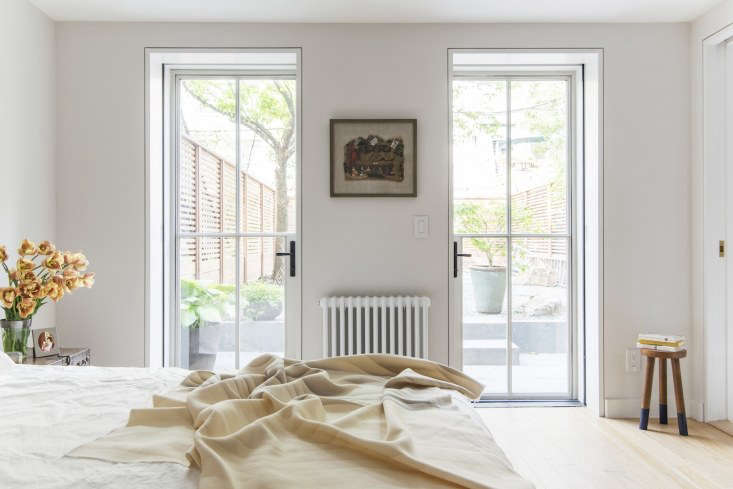
Above: The basement level’s original openings had been removed in a previous renovation. Roberts restored them so the master bedroom now opens directly onto the backyard.
elizabeth roberts prospect heights townhouse 11
Above: The master bathroom walls are finished in gray tadelakt. The plumbing fixtures are Vola and the sconces are Trapeze from NYC’s Apparatus Studio.
elizabeth roberts prospect heights townhouse 12
Above: The kids’ bath is lined in Brasilia cement tile from Popham Design with fixtures from Fantini.

If you’re tackling a kitchen renovation like the one featured here, start with our Remodeling 101: Kitchen guide to Kitchen Sinks & Faucets, Kitchen Storage & Organization, and Kitchen Cabinets & Hardware. For more from architect Elizabeth Roberts, see:

(Visited 1,820 times, 1 visits today)
You need to login or register to view and manage your bookmarks.

Frequently asked questions

Who is the architect of the Brooklyn duplex?

The architect of the Brooklyn duplex is Elizabeth Roberts.

How would you describe the design style of the duplex?

The design style of the duplex can be described as warm and minimalist.

What type of property is the Brooklyn duplex?

The Brooklyn duplex is a residential property.

Where is the Brooklyn duplex located?

The Brooklyn duplex is located in Brooklyn, New York.

What inspired the design of the Brooklyn duplex?

The design of the Brooklyn duplex was inspired by the client's desire for a warm and inviting space that incorporates natural materials.

What are some of the materials used in the Brooklyn duplex?

Some of the materials used in the Brooklyn duplex include white oak, soapstone, and steel.

Are there any unique design features in the Brooklyn duplex?

Yes, there are unique design features in the Brooklyn duplex such as the custom steel and glass staircase and the built-in bookshelves.

Is the Brooklyn duplex available for rent or sale?

It is unclear whether the Brooklyn duplex is available for rent or sale.

Product summary  

Have a Question or Comment About This Post?

Join the conversation

v5.0