In Tuxedo Park, New York—a tiny enclave an hour north of New York City—architect Kevin Greenberg transformed a former carriage house into a vacation home for a young couple, both financiers.
The late-1800s structure—an outbuilding designed to hold horse-drawn carriages from a nearby, much grander, home—had some compelling original details but an awkward layout with unfortunate “improvements” over time. With his Brooklyn firm Space Exploration, Greenberg modernized the home while preserving much of its original tack, wood floors, and beadboard paneling. Let’s take a look.
Photography by and courtesy of Kevin Greenberg.
Above: A matte black T-Light by Allied Maker hangs above the entryway; the fixture was modeled after gas lanterns that illuminated 19th-century saloons.
When Tuxedo Park was founded in the late 1800s as a private hunting and fishing park, “the carriage house that served the primary residences were—unusually—consolidated on their own street,” said Greenberg. “So the main house that this carriage house served is actually located quite some distance away.”

Above: The stairway post and railing are original; Greenburg had them cleaned and sealed with a clear finish.
In part, says Greenberg, the owners chose Tuxedo Park for their weekend house “because the Hamptons are so expensive and congested.” They’re drawn to the terrain, architectural history, and relative obscurity of Tuxedo Park, “as well as its easy proximity to New York City.” The couple spends the workweek in Brooklyn, in a house also designed by Space Exploration.

Above: The dark wood beadboard paneling in the sitting room is original and unchanged, save for a new coat of protective polyurethane. Just above the frame, but not visible here, is an original “hay drop” used to transfer food for horses.

Above: Throughout the house, the floors, ceilings, and paneling are a mix of old and new. “The idea was to preserve the patina of the original wall paneling in the rooms that got the best light,” said Greenberg.

Above: To make the dining room feel intimate, Greenberg had it painted in Railings from Farrow & Ball. “The clients wanted the room to feel dark so that during gatherings there, the attention would be on the company, not the walls beyond.”
Plus, adds Greenberg, “the beautiful dappling of light on the wall in the late morning is a nice, and unexpected, effect of the color.”

Above: An original piece of equestrian tack hardware is visible in the ceiling.
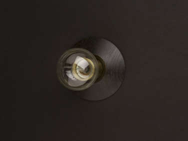
Above: Allied Maker’s Court Sconces line the hallway.

Above: Space Exploration added beadboard to the exposed side of the kitchen peninsula. The general contractor helped source new beadboard that was a good match with the old, and the team even salvaged some from the adjacent garage, “where it wouldn’t be missed.”

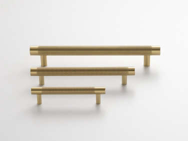
Above: The kitchen cabinets were designed by Space Exploration, fabricated by the general contractor, and painted in Farrow & Ball’s Manor House Gray. The countertops are black marble, with a custom fabricated, integrated sink. The faucet is the Quinoa Joy Slim by Aquabrass—”our favorite ridiculously named plumbing fixture.” The cabinet pulls are natural brass Knurled Pulls from Schoolhouse Electric.

Above: To maintain the openness of the kitchen, Space Exploration opted against a full-height refrigerator. They used four Sub-Zero refrigerator drawers instead, plus an auxiliary fridge in the garage that’s “usually stocked with beer and esoteric spirits for impromptu parties,” said Greenberg.

Above: The ground-floor bath got a dramatic overhaul with cement tiles sourced by the client. (See the “Before” photos, further down below.)

Above: Throughout the house, the walls, floors, and ceilings are painted in Farrow & Ball’s Wevet. The trim is Hollandlac Oil Paint in black from Fine Paints of Europe.

Above: Space Exploration removed the attic, exposing the underside of the roof on the top floor “to create soaring cathedral ceilings” in the upstairs bedrooms. The master bedroom (shown) has an open clothes closet tucked beneath the slope.
Above: A working fireplace supplements the master bedroom’s baseboard heaters; it’s flanked by a pair of Minimalist Sconces by Allied Maker.

Above: In the guest bedroom, Space Exploration chose to highlight the original structural supports by painting them black.

Above: A third bedroom is used as an office.
Before
Above: The original sitting room had wall-to-wall carpeting and dated ceiling fans. The hay drop in the ceiling is partly visible here.

Above: Space Exploration scrapped the dated kitchen and started over with a new, open layout.
Above: “The upstairs was a confusing warren of small rooms,” said Greenberg, and part had been “freshly carpeted with wall-to-wall, mint-colored berber to entice potential buyers.”
For more from Space Exploration, see:
- Best Professionally Designed Kitchen Winner: Space Exploration
- The Simple Life: A Montauk Beach House for a Creative Couple
- Before & After: A Period Brooklyn Heights Penthouse Gets an Overhaul






Have a Question or Comment About This Post?
Join the conversation (3)