The Japanese are masters of building on slivers of land and maximizing tiny lots in dense urban areas. Americans less so; New Zealand-born, LA-based architect Simon Storey is a refreshing exception.
Storey, who founded Anonymous Architects in 2005 (named thus as he likes his buildings to blend into an environment), took a 15-foot-wide Echo Park lot with a tiny house above a garage and turned it into a vertical, light-filled two bedroom home and office. It was, as he puts it, “the perfect site to experiment with compact and efficient urban living.” Read on to see the results.
Above: An open staircase with floating beech treads brings light into the living area.

Above: The kitchen features a concrete floor, Douglas fir cabinetry, and Formica countertops; it sits at a lower level from the wood floored dining area as a way to delineate space in the open living quarters.

Above: Large floor-to-ceiling windows at the front and back of the house provide plenty of light. Full-height doors open onto a guard rail, allowing for cross breezes. The Wow and Flutter Speaker was made by Storey.

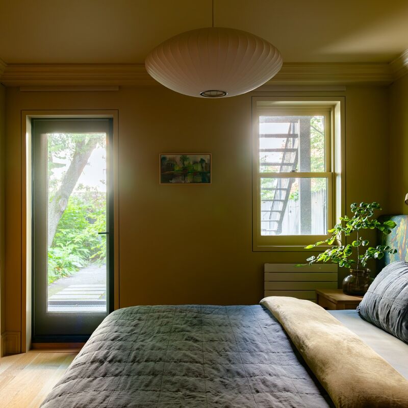
Above: Storey designed his own wallpaper, called Torn and Confused, for the bedroom.

Above: A roof deck with built-in seating affords views that extend as far as the Hollywood sign and the San Gabriel Mountains.

Above: Since the building extends to the property line, fire code required the exterior to be fire resistant, so Storey clad the house with cement plaster.
To see what the original structure looked like, check out Curbed LA.


Have a Question or Comment About This Post?
Join the conversation (5)