Architect Sheila Narusawa came to this project when her high school boyfriend, Moncreiff Cochran (whom she hadn’t seen in decades) was looking to build a house. She ended up marrying him—and designing a New England–inspired modernist hideaway for the two of them, shiplap-paneled kitchen included. Look closely: The room is filled with a career’s worth of clever, cost-conscious design solutions.
Photography by Matthew Williams for Remodelista.
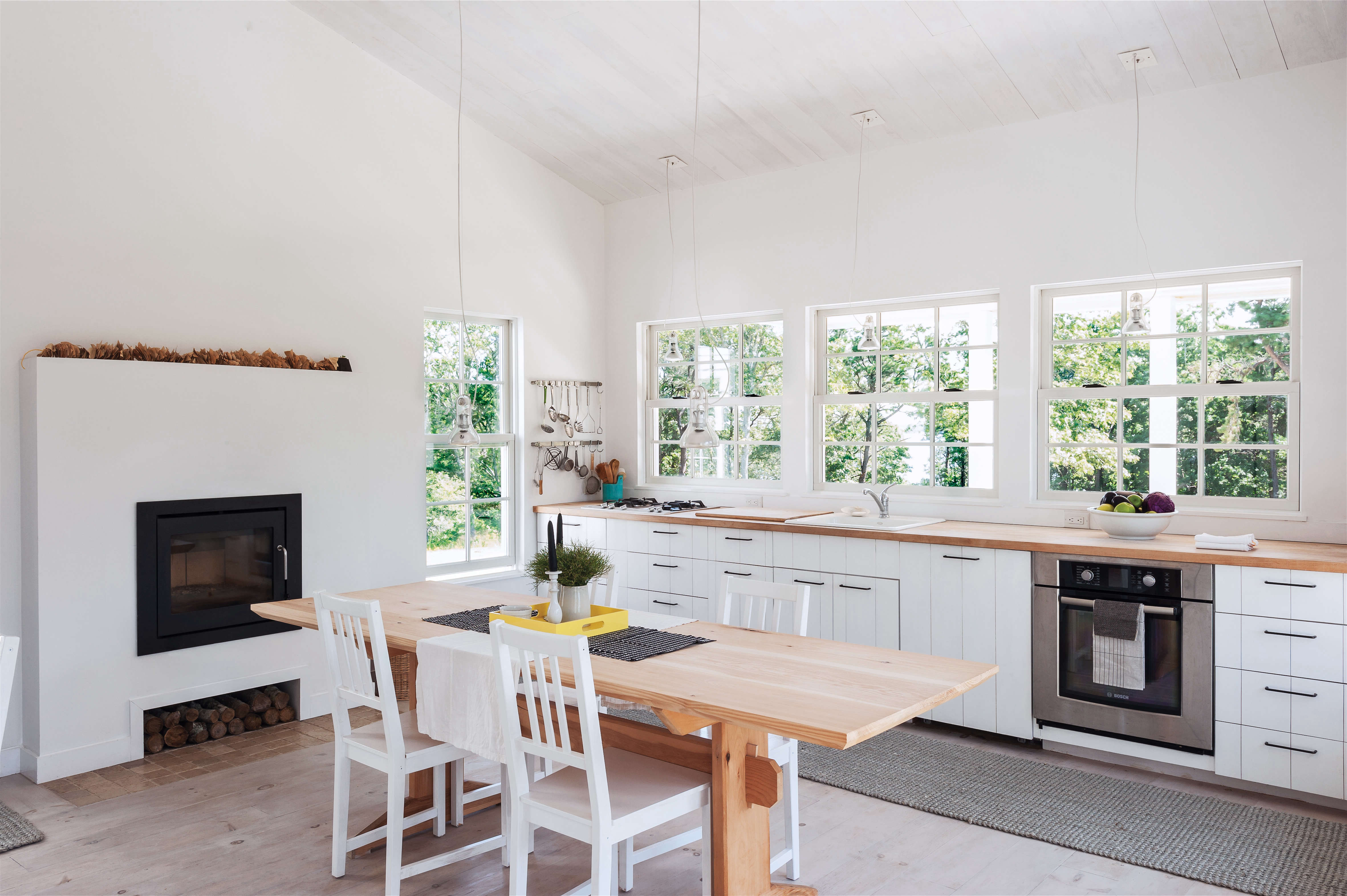
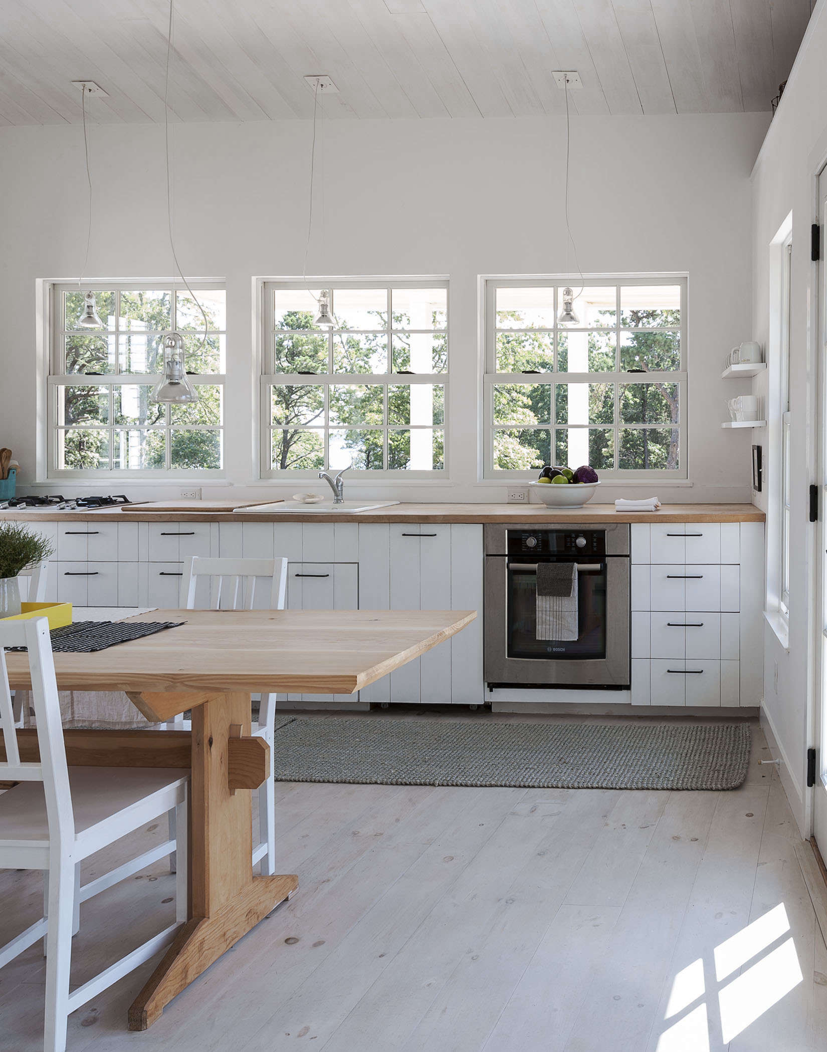
Above: Sheila practiced architecture in Tokyo before returning to home to Orleans, on Cape Cod, and her style is a mix of Yankee practicality and Japanese craftsmanship shot through with a Scandinavian love of light. A longtime opponent of flabby houses filled with little-used spaces, she decided to skip the dining room and have the kitchen serve as an all-purpose hub for cooking, eating, and entertaining.
Above: The key piece of furniture in the room, the dining table, was designed by Sheila and given to her and Mon as a wedding present from his siblings. Made of clear-grade Eastern white pine and fabricated by Rhode Island carpenter Nick Hollibaugh, a brother-in-law, it takes its shape from an antique trestle table but follows exacting specs. As Sheila explains, “It’s eight feet long and 30 inches wide, magic numbers if you want a nice proportion that has length—it seats eight—and room for plates, but still allows for intimate conversations.”
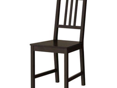
The fussiness ends there: The chairs are Ikea’s $29 Stefan design, and the delicate bulbs suspended over the table are $261 Atlas Pendants.
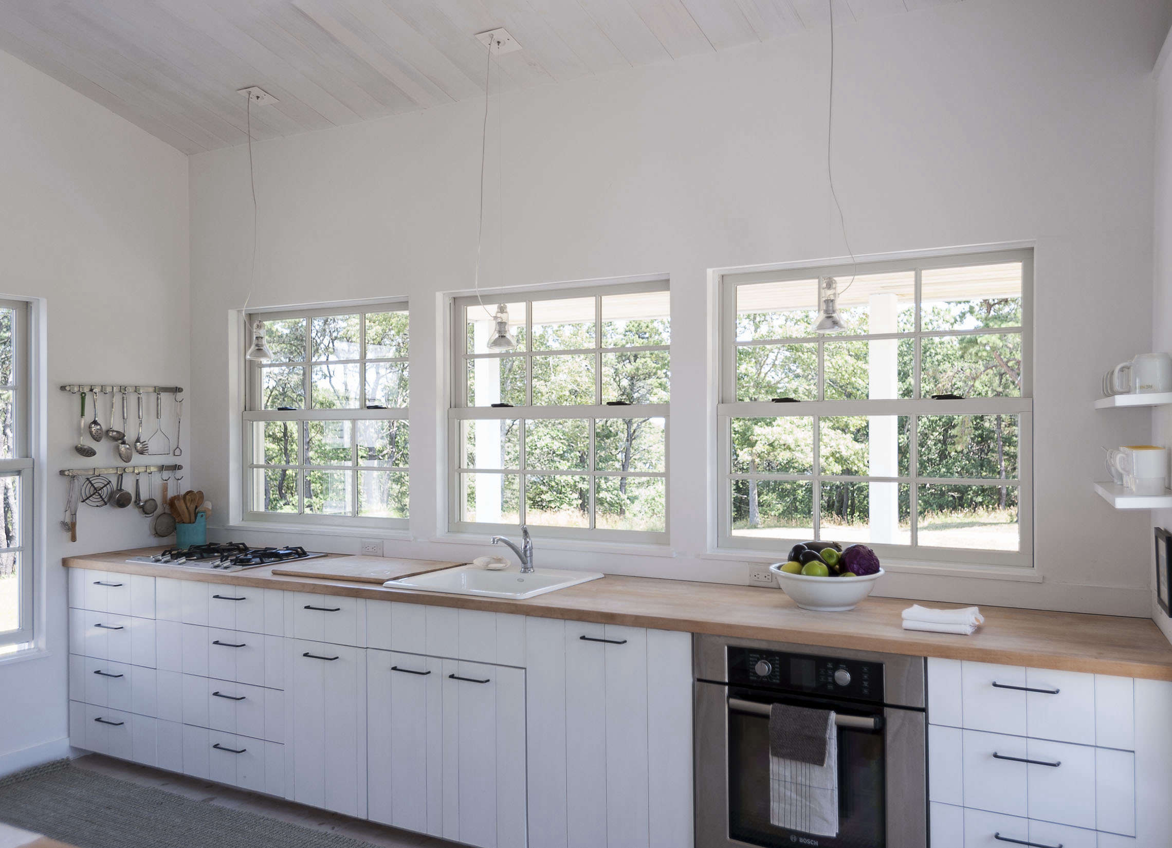
Above: Another of Sheila’s beliefs is that houses should be designed with cost tradeoffs in mind: Save here, spend there. Windows, in her book, are worth paying extra for—but only to a point. After originally speccing Marvin, she went with more affordable Andersen.
Throughout the house, Sheila used extra-long windows—they’re 65 inches tall; 50 inches is standard—and she placed the sills only 19 inches above the floor. “The size and lowered sills extend the feeling of bringing the outside in and allow the house to breathe,” she says.
Above: Radiant heat flooring efficiently warms the entire house, even in the height of winter. In the kitchen, it’s supplemented by a wood-burning Rais 60 firebox inserted into a Majestic SRSH36 stove, raised to table level so it’s fully in view. Wood is conveniently stowed in an insert underneath. The decoration on top (visible in the first two photos) is a paper garland found on Etsy.
Above: The custom cabinetry is all shiplap poplar, a painstaking tongue-and-groove construction borrowed from old Cape houses and painted with primer. (See The Enduring Appeal of Shiplap.) For a high/low mix, Sheila paired them with affordable butcher block counters and simple black metal squared-off drawer pulls from the hardware store.
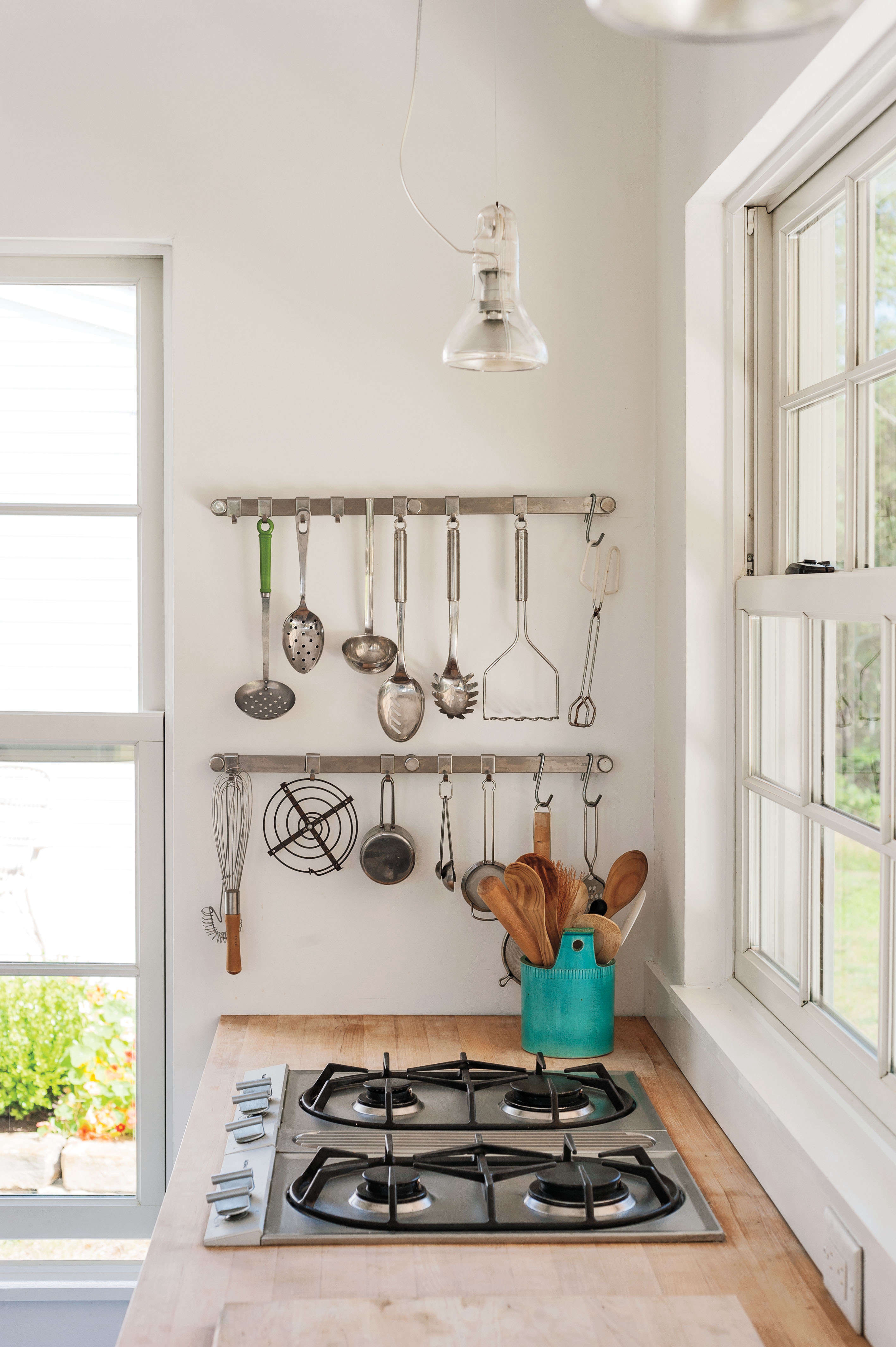
Above: Cooking utensils hang from stainless steel Kitchen Rails by German company Rösle next to the stovetop.
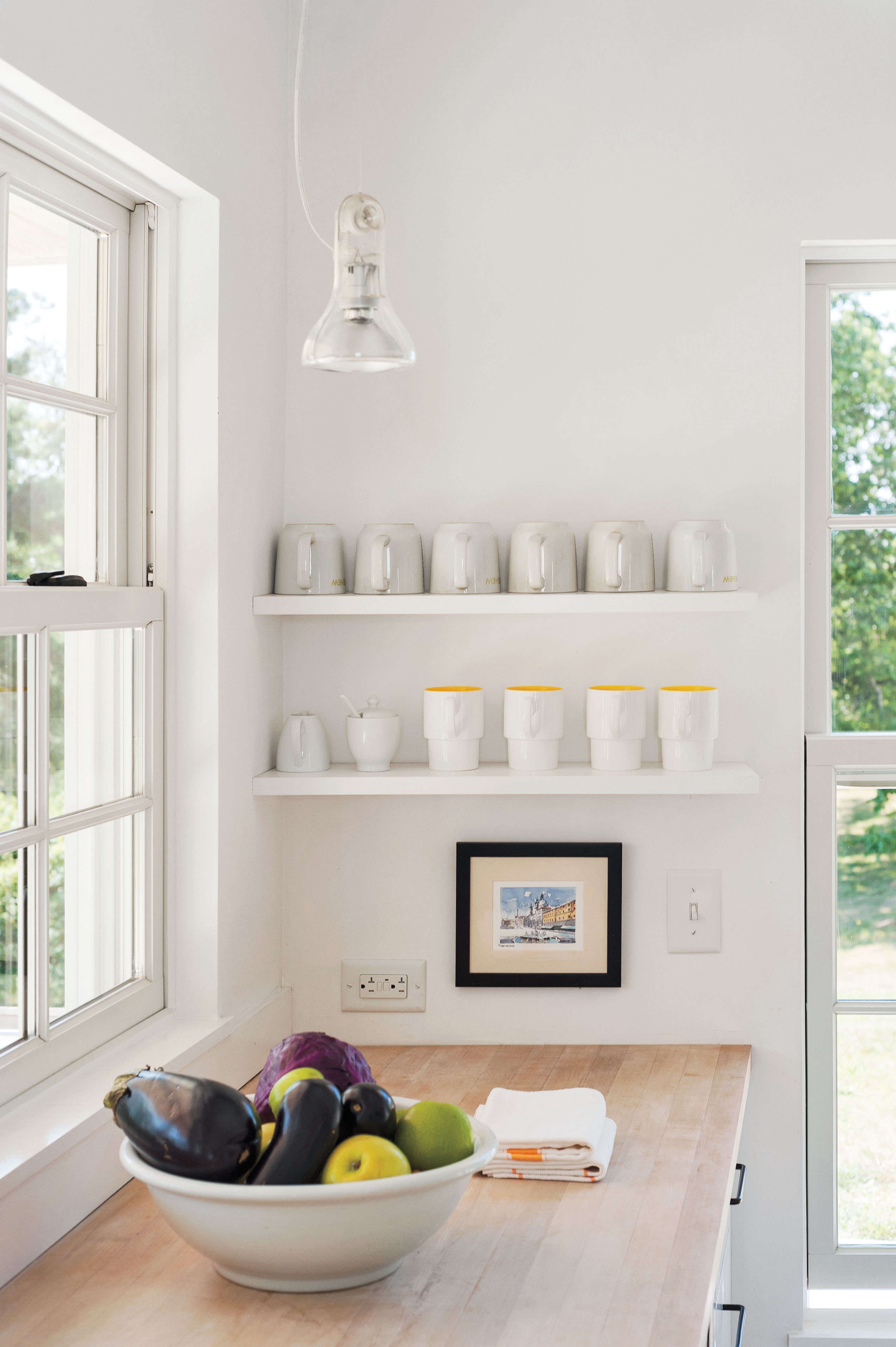
Above: Mugs line the open shelves on the other end of the counter.
Of the Atlas Pendants, Sheila says, “It took me years to find a light I like for the kitchen because most are so homogenous and ambient. These send pools of light to surfaces. And they’re so minimalist, they’re one inch short of a bare bulb and almost invisible.”
Above: The floor is made of Eastern white pine, “an inexpensive wood considered soft for this use,” says Sheila, “but we wanted a raw, unfinished Scandinavian look.” To lighten it, she washed the boards with a custom Benjamin Moore shade of warm gray and applied a Danish soap finish, a combination that requires periodic upkeep in high-traffic areas (“polyurethane would help, but it would add a sheen,” says Sheila.)
The walls are painted Deeptone Mixing Base, a flat latex from Pittsburg Paints’ Manor Hall line, and the ceiling is poplar with a coat of primer. As another money-saving measure, Sheila and Mon did all of the interior painting themselves, ceilings and floor included.
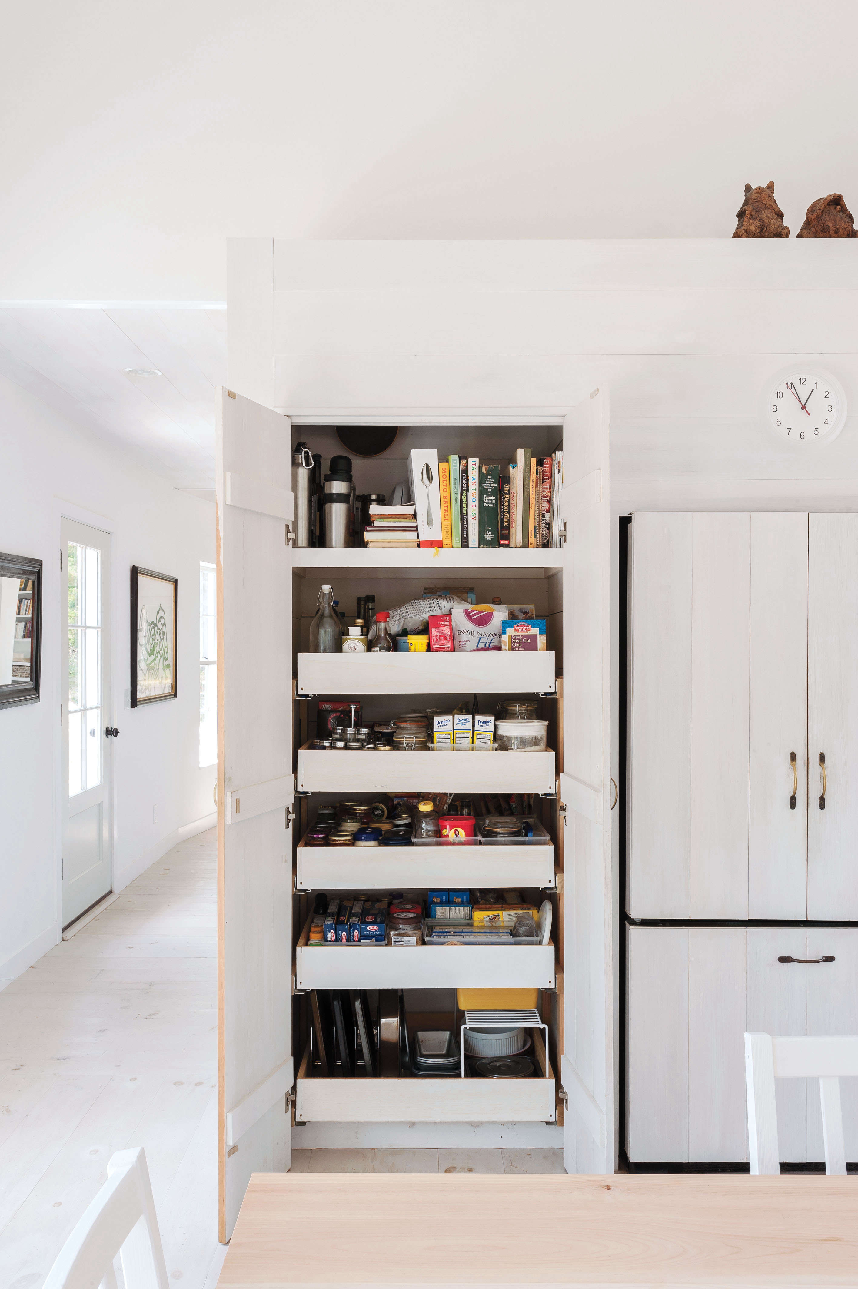
Above: Wanting to keep visible clutter to a minimum, Sheila created a wall of tall storage cabinets on either side of the shiplap-paneled double-door fridge (shown on the right). The pantry cabinet is devoted to cookbooks, bakeware, and dry goods.
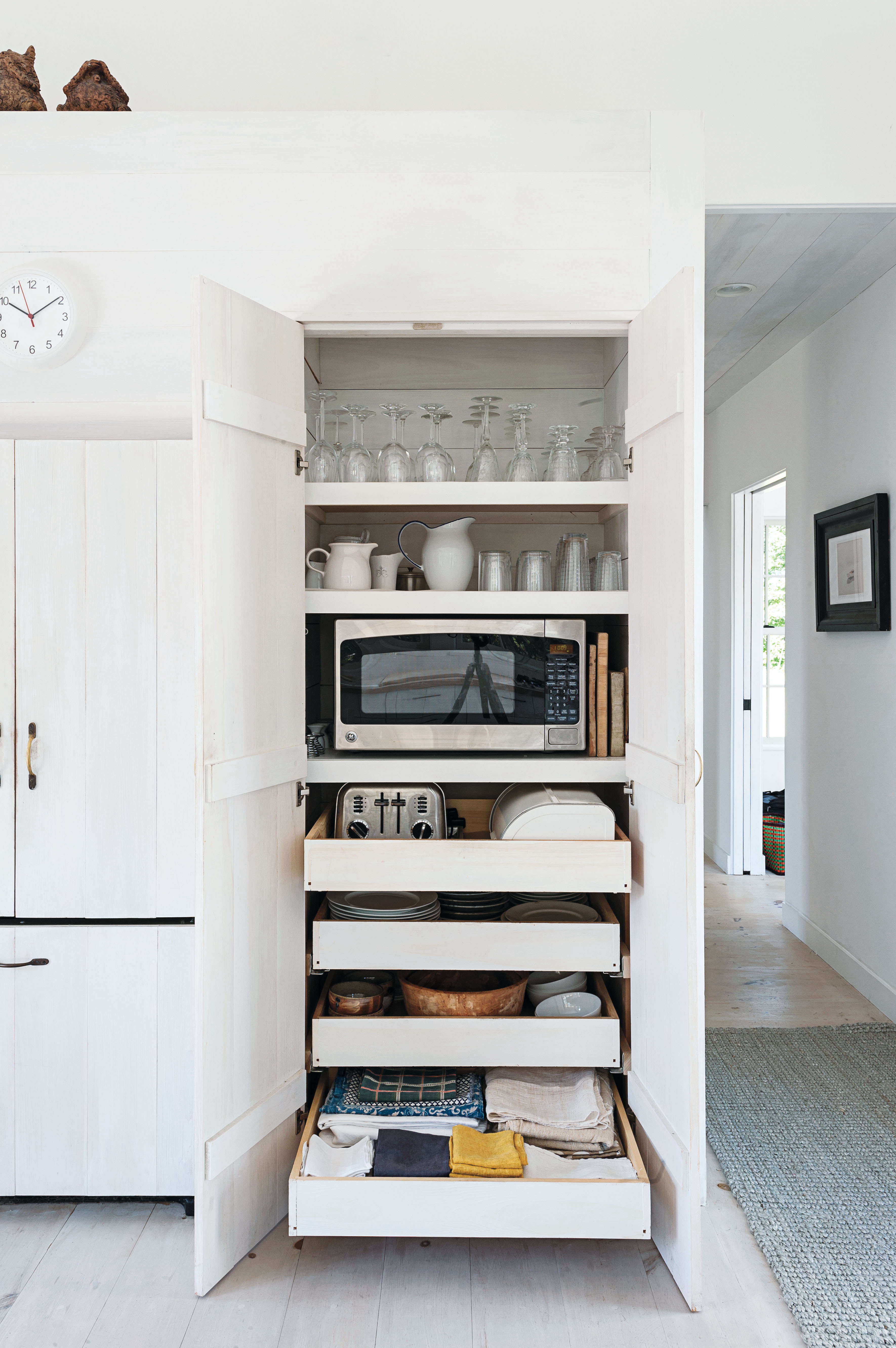
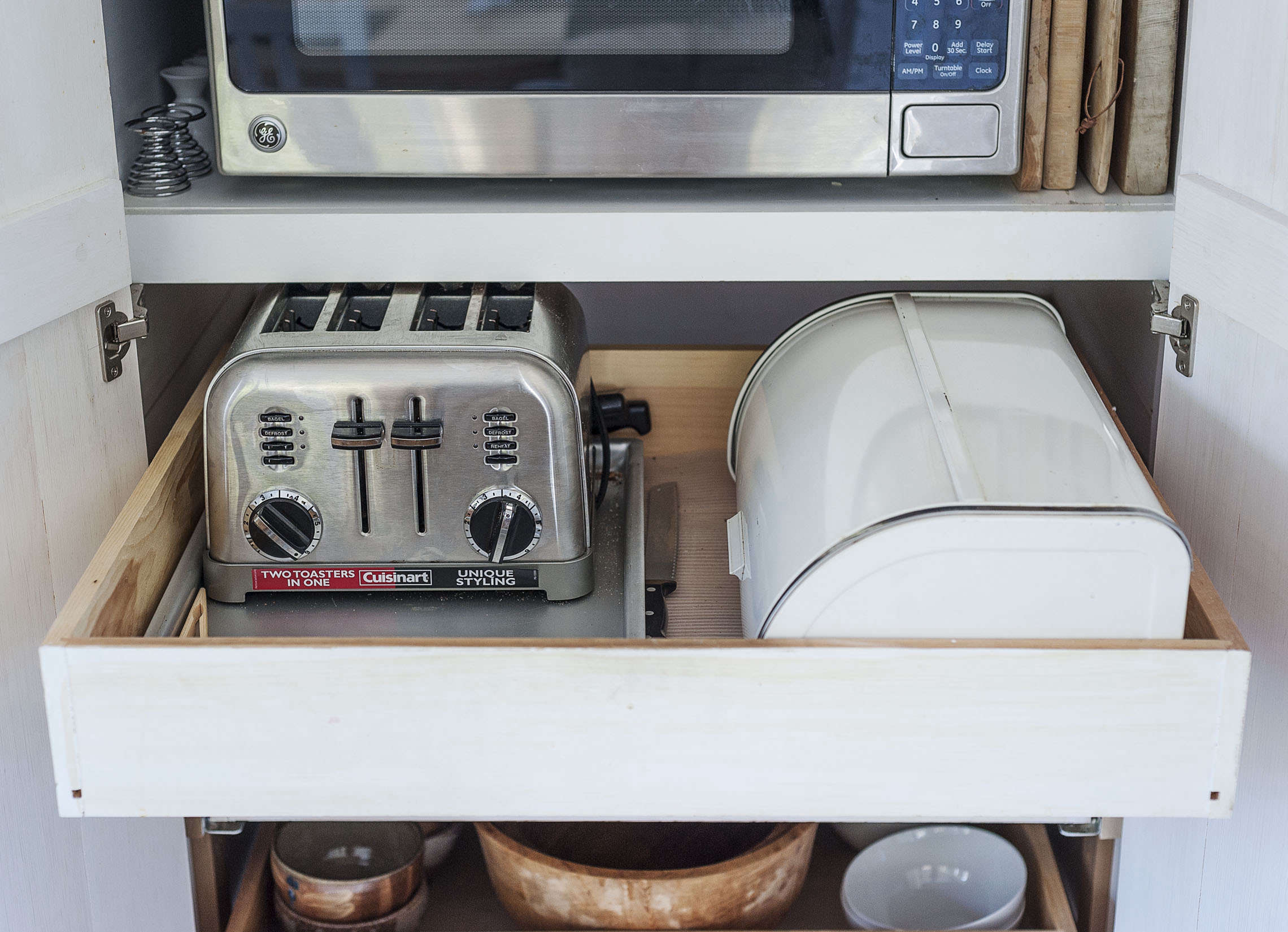
Above: The appliance and tableware cabinet holds, among other things, a microwave, toaster, and breadbox. “Kitchen storage can be consolidated so that it doesn’t overtake the room,” says Sheila.
Above: The pullout shelves have outlets in the back.
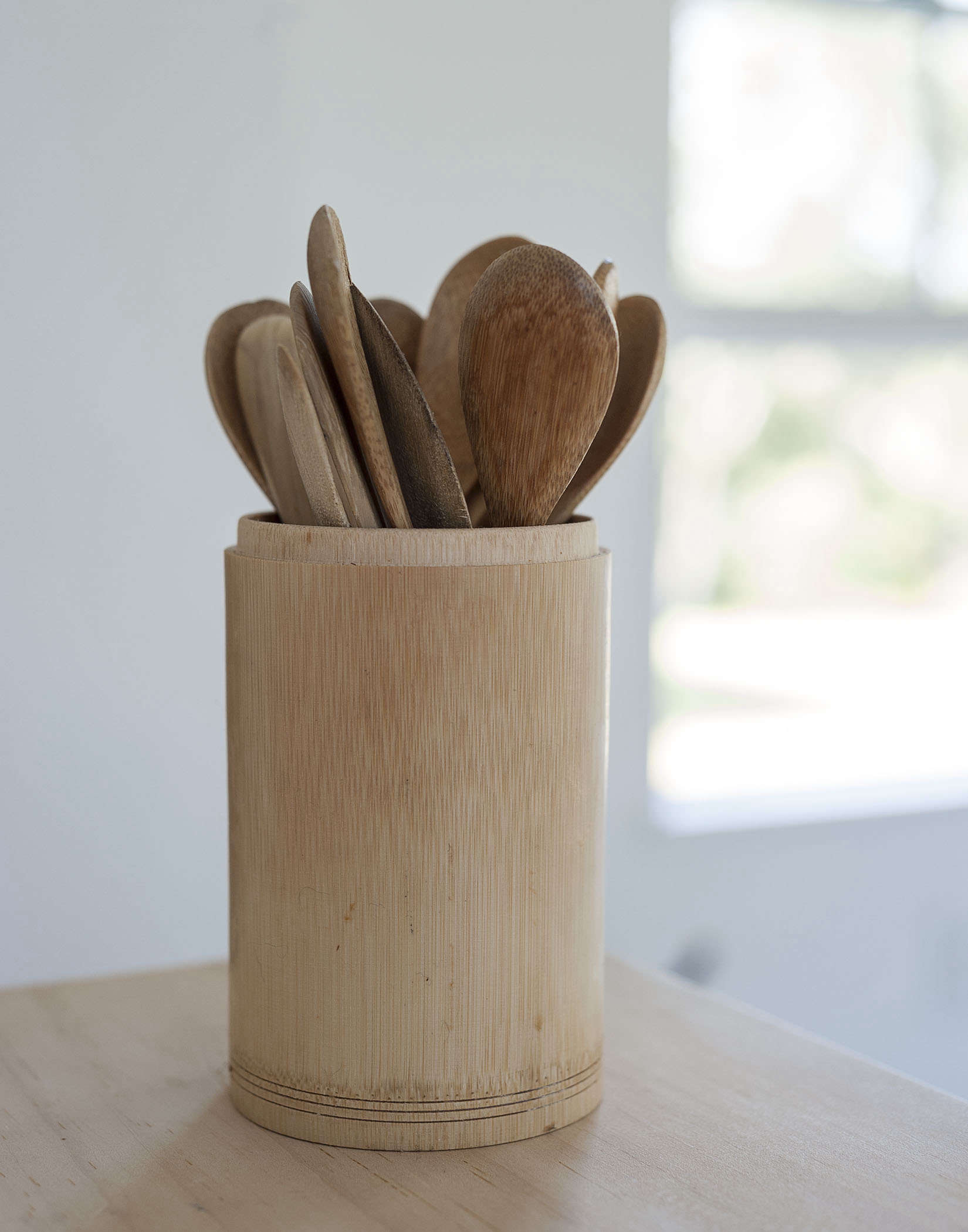
Above: Spoons used for eating oatmeal are gathered in a bamboo holder.
Above: What to put on a high shelf? Nothing big and heavy or purely ornamental is allowed in Sheila’s kitchen. Metal clamming baskets made the cut—they’re interesting to look at and, on the Cape, useful to have on hand.
Want to see more? We explore the whole house in the Remodelista book. And we recently presented another design by Sheila: A Cottage Reborn in Coastal Maine.
N.B.: This post is an update; the original story ran on July 2, 2015.






Have a Question or Comment About This Post?
Join the conversation (12)