Architect Kevin Greenberg of Space Exploration (a Remodelista Architect Directory member) loves a challenge. Case in point: a top-floor, prewar apartment in Brooklyn Heights that had never been renovated and was in need of a complete overhaul. “We love this type of period apartment,” he says, “and we wanted to preserve its essence and character while modernizing it to accommodate the needs of our clients, a young family.”
Greenberg assessed the space and pruned the following: “odd closets” with sinks, a wall enclosing the kitchen, and original period detailing in a “sad state.” Plus, said Greenberg, the “proportions and layout of the rooms were typical of the period—cramped and warren-like,” storage was “beyond inadequate,” and a maid’s bathroom “was absurdly claustrophobic.”
The additions included a third bedroom, new walnut floors, an electrical overhaul, and a new design for wall molding panels “that respects the traditional heritage of the building and neighborhood.”
Photography by Kevin Greenberg, courtesy of Space Exploration.
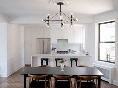
Above: Over the dining table hangs a Modo Chandelier by Jason Miller for Roll & Hill. Behind the table is a custom heating unit with inset grills from Architectural Grille.
Above: The entire apartment is painted in Wevet from Farrow & Ball, in flat Estate Emulsion finish on the walls and ceilings and Estate Eggshell on the baseboards and casings.

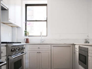
Above: Greenberg and his team dramatically reconfigured the kitchen, reframing a low window to relocate the sink and removing a wall to open up the space. These strategies “helped transform the formerly dark, cramped kitchen into an inviting peninsula with ample storage.”
Above: Fully custom kitchen cabinets were out of the budget, so the contractor recommended J&K Cabinetry for a semi-custom solution. The simple cabinet profile the team liked, however, was only available in an undesirable shade of greige, so they painstakingly refinished the cabinets to their desired hue and sheen. Said the painter in charge of the unenviable task, the greige had “been baked on in the forges of hell, with a tenacity that was downright depressing to confront.” The kitchen faucet is the Quinoa Joy Slim by Aquabrass. Countertops are Carrara marble in a “high honed” finish.

Above: Though a working fireplace was not permitted by the building, Space Exploration added a new faux fireplace. The hearth and firebox are absolute black granite, the hearth installed flush to the floor.
The floors are tongue-and-groove American walnut with a matte finish, laid in a herringbone pattern and surrounded by a custom border.
“We wanted to preserve a feeling of separation between the main public spaces of the apartment, while allowing them to be more connected,” said Greenberg. “We did this by introducing a border at the new walnut floor, and also new soffits above, to help to demarcate the different spaces.”
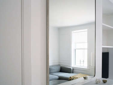
Above: Over the fireplace hangs a Bristol Flat Mirror from Restoration Hardware. The fireplace mantel and surround are white Carrara marble, in the same high-honed finish used in the kitchen.
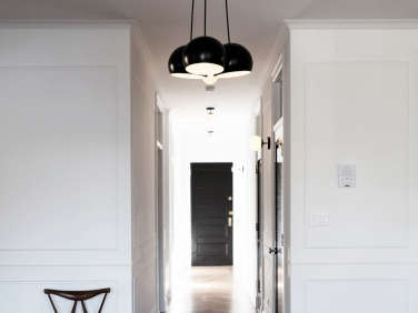
Above: “Of paramount importance was the preservation of the ornate original detailing,” said Greenberg, but preservation was not in the cards. The crumbling walls were replaced entirely with a new “period appropriate” wall panel molding system, plus complementary door and window casings, baseboards, and ceiling details.
A Schoolhouse Electric Isaac Chandelier hangs at the entrance to the hallway, installed within a plaster ceiling medallion.
Above: Hallway lights are Nova sconces from Schoolhouse Electric.

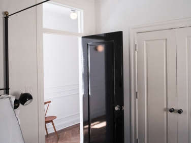
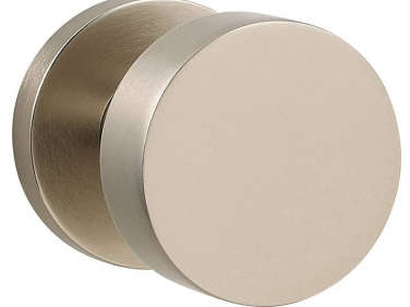
Above: All the main room doors are painted in Noir from kt.Color’s Le Corbusier collection, in a brilliant-sheen oil paint from Fine Paints of Europe. The new solid-core doors are topped with transom windows for better transmission of light throughout the apartment. Doorknobs are 5055 from Baldwin.
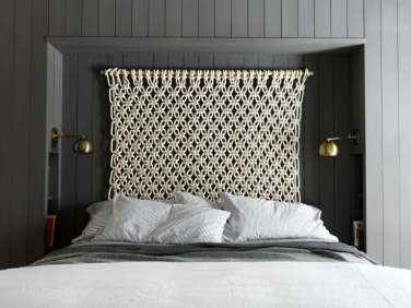
On either side of the bed is an Isaac Short-Arm Sconce from Schoolhouse Electric.
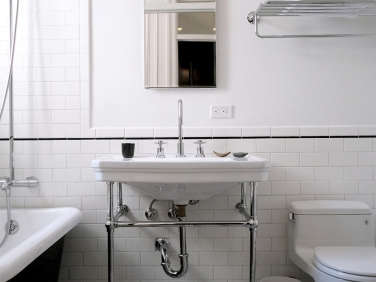
Above: The star of the hallway bath is Tulum floor tile from Cement Tile Shop. The walls wear simple Subway Ceramics from Heritage Tile. Above the mirror is an Alto Sconce from Cedar & Moss.

Above: The black bathtub was custom-finished with the same glossy oil paint as is used on the doors.
Before
Above: Before the remodel, the kitchen was enclosed within a wall.
Above: “The apartment’s enviable abundance of natural light was curtailed to the front rooms because of the narrow corridors and myriad partitions cordoning off the many small rooms,” said Greenberg.
Above: “It was equipped with woefully inadequate infrastructure and outdated amenities.”
For more from the architects, see The Simple Life: A Montauk Beach House for a Creative Couple and Best Professionally Designed Kitchen Winner: Space Exploration.





Have a Question or Comment About This Post?
Join the conversation (3)