A few weeks back, we shared the interiors of the London Plane in Seattle—a restaurant with flower shop, bakery, retail, and takeaway located in a former bank building in the city’s Pioneer Square neighborhood. The space was designed by its owners, prolific Seattle chef Matt Dillon and longtime floral purveyor Katherine Anderson, both passionate about design. Today, we move up the block—truly, just a few doors down—to visit the Little London Plane, an ever-evolving room that’s also received the Dillon-Anderson treatment.
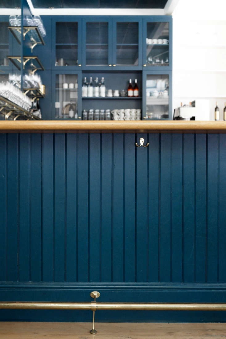
Aesthetically, the space is a mix: It’s half bar, grounded in dark blue, and half a bright, airy dining room. For the look, Dillon and Anderson took inspiration from bars and restaurants in Paris and London, plus the whimsical, half-bright and half-dark children’s store, Bonton, in Paris. They turned to their own hobbies as sailors for some nautical inflections, and used their design’s emotive capabilities as a bellwether along the way: “The space makes people feel good,” said Anderson, “which makes me feel really good. What else do you need in design, at the end of the day?”
Here, nine lessons we take from their design.
Photography by Ellie Lillstrom for Remodelista.
1. Design for flexibility.

The Little London Plane was first envisioned as part wine bar, part event space, intended to host goings-on outside of just food and wine: a space for authors, artists, makers, and others to collaborate. Over the years, the space has hosted cooking demonstrations, flower arranging classes, served as a retail wine shop, and even been a part-time art gallery. But “so many people want events,” said Dillon, “that event rentals now take up most of the energy.” Luckily, Dillon and Anderson had the foresight to design a space that could become many things, with room for drinking, dining, storage, display, and a bright, windowed storefront that’s appealing to passersby.
2. Stock good-looking things so you won’t need to hide them.

The owners were wise to stockpile glasses, kitchenwares, and even storage tools that are appealing enough to sit out in the open; in a catering, retail, or otherwise commercial environment, tools have a tendency to put themselves on display.

3. Nautical style is always a good bet.

You know the old writer’s adage, “Write what you know”? The concept applies to design, too. Dillon and Anderson are both sailors, and they have a penchant for nautical design. (Pioneer Square is also “really close to the water,” says Anderson, so most guests “have a subconscious marine sense in their heads.”) Shiplap paneling, weathered brass details, and dark blue paint were natural fits. (The paint is Hague Blue from Farrow & Ball.)

4. White shelving is best for display.

A storage wall that runs almost the whole length of the space is mostly white, with a little light wood—a design choice for which Anderson takes credit. When setting up her Capitol Hill flower shop (called Marigold & Mint) years ago, Anderson installed some plain plywood shelving and had other shelves painted in a variety of colors. “It drove me crazy,” she said. “Here, I wanted a clean slate to highlight whatever objects we put on the shelves.”
5. Want a high-end vibe? Invest a little.

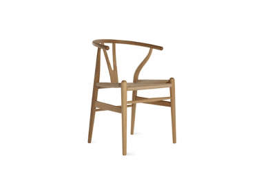
Though it was a sizable investment, Dillon and Anderson picked Hans Wegner’s Wishbone Chairs to accompany two custom oak dining tables. They are “a little bit higher end and a little more elegant” than the restaurant-supply chairs they used in the big London Plane, said Dillon, and take the style quotient of the event space up a notch.
6. Keep your holiday decor.

7. Give store-bought wares an artist’s touch.

Dillon and Anderson bought basic glass pendant lights from Restoration Hardware and had artist Tamara Condor paint them in gold leaf. “The gold and brass touches harken back to Parisian bars,” said Anderson.
8. A storage wall is always a good idea.

The owners had their contractors design a wall of shelving units plus a fully custom bank of angled drawers with brass pulls. It was originally used for retail, but has proved indispensable as the space evolves: It regularly stores wine inventory and can be used to display flowers and other decor during event rentals and art shows.
9. Make a repair a thing of beauty.

“Many people told us we should change the floor,” said Dillon, but the owners kept it because “it felt right” and to keep costs down. Still, a heavily damaged section by the front door needed to be filled in—so they patched it, painted it in Hague Blue, and linked it to the rest of the floor with a gold leaf seam.

For more from chef Matt Dillon and florist Katherine Anderson, see:
- The Flower Shop at Seattle’s London Plane
- 9 Design Ideas to Steal from Seattle’s London Plane
- Seattle Chef Matt Dillon’s Cookhouse at Old Chaser Farm on Vashon Island


Have a Question or Comment About This Post?
Join the conversation (1)