Yesterday we featured Seattle chef Matt Dillon’s cookhouse on his Vashon Island farm, which also supplies his restaurants (see the story at Cookhouse at Old Chaser Farm). Today we share what might be the chef-designer’s most ambitious undertaking, the London Plane, a collaboration with business partner Katherine Anderson on a restaurant plus flower shop, bakery, and bar with retail goods and takeaway.
After opening several restaurants in Seattle’s Capitol Hill neighborhood, Dillon began thinking of doing something in Pioneer Square—a historic, bustling area of Seattle just south of downtown. Meanwhile, Dillon looked around his restaurants and realized, “I had these really amazing people working for me who needed an outlet for their talents beyond what they were doing.” Among them, Emily Crawford of the Corson Building (now head chef at the London Plane), Sarah Ellsworth of Sitka & Spruce (now pastry chef), and baker Michael Sanders (who now runs the bread program for Dillon’s restaurants through a separate business called Plane Bread).
He turned to Anderson, a friend who ran the flower shop Marigold & Mint across from one of Dillon’s restaurants. She wanted to grow her business, and the pair already knew their aesthetic sensibilities were a good match.
Dillon and Anderson found a space at 300 Occidental Ave. back in 2014 and transformed it themselves (with help from Matt Hoffman, then of Dovetail construction), turning a defunct bank into the multifaceted space it is today. Here are nine takeaways from their design.
N.B. We also feature the London Plane’s Flower Shop on Gardenista today.
Photography by Ellie Lillstrom for Remodelista.
1. Maintain historical elements for maximum charm.


Dillon and Anderson kept the detailed paneled ceiling of the building’s previous life as a bank, and painted the ceiling plus cornices, columns, and even structural I-beams the same color to achieve a historic feel without conjuring any one historical period.
2. Create a dramatic entryway.

Visitors entering the London Plane are greeted by a table laden with cut flowers. “People tell me, ‘Whenever I walk in, it just makes me feel good,'” Anderson says, “and that’s so satisfying to hear. I love that our space is a mood elevator on a rainy day.”
3. Customize off-the-shelf fixtures.

The pendant lights hanging above the bar look like vintage finds, but are actually from Restoration Hardware and custom painted by local artist and furniture maker Tamara Codor.
4. Take color inspiration from your travels.


During the design phase, Dillon and Anderson both conjured places they’d seen and loved while traveling—in London and Paris especially. “There’s always this sense of timelessness in their use of color,” Dillon says of his favorite European spaces. The duo settled on a blue/green color scheme inspired by European cafes while also referencing the nearby ocean, forests, and sky. “Blue and green function as natural neutrals out here,” said Anderson.
5. Practice economy when necessary.

When the restaurant first opened, a full-height fridge and freezer stood in the middle of the room at the end of the bar. “It was the one thing that ruined the feng shui of the space,” Anderson says. They moved the units but kept the wood counter, and Anderson repurposed the last Mia & Finn tablecloth from the restaurant’s retail section and used it as a curtain that conceals the space under the counter, which is now used for storage. “After the huge renovation, we were short on cash and it was an economical thing to do,” she says.
6. Bring in the light.

“So much of Seattle is dark,” said Dillon, referring both to the weather and reclaimed wood-heavy local design. Says Anderson: “We wanted the space to feel much lighter in spirit, so you didn’t walk in and sink into the rain and cold and cedar smell.”
Plus, said Dillon, the restaurant’s food is highlighted by flavors from North Africa, the Middle East, and the Mediterranean—”places where it’s sunny a lot. We wanted to pay homage to that and make it feel cohesive for the diners.”
7. Use classic, time-tested neutrals.

Beyond the green and blue, Dillon and Anderson chose Benjamin Moore’s Cloud White for the interior walls. The color is a classic—we’ve featured it in Architects’ Favorite White Paints, and it’s the go-to white of design icons Juli and John Baker of Toronto’s Mjolk (a space Anderson loves).
8. Be creative with every inch of space.
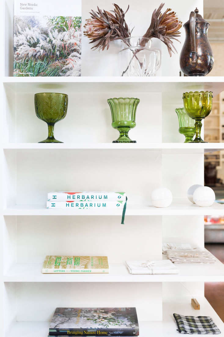
The stairway to the upstairs dining balcony and the restaurant’s only bathroom requires a short journey along a hallway that might have been wasted space; but Dillon and Anderson installed white wraparound shelving to offer shop items relevant to the restaurant’s story.

9. Create a beautiful environment for your staff.
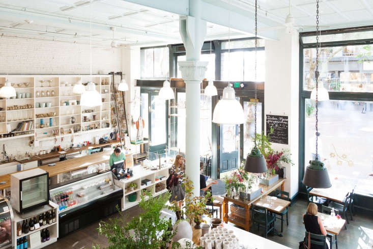
In his restaurants, Dillon likes the staff to be a visible part of the show: “I want people to know it’s not just me or Katherine here—there’s a whole group of people working very hard to do we do,” he said. And perhaps more importantly: “I want my staff to know that we think of them as much as the guest,” he said. “I want to give them a beautiful space to work in, too.”
For more of Matt Dillon’s spaces, see:
- Seattle Chef Matt Dillon’s Cookhouse at Old Chaser Farm on Vashon Island
- Old Chaser Farm: A Seattle Chef’s Garden on Vashon Island, Washington
- Restaurant Visit: The Corson Building in Seattle

Have a Question or Comment About This Post?
Join the conversation (0)