Icon - Arrow LeftAn icon we use to indicate a rightwards action. Icon - Arrow RightAn icon we use to indicate a leftwards action. Icon - External LinkAn icon we use to indicate a button link is external. Icon - MessageThe icon we use to represent an email action. Icon - Down ChevronUsed to indicate a dropdown. Icon - CloseUsed to indicate a close action. Icon - Dropdown ArrowUsed to indicate a dropdown. Icon - Location PinUsed to showcase a location on a map. Icon - Zoom OutUsed to indicate a zoom out action on a map. Icon - Zoom InUsed to indicate a zoom in action on a map. Icon - SearchUsed to indicate a search action. Icon - EmailUsed to indicate an emai action. Icon - FacebookFacebooks brand mark for use in social sharing icons. flipboard Icon - InstagramInstagrams brand mark for use in social sharing icons. Icon - PinterestPinterests brand mark for use in social sharing icons. Icon - TwitterTwitters brand mark for use in social sharing icons. Icon - Check MarkA check mark for checkbox buttons.
You are reading

Don’t Be Afraid of the Dark: 9 Design Ideas to Steal from NYC’s Best-Looking New Ramen Restaurant

Search

Don’t Be Afraid of the Dark: 9 Design Ideas to Steal from NYC’s Best-Looking New Ramen Restaurant

February 9, 2018

When the owner of Tonchin, a popular Tokyo-based ramen chain, wanted to introduce his noodles to New York, he let his two sons, ages 19 and 27, oversee the project. They did a bit of restaurant reconnaissance and turned to local architects Sarah Carpenter and Chris Horger to transform a narrow storefront on not-exactly-happening West 36th Street into Tonchin NY.

The husband-and-wife designers run their own four-year-old Brooklyn firm, Carpenter & Mason, specializing in exceptionally fresh-looking restaurants and bars (their many credits include Brooklyn Kura and Egg Shop). Their mandate: to come up with a ramen joint that departs from the expected. “But we didn’t want the place to feel completely dislocated,” Carpenter says, explaining that they set out to creatively translate Tonchin’s heritage through American eyes. Leigh Nelson of graphics and branding specialists LMNOP Creative—and a former colleague of mine at Travel & Leisure—joined the design team at the start, and other local creatives, such as ceramic artist Helen Levi, were recruited along the way. Together they came up with a small space that feels both Japanese and foreign, dark and light, refined and playful. Plus, it’s loaded with inventive, cost-conscious ideas worth trying out at home.

Photography by Nicole Franzen, courtesy of Tonchin New York.

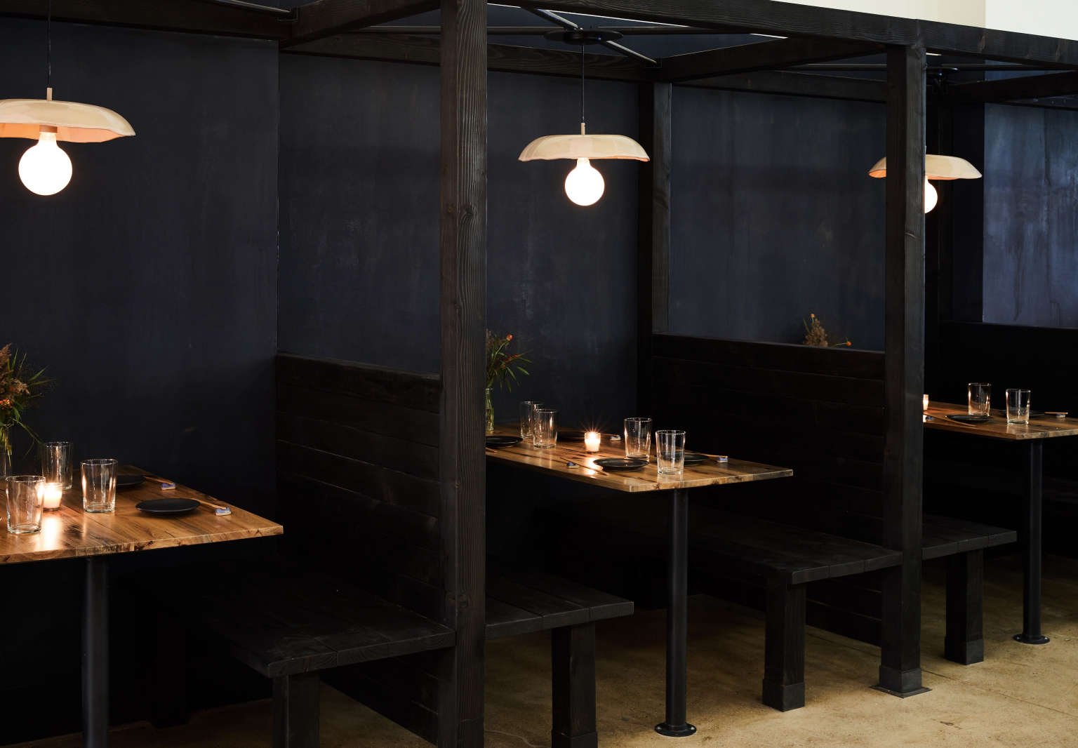
1. Embrace the dark.

&#8\2\20;the space didn&#8\2\17;t have much natural light to begin with 17
Above: “The space didn’t have much natural light to begin with and we decided to embrace that,” Carpenter says. “Going heavy on dark surfaces doesn’t mean the room has to feel like a black hole.” They divided the space into deep indigo and bright white: Below a 7.5-foot datum line, all is softly lit and moody, while the room’s light upper half keeps it looking and feeling open.

Equally importantly, they introduced a variety of materials: navy plaster lower walls, stained wood banquettes, heavily grained tabletops, blue leather bench trim, and a custom patchwork textile by Alison Charli Smith over the kitchen door that incorporates Japanese boro.
“These different textures soften the space and prevent it from feeling like a bat cave,” says Carpenter, who notes that the Firenzecolor Custom Color Lime Plaster they used can be tinted any Benjamin Moore color. (Read up on options in Remodeling 101: Modern Plaster Walls, Six Ways.)

2. Discover customish.

being on a tight budget forces restaurant designers to improvise, and carpenter 18
Above: Being on a tight budget forces restaurant designers to improvise, and Carpenter points out that their “customish” approach—using a combination of available and bespoke parts—isn’t hard to replicate.

Here they spared the torch: Rather than going with the pricey Japanese-style burned wood known as shou sugi ban, the architects simulated the look using Cedar Fence Posts—”we wanted hefty pieces and cedar is one of the only woods you can buy at Home Depot in four-by-four-inch sections”—finished with Rubio Monocoat in black. Wanting lights that would “play well against the navy plaster backdrop,” they bought off-the-shelf Flos globe fixtures and got Helen Levi to make glazed shades that are used here as hanging pendants and on the opposite wall as colorful sconces.

3. Use lighting to create a sense of intimacy.

to impart a feeling of coziness, the lighting in the space is hung below the da 19
Above: To impart a feeling of coziness, the lighting in the space is hung below the datum line. “In a residential setting, this same intimacy can be created through the use of floor and table lamps,” Carpenter says.

She notes that they used a large number of fixtures, “often quite closely spaced,” and went with exposed frosted globe lights “because they have a big light spread.” The fixtures are kept at a low glow: “The number-one tip I can give to anyone who wants to change the light environment in their home is to install dimmers,” Carpenter says. “It can be done inexpensively even in a rental, and will transform the look of the room.”

4. Pick a palette—then play with it.

at the start of the project, graphic designer leigh nelson came up with tonchin 20
Above: At the start of the project, graphic designer Leigh Nelson came up with Tonchin’s four dominant colors: blue, red, pink, and gray. “The idea is to establish coherency without being too literal and matchy-matchy,” she says. “Start with two foundational shades and then pick secondary colors that can be your accent pieces. Here the deep blue refers to indigo textiles and the red alludes to the Japanese flag.”

Note the patch of red amid the blue leather trim on the banquette: initially the team experimented with more red sections, but saw that just a touch works best.

the restaurant&#8\2\17;s colors extend to the staff uniforms: a bandana des 21
Above: The restaurant’s colors extend to the staff uniforms: a bandana designed by Nelson, navy Peels work shirt, and custom apron work well against the indigo plaster.

5. Mix the angular with the organic.

throughout the space clean lines and hard surfaces are leavened with wooden ele 22
Above: Throughout the space clean lines and hard surfaces are leavened with wooden elements, and with Nelson’s playful graphics. She created eight patterns that appear on the back of the menus, which are set on the tables face down, so they work like placemats—and “can come together in endless combinations, much like a bowl of ramen.”

Nelson took inspiration from the 1960s and ’70s geometric paintings of Kumi Sugai, an artist known for his Japan-meets-the-West style. Her stack of bowls on one of the menus is also painted over the kitchen window.

nelson&#8\2\17;s colors and patterns were also applied to the restaurant&am 23
Above: Nelson’s colors and patterns were also applied to the restaurant’s bowls, which are paired with single-color bowls by Beau Rush Ceramics.

6. Add some tension.

&#8\2\20;we were constantly towing the line between refined and not too fan 24
Above: “We were constantly towing the line between refined and not too fancy,” says Carpenter. “It’s that tension between the two that creates excitement and balance.” At the bar, handmade blue tile is paired with a concrete slab counter in Pacifica (concrete mixed with an aggregate): “Like the floor, it adds an elevated industrial finish to the space.”

Muuto’s Nerd Counter Stools, $499, come in nine colors; picked from the accent palette, red works here as an eye opener.

7. Paint is your friend.

the day before tonchin opened, the architects decided it needed an extra lift,  25
Above: The day before Tonchin opened, the architects decided it needed an extra lift, so Nelson’s geometric elements were painted here and there to the walls. “In the design and construction world, mistakes can be expensive and difficult to correct; luckily paint isn’t one of those things,” Carpenter says. DJ Schmidt of Crispy & Clean did the late-night work using Annie Sloan Chalk Paints, a Remodelista favorite.

8. Set the mood with seating.

Of the mix of table arrangements, Carpenter notes: “We created a variety of seating typologies to work for a group lunch, romantic date, or office dinner, so everyone can have a good time eating ramen.” The steel-and-wood Stools at the casual front table above are by Declercq Mobilier of Belgium.

9. Go bold in the bath.

in restaurant baths and powder rooms, the small size allows for experimentation 26
Above: In restaurant baths and powder rooms, the small size allows for experimentation and some splurging. Here the designers decided to create custom wallpaper in a noodle pattern by LMNOP Creative’s Heidi Chisholm.

Note the corner-turning mirror: For something similar, see the Anamorphosis Mirror, $165, by L’Atelier D’Exercices.

 the ramen mural was made by limitless walls of north carolina; pricing st 27
Above: The ramen mural was made by Limitless Walls of North Carolina; pricing starts at $176.67 for a 7.4-by-4.11-foot roll. LMNOP used the self-adhesive canvas option.

“If you don’t know what you’re doing, they’ll help you work out how to space things and create repeats,” Nelson says. “Wallpaper like this acts as a foil: It keeps the place from feeling too serious.”

We get some of our best design ideas from inventive cafes and restaurants:

(Visited 1,197 times, 1 visits today)
You need to login or register to view and manage your bookmarks.

Product summary  

Have a Question or Comment About This Post?

Join the conversation

v5.0