Interior designer Nicola Harding approaches remodeling projects with a one-two punch: “The first thing I do is plan the use of space, quite often reorganizing the way parts of the house are used,” she tells us. “Then I assign paint colors. I understand this is different from the way most decorators work, but, for me, the choice of color is fundamental to unlocking the potential of each space.”
Harding feels this way, no doubt, because she’s so attuned to the mood enhancing of powers of her paint palette. Safe, predictable choices aren’t for her: the London designer, who goes by Nix, loves to invite in an unexpected mix of subtle and decidedly bold hues: see, for instance, Mamma Mia Producer Nick Gilpin’s Stylishly Revived Georgian Manse and A Classic English Country House with an Injection of Color.
Having admired Harding’s dare-devil choices for so long, we decided to ask her to enlighten, and perhaps embolden, us with her way of thinking. As a case study, Harding presented a recent project, an 18th-century house overlooking the Thames on the outskirts of London that she was charged with transforming into a young city family’s weekend retreat. A “soulful and easy atmosphere” was the directive, and a crucial way Harding achieved this was through her use of color.
Photography by Paul Massey, courtesy of Nicola Harding & Co.
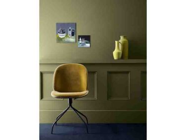
1. You can’t go wrong with green

In this case, leaf green, cerulean blue, lively reds and pinks, and rich browns set the tone. The colorful prints over the sideboard are by Hormazd Narielwalla via UK art site C&B Curates.

“I wanted there to be some color threads to link the different spaces,” says Harding. “I choose green as the link because it draws the garden and wider landscape into the house, softening the lines between the two. Green is a brilliant color to live with: it works well at all times of day and times of year.”
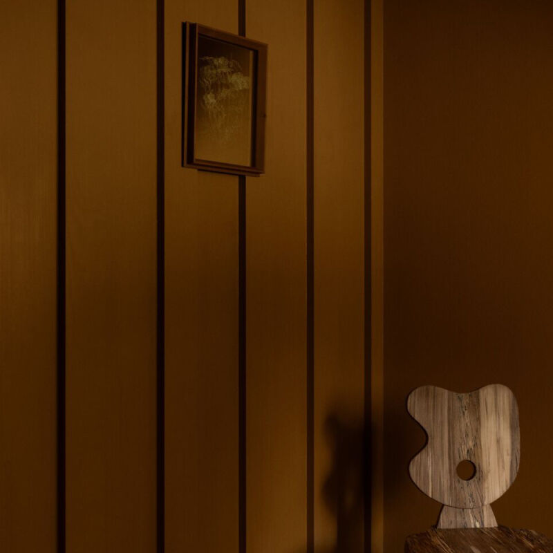
2. Go pale (but not necessarily white) in a big, busy space

How does Harding test her paint color choices? “I make large samples on lining paper [the paper used on walls as an under layer]. I move them around the space and layer them with other ingredients, including hard finishes, wallpaper, fabrics, etc. I play around with the sample size to make it reflective of the amount of that color I’m considering using. I never look at colors in isolation, always in combination.”
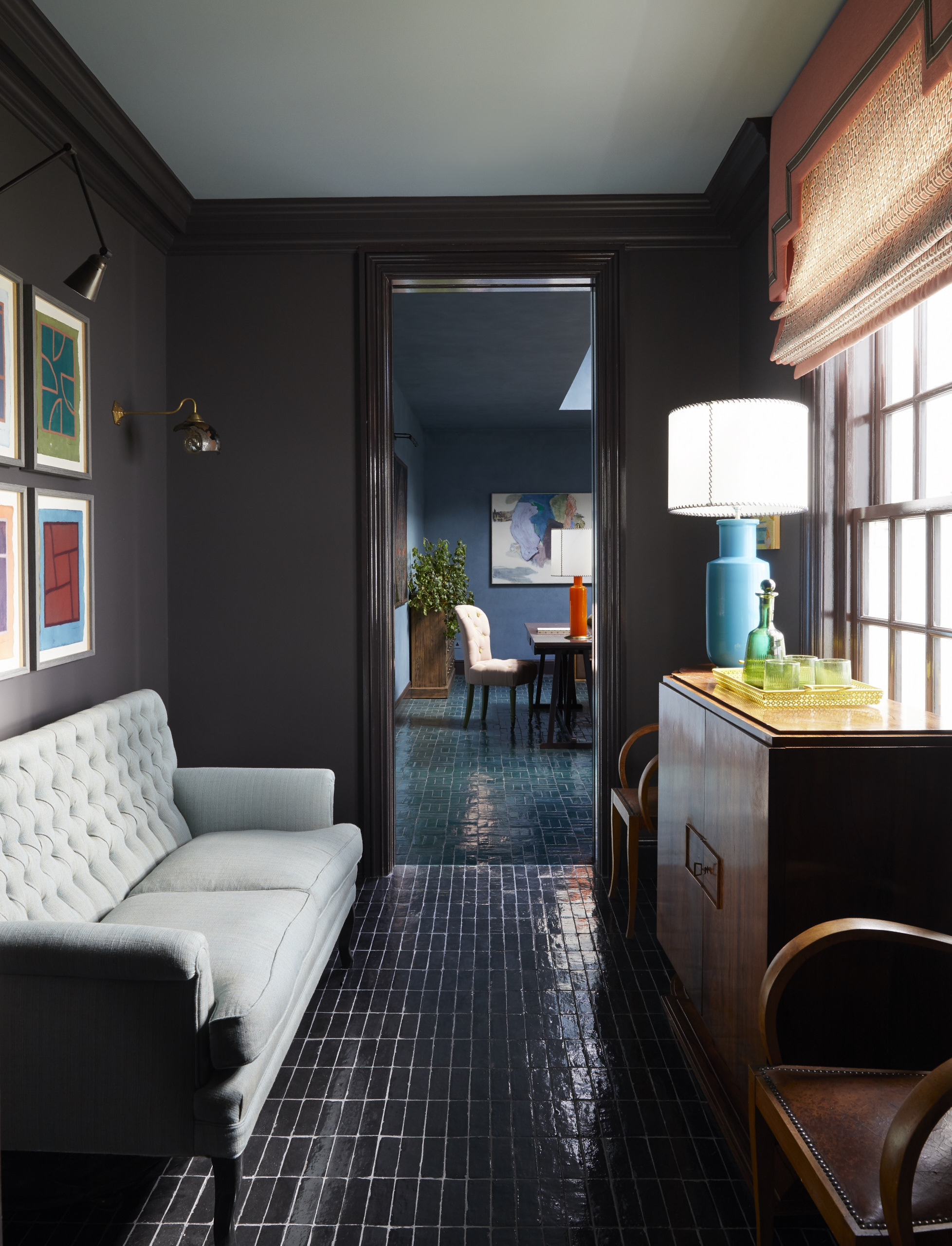
3. Moody blues look good just about anywhere

The walls here are Pure & Original’s lime-plaster paint Marrakech in a shade called Atria, which Harding color-matched in the unlined linen curtains and tiled floor (see bel0w). Her studio made the jewel-toned velvet pillows from a mix of new and vintage fabrics (find similar solid velvet cushions currently on sale in Harding’s own housewares collection, NiX). The large skylight has electric blinds that filter the shifting light.
“I’m always looking at how things work in combination; how adding a green linen sofa to a blue room creates a very different feeling from adding, say, a cherry-colored mohair one,” continues Harding. “The different energies are created largely by color but also texture and the degree to which a surface reflects light. I tend to want the largest elements to be relatively quiet, so that they don’t take up too much space visually but also, so that we don’t tire of them: a sofa and the fabric that covers it is a big investment. The mischief and fun is to be had in the smaller elements that we layer in.”
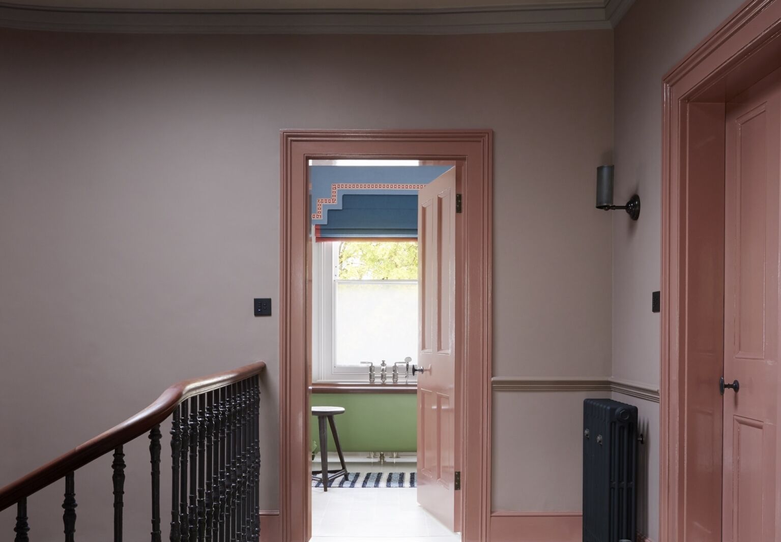
4. Dark and shiny shades turn small spaces into jewel boxes

5. Doors and trim can be playfully uplifting

“A trick I like to use is putting a darker color on the woodwork than on the walls,” says Harding. “Ones’ eye stops at the lightest thing we see, so if you paint a window frame in a darker color, your eye is drawn beyond it, to the view.”
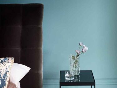
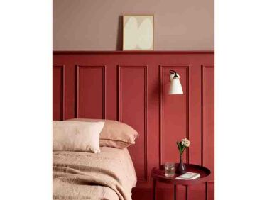
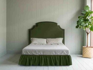
6. Restful colors make sense in your bedroom

“I truly believe that color is good for the soul and that is in part because it reminds us of being in nature,” says Harding. “I prefer paints that have a high proportion of natural color pigment: the more natural the colors, the better they make us feel. I love playing around with lots of different paint finishes and brands. Edward Bulmer is a brilliant one that uses a high proportion of natural color pigment”: see “Natural, Not Plastic Paint” from Herefordshire.
7. But in the guest room why not go bold?

8. Bathrooms can be both colorful and serene

Stay tuned for Harding’s first monograph, out this fall from Rizzoli.
Two more of her standout rooms :
- Steal This Look: A Plaster Pink Kitchen in Bath, England
- Steal This Look: A Color-Drenched Reading Room in a Georgian Manse


Have a Question or Comment About This Post?
Join the conversation (0)