Icon - Arrow LeftAn icon we use to indicate a rightwards action. Icon - Arrow RightAn icon we use to indicate a leftwards action. Icon - External LinkAn icon we use to indicate a button link is external. Icon - MessageThe icon we use to represent an email action. Icon - Down ChevronUsed to indicate a dropdown. Icon - CloseUsed to indicate a close action. Icon - Dropdown ArrowUsed to indicate a dropdown. Icon - Location PinUsed to showcase a location on a map. Icon - Zoom OutUsed to indicate a zoom out action on a map. Icon - Zoom InUsed to indicate a zoom in action on a map. Icon - SearchUsed to indicate a search action. Icon - EmailUsed to indicate an emai action. Icon - FacebookFacebooks brand mark for use in social sharing icons. flipboard Icon - InstagramInstagrams brand mark for use in social sharing icons. Icon - PinterestPinterests brand mark for use in social sharing icons. Icon - TwitterTwitters brand mark for use in social sharing icons. Icon - Check MarkA check mark for checkbox buttons.
You are reading

A Vintage-Inspired Apartment in Hackney from Abel Sloane and Ruby Woodhouse of 1934

Search

A Vintage-Inspired Apartment in Hackney from Abel Sloane and Ruby Woodhouse of 1934

March 12, 2018

“Sensitive, tactile, and purely functional” is how design firm 1934 describes their latest project in Hackney, London. Founded by Abel Sloane and Ruby Woodhouse, who live in Croydon, on the south side of London, 1934 is named after the year Gerrit Rietveld designed his Crate furniture series. When Abel, an English major who did restoration work for Retrouvius, started the project five years ago, he was focused on furniture sourcing and restoration. A year later, Ruby, a photographer and graphic designer, joined Abel, and 1934 expanded into styling, consulting, and interiors.

Their first full-scale interior design project, a one-bedroom Victorian apartment in Hackney, is inspired by interwar European design (from Eileen Gray to Bauhaus kitchens) and the work of the American Shakers. “They’re both practical and minimal,” Abel says. “They also use color in a surprising way. For instance, the bright red and yellow skirting and door frames of Shaker interiors.” Working within the constraints presented by the Victorian building, 1934 stripped back the kitchen, refitted the bath, sourced furniture, and dreamed up the color scheme using a proprietary blend of Farrow & Ball paint. “We are so used to seeing interiors painted white, but it can actually make a space seem more cube-like and close it off,” Abel says. “By introducing darker colors we gave the space more flow.”

Join us for a tour.

Photography by Ruby Woodhouse, courtesy of 1934.

a pine dining table sourced by \1934 pairs with the owners’ \1960s ercol 17
Above: A pine dining table sourced by 1934 pairs with the owners’ 1960s Ercol chairs. Overhead is a Bakelite lamp shade made in Australia, sourced from a small English shop called Period Lighting.
the kitchen was gut renovated and \1934 designed cabinets with soft closing hin 18
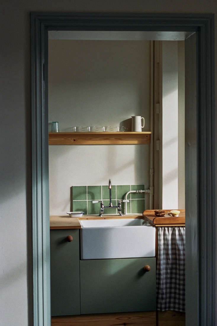
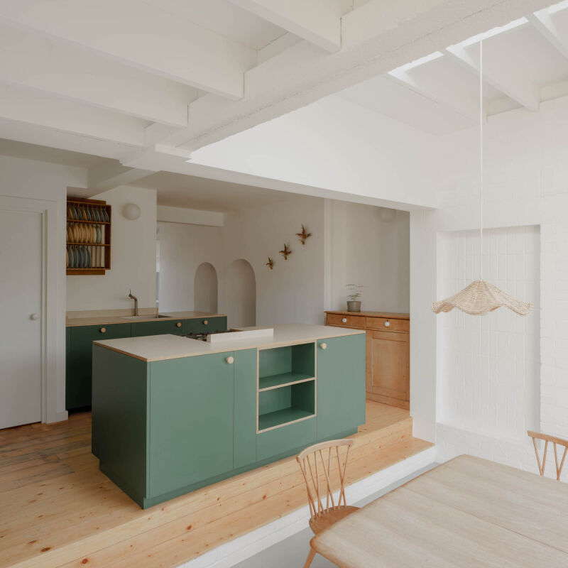
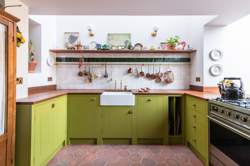
Above: The kitchen was gut renovated and 1934 designed cabinets with soft-closing hinges and doors. They’re fitted with oversize door knobs (wood knobs found at North Road Timber & Joinery in Brighton) inspired by the 1930s kitchen at the Werkbund Estate in Vienna.
a traditional butler sink and faucet sourced from a company in the north of eng 19
Above: A traditional butler sink and faucet sourced from a company in the north of England and a custom backsplash of green tile originally salvaged from a cast iron surround.
a custom drainage rack sits next to the sink. ruby sewed vintage check fabric t 20
Above: A custom drainage rack sits next to the sink. Ruby sewed vintage check fabric to create the under-counter curtain. Appliances—a refrigerator and clothes washing machine—are hidden behind cabinet panels.

a single pine shelf runs the length of the kitchen, and, on one end, features a 21
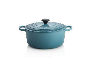
Above: A single pine shelf runs the length of the kitchen, and, on one end, features a row of Shaker pegs. The countertops are also pine, styled here with a Le Cruset Flame Dutch Oven, bamboo utensils, and Le Parfait Super Jars.
 \1934 created a title surround on the original electric range with the sa 22
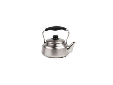
Above: 1934 created a title surround on the original electric range with the same green salvage tile used above the sink. On the range is a Sori Yanagi Tea Kettle.

the slim storage area has a pine shelf surface and irish linen curtains (ȁ 23
Above: The slim storage area has a pine shelf surface and Irish linen curtains (“a good way to avoid more doors,” says Abel) bought from a factory-seconds dealer at Brighton Market.
slim shaker peg rails in pine on the opposite wall of the kitchen for hanging k 24
Above: Slim Shaker peg rails in pine on the opposite wall of the kitchen for hanging kitchen linens and aprons.
the rails are also used to store additional seating, like a children’s c 25
Above: The rails are also used to store additional seating, like a children’s chair handmade by the owner’s grandfather.
the designers commissioned their friend harriet vogeler to make linen roman bli 26
Above: The designers commissioned their friend Harriet Vogeler to make linen Roman blinds for the larger windows in the apartment.
abel and ruby covered the owners’ sofa bed with a swath of antique white 27
Above: Abel and Ruby covered the owners’ sofa bed with a swath of antique white linen from their “ever-growing collection of materials picked up here and there.” Next to it, a vintage Alvar Aalto Stool 60 and Baffle Table Lamp by Dean Edmonds. The floors are original pine—some replaced and updated by 1934—painted ultra-dark green.
custom pine shelves match the depth of the fireplace and mantel. the chair is p 28
Above: Custom pine shelves match the depth of the fireplace and mantel. The chair is part of Enzo Mari’s 1974 Autoprogettazione series, which, as Abel explains, is “about self-building furniture through a very simple technique using a hammer and nails.”
the bedroom is more neutral than other rooms in the apartment to “make u 29
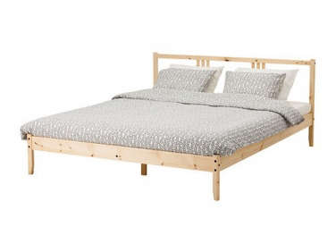
Above: The bedroom is more neutral than other rooms in the apartment to “make up for the lack of direct sunlight,” Abel says. The couple commissioned their friend Dean Edmonds to design sconce lights painted a “milk coffee color” based on his perforated Baffle Lamp design. The bed is a modified Ikea Fjellse Bed Frame made of pine.
another antique bakelite pendant lamp, this one in flecked pink, from the same  30
Above: Another antique Bakelite pendant lamp, this one in flecked pink, from the same lot as seen in the dining/living room.
floors are painted in a farrow & ball shade in a modern eggshell finish and 31
Above: Floors are painted in a Farrow & Ball shade in a modern eggshell finish and match the color of the doors throughout the apartment. The bed is covered with more check fabric from the Brighton Market seller.
they replaced the three interior doors with horizontally paneled doors from an  32
Above: They replaced the three interior doors with horizontally paneled doors from an architectural salvage yard in Tonbridge (in Kent) that they then had altered to fit the nonstandard Victorian frames. The door knobs in the apartment are from Abel and Ruby’s archive, a set of Bakelite knobs from a Kempton antique market.
a clothes rail by dean edmonds made from powder coated steel and pine. 33
Above: A clothes rail by Dean Edmonds made from powder-coated steel and pine.
an alvar aalto chair 6\1\1 designed in \19\29. “that one in particular w 34
Above: An Alvar Aalto Chair 611 designed in 1929. “That one in particular was retailed in a shop called Dunne’s in Bromley (Kent) in the 1930s,” Abel says. “It was painted white some time ago, and we picked it up at an auction house in Exeter.”
when abel and ruby stripped the wallpaper from the hallway and a small utility  35
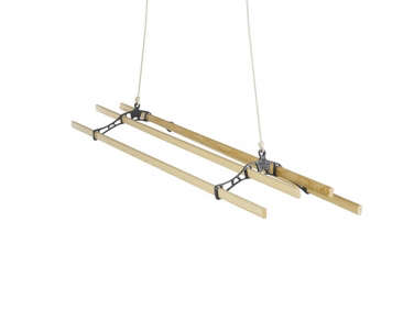
Above: When Abel and Ruby stripped the wallpaper from the hallway and a small utility room, they found pink plaster beneath. Inspired by the color, they painted the walls with a pink-orange Farrow & Ball archive color. “You can’t buy tester pots for the archive colors, so we had to dive right in,” they say. The utility room has a Sheila Maid Clothes Airer in white.
the firm remodeled the bathroom using glossy black tile and a freestanding cast 36
Above: The firm remodeled the bathroom using glossy black tile and a freestanding cast iron bathtub.
a vintage porcelain sink sourced from a salvage yard in tonbridge is perched on 37
Above: A vintage porcelain sink sourced from a salvage yard in Tonbridge is perched on cast iron brackets.

References

abel and ruby&#8\2\17;s inspiration for the mare street project—cloc 38
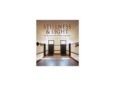
Above: Abel and Ruby’s inspiration for the Mare Street project—clockwise from left: Kitchen in House 69 of the Werkbund Estate from 1932, Haus Am Horn kitchen by Georg Mund in 1923, bathroom at Eileen Gray’s e.1027 house, and a Shaker interior from Stillness and Light: The Silent Eloquence of Shaker Architecture by Henry Plummer.

Floor Plan

the owners had a floor plan drawn up by lazenby architects prior to working wit 39
Above: The owners had a floor plan drawn up by Lazenby Architects prior to working with 1934.

For more vintage-influenced interiors, see our posts:

(Visited 7,729 times, 4 visits today)
You need to login or register to view and manage your bookmarks.

Product summary  

Have a Question or Comment About This Post?

Join the conversation

v5.0