Let others bemoan the challenges of fitting a working kitchen into a closet-sized space. To designer Marianne Evennou, c’est normal.
Marianne caters to a Parisian clientele who ask her to take on all sorts of remodels, from first apartments to historic townhouses. Celebrated for her inventive use of color and interior windows—and for approaching each project as an assignment in making art practical—Marianne has, along the way, become the master of the mini kitchen.
She never repeats herself but often deploys certain tricks: To make the most of each space, cabinets are custom built—on occasion “if the measures allow it,” her contractors go with money-saving Ikea cabinet skeletons. Cooktops are always induction for a streamlined look, and often just big enough for two pots. Ranges are standard size but ideally have dual function as microwave ovens. Sinks shrink to 40 centimeter (15.7 inch) squares, “which is more than enough,” Marianne says. Compact fridges—Marianne likes Smeg’s smallest—are concealed under the counter. And vents (not legally required) and dishwashers sometimes have to be sacrificed—”but you can find some very tiny dishwashers.”
Space permitting, Marianne likes to differentiate the kitchen from its surroundings: “Each passage from one universe to another must be felt and provoke an emotion.” Here’s a look at 10 of Marianne’s standout concoctions and some lessons to take away.
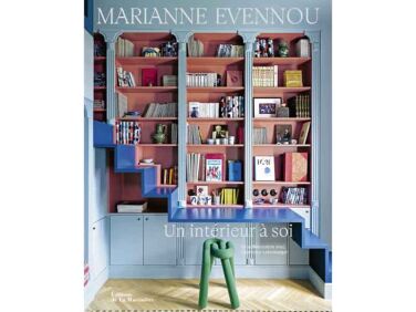
Photography courtesy of Marianne Evennou (@marianneevennou). Many of the images appear in her recent book, Un Intérieur à Soi.
1. Cabinets needn’t be blank slates.

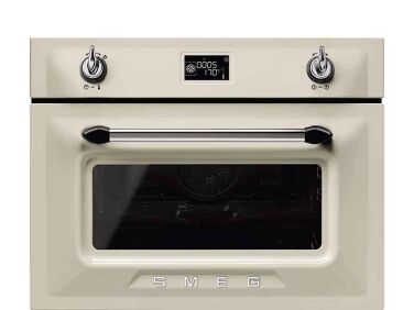
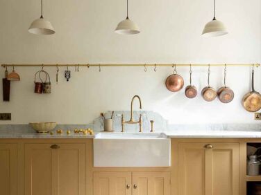
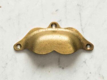
In general, Marianne doesn’t like the top-heavy look of over-the-counter cabinets, but for storage in this case, there was nowhere to go but up. So Marianne made the solution a point of interest: she enlisted her sculptor/furniture maker husband, Franck Evennou, to create the painted plywood bas relief on the cabinet doors. The combination oven-microwave is a Smeg Victoria. Note the deVol Aged Brass Hanging Rail for suspending key tools. DeVol is also one of Marianne’s favorite hardware sources and supplied the Boho Handles and Classic Knobs. Photograph by Grégory Timsit.
2. A niche can hold all the essentials.

Here, Marianne went with an open box as overhead storage and hung plinths for displaying ceramics. Photograph by Stefan Julliard.
3. Kitchen tables can be formal—and cozy.

4. Interior glazing is a great solution for a back kitchen.

Marianne designed the Mosaic del Sur cement tiles and matched them with a Ressource paints powder pink on the upper walls and cabinets. That’s a mini fridge over the oven by Candy. Circular THPG Bakelite light switches and outlet covers crop up like punctuation marks in a lot of Marianne’s projects.
Explore more of the apartment and kitchen details in Sabine’s Pocket Apartment and Steal This Look. Photograph by Grégory Timsit.
5. Kitchens and stairs can be artfully integrated.

6. Stairs can even provide kitchen storage.

7. “Being simple is sometimes complicated.”

The countertop is Zimbabwean granite, a favorite of Marianne’s, and the zellige used as a backsplash are from Mosaic Factory. The One-Arm Chandelier is a Wo & Wé design. Marianne cleverly distinguished the living area from the kitchen by applying the terra-cotta flooring in two patterns.Photograph by Grégory Timsit.
8. A counter can serve as a window—and a screen—for a tiny cook space.
 Above: Marianne built this partially enclosed kitchen for a 16 square meter (172 square foot) apartment. The design is now more than 10 years old and, she reports, still in active use “and doesn’t care about the passing of time or fashion.”
“The only luxury is the choice of white marble as a worktop and wooden cladding on the partition, which,” Marianne notes, acts as “a window and an opening to let the space breathe and offer it to the visitor’s eye.” Tolix Marais Stools stand at the just-big-enough-for-two counter. Kitchen equipment is hidden behind a curtain made of ticking from Paris fabric store Marché Saint Pierre. Thanks to shared shades of gray, the stripes pair well with the patterned cement tile floor. Photograph by Jean-Marc Palisse.
9. Open storage can be orderly.

10. Gem tones work in jewel-box kitchens.

A vintage Chinese portrait, amethyst curtain (from Marché Saint Pierre fabric), and Carocim cement tiles make this one of our all-time favorite Marianne creations. Photograph by Stephan Julliard.
Many of these apartments appear in Marianne’s recent book Un Intérieur à Soi.
Also take a look at:
- Marianne Evennou’s Paris Work Quarters and Pied-à-Terre
- 269 Square Feet in Paris: Design Ideas from a Shoebox Apartment
- Remodelista Reconnaisance: French-Made Doorknobs in a Tiny Paris Flat
N.B.: This story originally appeared on October 20, 2023 and has been updated.


Have a Question or Comment About This Post?
Join the conversation (4)