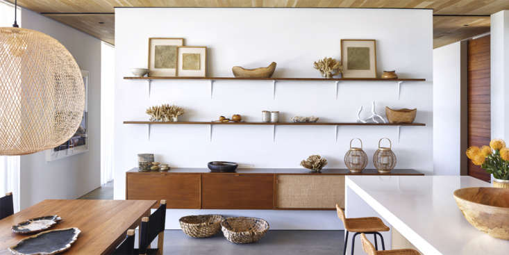
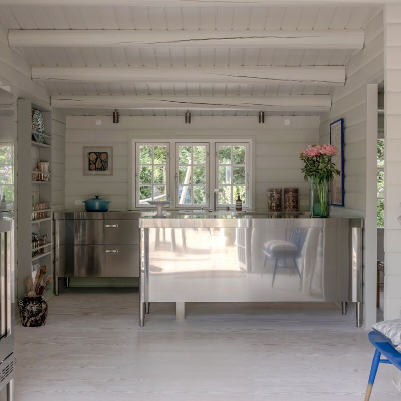
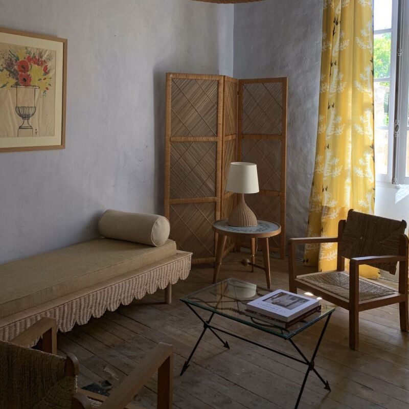
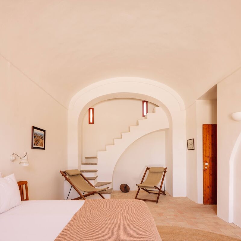
For architect Russell Groves of Groves & Co., good design is deceptively simple: clean and understated on the surface, rigorously planned and engineered underneath. He’s worked this equation for some major fashion and retail clients (Tiffany, Coach, Ralph Lauren) as well as in private homes, including his own modest getaway in East Hampton, New York. We asked Groves to share some insights:
Remodelista: You’re known for kitchens that look appealingly basic but are highly refined. How do you manage that?
Russell Groves: Kitchens are the superlative challenge—the ultimate struggle to balance aesthetics and function. Since we like to keep the details simple, we love strongly grained woods (rift oak, walnut) for cabinets to give them warmth. And we try not to let design gimmicks get in the way of use. Large knobs or pulls on cabinets can snag if you’re moving quickly through the space.
RM: Your favorite countertop surface?
RG: I love basalt or a honed absolute black granite. Basalt is a lovely warm gray—though it’s softer than granite, it is sublime. Granite is one of nature’s hardest stones, and a honed finish can soften the color and the texture.

RM: Concrete, yes or no? Best use and finish?
RG: Well, like a lot of things these days, it’s complicated. We love the look and feel of concrete, but it is very important to use an eco-friendly version (the process of making and curing typical concrete produces waste and off-gases). We use it for floors—it’s incredibly durable and in the right color/texture can be amazingly warm. We used a beautiful gray eco-conscious floor for two houses for Michael Kors.
RM: Your go-to neutral paint color?
RG: I’m still an admirer of Benjamin Moore Decorator’s White (CC-20). Sometimes we warm it up with Linen White (912): 60 percent Linen White /40 percent Decorator’s White on walls, and the reverse on ceilings. It creates a subtle, refined distinction.
RM: Your typical space-saving move?
RG: As we do a lot of work in New York City, we’re always aware of spatial constraints—there never seems to be enough storage room. A good trick with a dressing room is to make it the connector from the master bedroom to the bathroom. This way, it becomes a functional “hallway” and the circulation space is put to great use.
RM: What material is worth the splurge?
RG: Hard question! I love so many materials—I would say richly grained marble for a bathroom. It’s amazingly warm and lush, but also durable, water resistant and can last forever.
RM: What do you like to exaggerate, and why?
RG: Texture—both the rich and the restrained. I love super lush, warm materials like velvets, woods, and raw silks, even in small amounts, especially when set against smooth surfaces and restrained detailing. Raw silk pillows with a lamp or bowl in nickel or polished chrome makes a great contrast.

RM: What do you minimize, and why:
RG: I hate it when a beautiful wall is interrupted by extraneous hardware. Trufig makes great switches and outlets. We try to place them in convenient but discreet locations—on a side wall or in a niche.
RM: When are downlights a good idea?
RG: We try to use a mix of functional lighting (downlighting) and decorative lighting in any room. Probably the most effective uses of downlights are in the kitchen to light work surfaces and to illuminate art. The standard “color temperature” is 3500 kelvin, but I find that too cold and usually opt for a 3000 kelvin bulb that can be dimmed to 2500.
RM: Smartest “smart house” feature:
RG: We’ve seen a backlash against complicated systems that require an engineering degree to operate. My own home system is very simple, but the one thing we enjoy is a remote temperature control by Homeguard. With an app on my phone, I can rev up the heat so it’s toasty when we arrive home on a cold night. I find the Nest units too large.

RM: What gesture do you like to repeat within a house?
RG: An interior should be holistic and consistent—flooring, baseboard, and door details should convey a unified overall approach, if not be exactly the same.
RM: What two functions do you often combine in one space?
RG: A lot of our clients, especially those with small children, like a home office tucked into the kitchen or family room so they can keep an eye on both their work responsibilities and their children. For one client, we designed a sequence of study carrels for the kids much like in a library at one end of the parent’s home office. The desks were four feet wide for comfort and the storage was built in—but we also love the vintage vibe of Bisley file cabinets.
RM: Fad that needs to go.
RG: I’m not a fan of pattern on pattern—we are visually assaulted every day. I’m not a fan of “excessive” in any way.
RM: Opposites attract: what’s a favorite material pairing for you?
RG: We are all about contrast: hard against soft, smooth against rough. This visual tension brings dynamic interest to our work. Our favorite: sand blasted rift oak set against softly polished nickel silver. Sublime.
RM: Favorite design maxim?
RG: I like to say “simplicity is deceptively complicated.”
For more expert advice:
13 (Great) Questions for Architects Gachot Studios
Expert Advice: 13 (Great) Questions for Architect Gil Schafer


Have a Question or Comment About This Post?
Join the conversation (1)