Icon - Arrow LeftAn icon we use to indicate a rightwards action. Icon - Arrow RightAn icon we use to indicate a leftwards action. Icon - External LinkAn icon we use to indicate a button link is external. Icon - MessageThe icon we use to represent an email action. Icon - Down ChevronUsed to indicate a dropdown. Icon - CloseUsed to indicate a close action. Icon - Dropdown ArrowUsed to indicate a dropdown. Icon - Location PinUsed to showcase a location on a map. Icon - Zoom OutUsed to indicate a zoom out action on a map. Icon - Zoom InUsed to indicate a zoom in action on a map. Icon - SearchUsed to indicate a search action. Icon - EmailUsed to indicate an emai action. Icon - FacebookFacebooks brand mark for use in social sharing icons. flipboard Icon - InstagramInstagrams brand mark for use in social sharing icons. Icon - PinterestPinterests brand mark for use in social sharing icons. Icon - TwitterTwitters brand mark for use in social sharing icons. Icon - Check MarkA check mark for checkbox buttons.
You are reading

10 Paint Colors with Cult Followings: Architects’ All-Time Favorite Paint Picks

Search

10 Paint Colors with Cult Followings: Architects’ All-Time Favorite Paint Picks

May 14, 2019

Why reinvent the wheel every time you need to paint a room? Even architects and designers turn to their favorite colors—versatile and universally flattering—again and again. The members of the Remodelista Architect and Designer Directory were generous enough to let us in on their secrets.

1. Simply White from Benjamin Moore
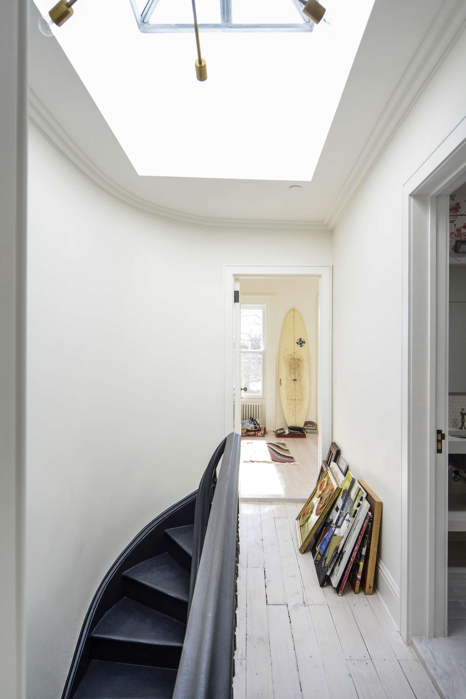
benjamin moore&#8\2\17;s simply white is the white chosen more often t 17
Above: Benjamin Moore’s Simply White is the white chosen more often than any other. Says SF designer Kriste Michelini, “It is my go-to white—fresh, versatile, and warm—and it works in any home, whether traditional or modern, with a warm or cool palette.” It’s also the pick of NYC designer Lauren Rubin, who called it “the perfect wall color.” (N.B.: Benjamin Moore chose Simply White as its 2016 Color of the Year.)

Shown here, architects Gregory Merkel and Ana Catalina Rojas used Simply White throughout their remodel featured in Two Young Architects Tackle Their Own Brooklyn Townhouse. Photograph by Carl Bellavia, courtesy of Gregory Merkel.

(For much more on what to know about white, see 10 Things Nobody Tells You About Painting a Room White.)

2. Hague Blue from Farrow & Ball

eva dornstreich of the brooklyn home co. nominated farrow & ball&# 18
Above: Eva Dornstreich of The Brooklyn Home Co. nominated Farrow & Ball’s Hague Blue to the cult list. “It’s a beautiful, deep, rich color that can be at once bold and understated,” she says.

Star London chef Skye Gyngell used Hague Blue on her British Standard kitchen cabinets, shown here and featured in In the Kitchen with Skye Gyngell, London’s Chef du Jour. Photograph by Alexis Hamilton, courtesy of British Standard.

3. White Dove from Benjamin Moore
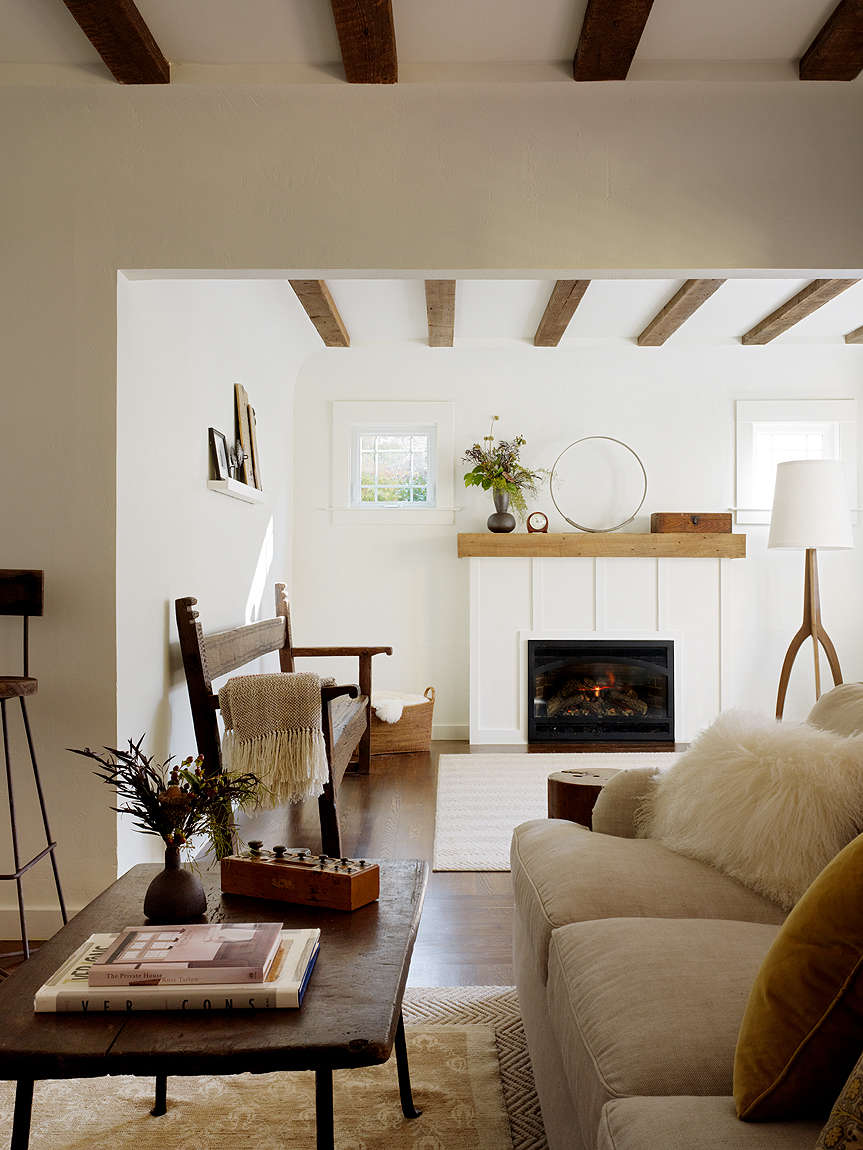
alison davin of jute in san francisco says, &#8\2\20;benjamin moore&am 19
Above: Alison Davin of Jute in San Francisco says, “Benjamin Moore’s White Dove has a cult following in the white world. Its warm undertone has a universal appeal and works well in most spaces.” The designer used the color in the San Anselmo living room shown here. Photograph by Matthew Millman, courtesy of Jute.

It’s also the color chosen by architect John Alee and designer Hannah Childs in Before & After: A Summer Cottage Reborn on the Connecticut Coast.

4. Iron Mountain from Benjamin Moore

benjamin moore&#8\2\17;s iron mountain is the dark color chosen more o 20
Above: Benjamin Moore’s Iron Mountain is the dark color chosen more often than any other. Says Los Angeles architect Oonagh Ryan, “I use this paint color on almost every project. It’s a warm gray with brown undertones and matches natural steel and sheet metal perfectly.”

Tatum Kendrick of Studio Hus in Los Angeles used the color in the Venice Beach bedroom shown here. “It can go classic, modern, or earthy depending on your environment and furniture,” she says. Photograph courtesy of Studio Hus.

5. Chantilly Lace from Benjamin Moore
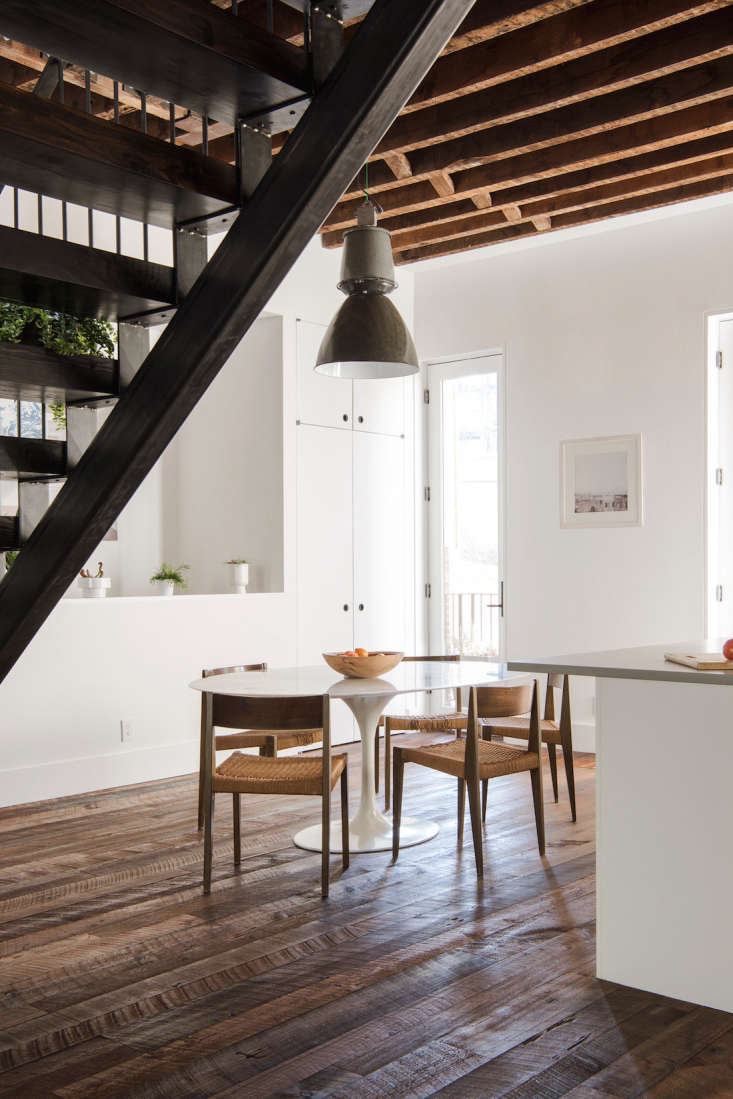
lewis butler of butler armsden architects nominated benjamin moore&#8\ 21
Above: Lewis Butler of Butler Armsden Architects nominated Benjamin Moore’s Chantilly Lace to the cult list: “It’s a terrible name, but the best white out there,” he says. The firm used it on the walls of its new San Francisco offices.

Architect Elizabeth Roberts used Chantilly Lace in this Williamsburg townhouse featured in A Whole-House Overhaul in Brooklyn with a High/Low Mix. Photograph courtesy of Elizabeth Roberts.

6. Nimbus from Benjamin Moore

nyc interior designer bella mancini named benjamin moore&#8\2\17;s
 22
Above: NYC interior designer Bella Mancini named Benjamin Moore’s Nimbus to the greatest-hits list. “We use it again and again and again,” she says, “We pick it without even meaning to. It is a versatile gray that goes bluer or browner, depending on the light.”

Remodelista contributing editor Justine Hand used Nimbus on the bed frame in her daughter Solvi’s room, shown here and featured in The Soulful Side of Old Cape Cod: Justine’s Family Cottage. Photograph by Matthew Williams for Remodelista.

7. Thunder from Benjamin Moore

nyc designer elizabeth bolognino named benjamin moore&#8\2\17;s thunde 23
Above: NYC designer Elizabeth Bolognino named Benjamin Moore’s Thunder to the cult list. “I love how it changes from gray to beige to white. It is the perfect background for accent colors while keeping things subdued and sophisticated,” she says. (Bolognino herself mixes a custom version of 25 percent Thunder and 75 percent white.)

Justine Hand used Thunder to create a forest pattern in her son Oliver’s room. See more at DIY: The Stenciled Kid’s Room, Boreal Forest Edition. Photograph by Justine Hand.

8. Clunch from Farrow & Ball

jessica speeckaert of chambers & chambers architects in mill valley, califo 24
Above: Jessica Speeckaert of Chambers & Chambers Architects in Mill Valley, California, says Clunch by Farrow & Ball is the cult favorite in their office. “It has a sophisticated warmth and adds a timeless elegance to any room,” she says. Firm principal Barbara Chambers used the color in her own living room, shown here. Photograph courtesy of Chambers + Chambers.

Paint expert Eve Ashcraft and writer Heather Smith MacIsaac also picked Clunch as a favorite soft white in our story Expert Advice: Living in Black and White.

9. Pitch Black from Farrow & Ball

 san francisco designer nicole hollis picked farrow & ball&#8\2\17 25
Above: San Francisco designer Nicole Hollis picked Farrow & Ball’s Pitch Black as her favorite, shown here in the library of a prewar residence in Pacific Heights, San Francisco. Photograph by Laure Joliet, courtesy of Nicole Hollis.

It’s also a favorite of NYC architect Steven Harris, who chose the color for our story Black Magic: Architects’ 8 Top Paint Picks.

10. Calamine from Farrow & Ball
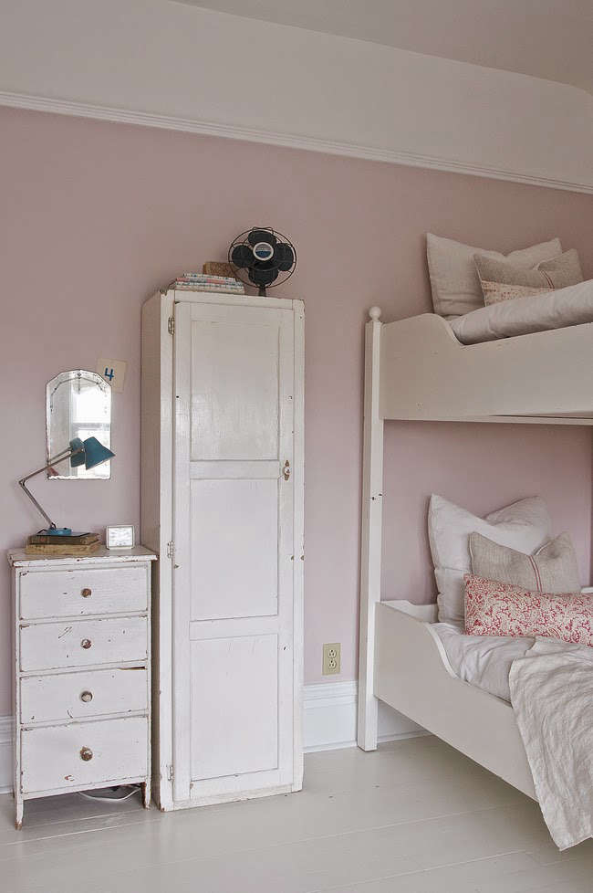
los angeles design firm alexandra loew (formerly from the desk of lola) added f 26
Above: Los Angeles design firm Alexandra Loew (formerly From the Desk of Lola) added Farrow & Ball’s Calamine to the cult list: “It’s the perfect nonwhite neutral, conservative as navy blue, while sweet, tender, and unassuming as pink.” LA designer Alexandra Angle used Calamine as an accent wall, putting it on our list of The 10 Best Pink Paints.

Candace Partain used Calamine in her daughters’ bedroom in their Bozeman, Montana, home, shown. Photograph by Vanessa Pleasants, featured in An Inspirational Montana Home, courtesy of Vintage Whites.

For more on paint, see:

N.B.: This post is an update; the original story ran on June 13, 2016.

(Visited 14,366 times, 1 visits today)
You need to login or register to view and manage your bookmarks.

Frequently asked questions

What are some paint colors with cult followings among architects and designers?

Some paint colors that have gained cult followings among architects and designers include:
Farrow & Ball "Elephant's Breath"
Benjamin Moore "Revere Pewter"
Farrow & Ball "Railings"
Sherwin-Williams "Agreeable Gray"
Farrow & Ball "Hague Blue"
Benjamin Moore "White Dove"
Farrow & Ball "Down Pipe"
Sherwin-Williams "Repose Gray"
Benjamin Moore "Gray Owl"
Farrow & Ball "Stiffkey Blue"
These colors are highly regarded for their versatility, timeless appeal, and ability to create a sophisticated atmosphere.

Why do architects and designers gravitate towards these paint colors?

Architects and designers often gravitate towards these paint colors due to their ability to enhance various architectural styles, create a sense of depth, and complement a wide range of design elements. These colors are known for their versatility, which allows them to be used in different spaces and lighting conditions.

Are these paint colors suitable for all types of interiors?

While these paint colors have garnered a cult following, their suitability for a specific interior depends on factors such as lighting, surrounding elements, personal preferences, and desired mood. It's always recommended to test paint samples in the actual space and observe how they interact with the existing design elements before making a final decision.

Can these paint colors work well in both residential and commercial spaces?

Yes, these paint colors can work well in both residential and commercial spaces. Their popularity stems from their versatility and ability to adapt to various architectural styles and design aesthetics. However, it's essential to consider the specific requirements and desired atmosphere of each space before selecting a paint color.

Do these paint colors have specific undertones?

Yes, many of these paint colors have specific undertones that contribute to their unique appeal. Undertones can range from warm or cool hues to subtle hints of other colors. Understanding the undertones of a paint color is crucial for achieving the desired ambiance and ensuring it harmonizes with other design elements in the space.

Can I use these paint colors as accent colors or for specific architectural features?

Absolutely! These paint colors can be used as accent colors or for specific architectural features to add visual interest and create focal points. For example, using a deep blue like Farrow & Ball's "Hague Blue" on a feature wall or incorporating Benjamin Moore's "Revere Pewter" as a contrasting color for trim can enhance the overall design and bring attention to specific areas.

Are there any recommended color combinations or palettes using these paint colors?

While the paint colors mentioned have their individual appeal, they can also be combined with other colors to create harmonious palettes. For example, pairing Farrow & Ball's "Railings" with soft neutrals like Benjamin Moore's "White Dove" or using Sherwin-Williams' "Agreeable Gray" as a backdrop for vibrant accents can result in visually pleasing combinations.

Product summary  Item 6 192Item 7 193

Have a Question or Comment About This Post?

Join the conversation

v5.0