Icon - Arrow LeftAn icon we use to indicate a rightwards action. Icon - Arrow RightAn icon we use to indicate a leftwards action. Icon - External LinkAn icon we use to indicate a button link is external. Icon - MessageThe icon we use to represent an email action. Icon - Down ChevronUsed to indicate a dropdown. Icon - CloseUsed to indicate a close action. Icon - Dropdown ArrowUsed to indicate a dropdown. Icon - Location PinUsed to showcase a location on a map. Icon - Zoom OutUsed to indicate a zoom out action on a map. Icon - Zoom InUsed to indicate a zoom in action on a map. Icon - SearchUsed to indicate a search action. Icon - EmailUsed to indicate an emai action. Icon - FacebookFacebooks brand mark for use in social sharing icons. flipboard Icon - InstagramInstagrams brand mark for use in social sharing icons. Icon - PinterestPinterests brand mark for use in social sharing icons. Icon - TwitterTwitters brand mark for use in social sharing icons. Icon - Check MarkA check mark for checkbox buttons.
You are reading

10 Design Ideas to Steal from an Über Creative Remodel by Studio Oink

Search

10 Design Ideas to Steal from an Über Creative Remodel by Studio Oink

May 23, 2018

When our photographer friend Matthew Williams and I traveled to Washington, DC, to photograph a new project by German design firm Studio Oink, I was glad I had just cleared up memory on my iPhone. I took a lot of snapshots. The switch plates, powder-coated hardware, iridescent curtains, paint colors, flush electrical outlets—I was in design-detail heaven. A lot of it went on my mental pinboard I call “future remodel.” Here’s a look at the genius design ideas brought to life by Studio Oink’s Lea Korzeczek and Matthias Hiller.

Photography by Matthew Williams for Remodelista; styling by Alexa Hotz.

1. Swap walls for windows.

 with an idea borrowed from parisian interiors and shaker houses, studio o 17
Above: With an idea borrowed from Parisian interiors and Shaker houses, Studio Oink solved the problem of a lightless hallway by tearing down the existing walls between the bedrooms and creating a glass wall. “You can guide the light into smaller or hidden rooms without losing a private atmosphere,” says Lea.

2. Match light-switch covers to the wall color.

studio oink spec&#8\2\17;d paintable legrand adorne wall plates throug 18
Above: Studio Oink spec’d paintable Legrand Adorne Wall Plates throughout the project and matched the color to the Farrow & Ball painted walls (Oval Room Blue here) for a seamless effect.

3. Create an appliance alcove.

rather than installing a giant stainless refrigerator standing front and center 19
Above: Rather than installing a giant stainless refrigerator standing front and center in the kitchen, the designers wanted a look that was more discreet. They extended the wall to the dimensions of the Liebherr refrigerator to create a nook.

4. Don’t skimp on hardware.

when the designers and the owner agreed that standard american hardware wasn&#x 20
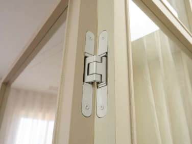
Above: When the designers and the owner agreed that standard American hardware wasn’t going to fit the bill, they sourced high-end hardware from Europe and New Zealand—and often through stateside vendors online. A powder-coated Tectus Hinge from Simonswerk in Germany and edge pulls from Halliday & Baillie show that every detail was considered—and the details make all the difference.

5. Consider the Harry Potter understairs cupboard.

studio oink made use of potential storage spaces with in line cabinets througho 21
Above: Studio Oink made use of potential storage spaces with in-line cabinets throughout the house. Here, a cabinet cut on a diagonal and a door are used for easy access to the deep storage space.

6. Bring back the hospital track.

kinnasand curtains are hung on a track in both upstairs bedrooms to create an o 22
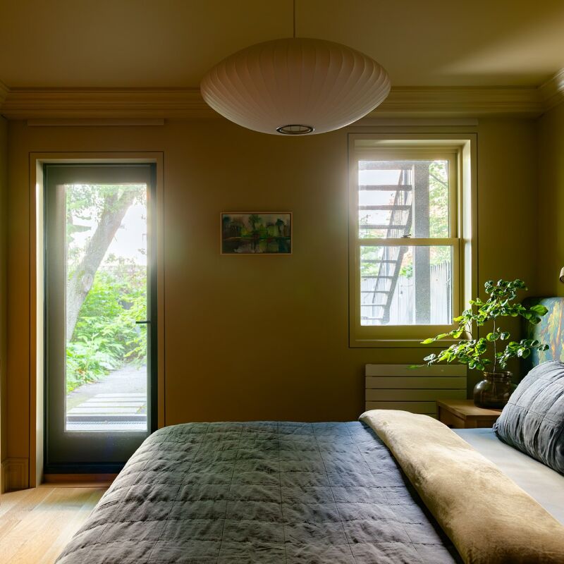
Above: Kinnasand curtains are hung on a track in both upstairs bedrooms to create an open atmosphere while “at the same time, functioning as a private and discreet retreat.” In the main bedroom, seen here, the curtains run the length of the wall to cover both windows rather than hanging on individual curtain rods.

7. DIY your doorstops.

a diy doorstop to keep door knobs from hitting the walls came from the owner: i 23
Above: A DIY doorstop to keep door knobs from hitting the walls came from the owner: It’s made of the same wood and thickness as the door but cut, by the contractor, in a cube shape “so the lines are pleasing,” she says. She added pale gray adhesive felt where the door hits the stop.

8. Use a trundle bed for storage.

a twin trundle bed from urban green furniture in brooklyn, painted the same far 24
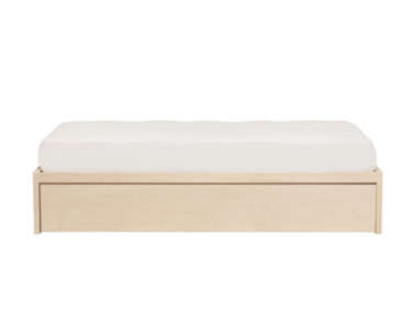
Above: A twin trundle bed from Urban Green Furniture in Brooklyn, painted the same Farrow & Ball color as the walls (Slipper Satin), functions as a storage bed in the guest bedroom. It’s where the owner keeps clunky, cumbersome, but necessary household items such as the ironing board.

9. Make the boring beautiful.

studio oink turned the functional elements of the house into appealing accents. 25
Above: Studio Oink turned the functional elements of the house into appealing accents. Vent covers were sourced from Majestic Vent Covers (shown here is the Caspian grille) and painted with Farrow & Ball color (Slipper Satin here).

10. Go big or go home (with color).

lea and matthias&#8\2\17;s abstracted color palettes are drawn from flemish 26
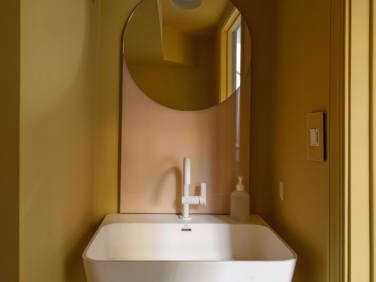
Above: Lea and Matthias’s abstracted color palettes are drawn from Flemish painting traditions. Where the rest of the house is designed in soft and pale blue, cream, and pink tones, a tiny half bath on the lower level gets a dose of character with monochromatic Sudbury Yellow from Farrow & Ball. When guests open the door they get a cheerful surprise.
For more from Studio Oink, see our posts:

(Visited 1,389 times, 3 visits today)
You need to login or register to view and manage your bookmarks.

Product summary  

Have a Question or Comment About This Post?

Join the conversation

v5.0