Icon - Arrow LeftAn icon we use to indicate a rightwards action. Icon - Arrow RightAn icon we use to indicate a leftwards action. Icon - External LinkAn icon we use to indicate a button link is external. Icon - MessageThe icon we use to represent an email action. Icon - Down ChevronUsed to indicate a dropdown. Icon - CloseUsed to indicate a close action. Icon - Dropdown ArrowUsed to indicate a dropdown. Icon - Location PinUsed to showcase a location on a map. Icon - Zoom OutUsed to indicate a zoom out action on a map. Icon - Zoom InUsed to indicate a zoom in action on a map. Icon - SearchUsed to indicate a search action. Icon - EmailUsed to indicate an emai action. Icon - FacebookFacebooks brand mark for use in social sharing icons. flipboard Icon - InstagramInstagrams brand mark for use in social sharing icons. Icon - PinterestPinterests brand mark for use in social sharing icons. Icon - TwitterTwitters brand mark for use in social sharing icons. Icon - Check MarkA check mark for checkbox buttons.
Search

Jennifer Weiss Architecture

San Francisco
Photo: Lucas Fladzinski

Regions Served

  • San Francisco & Bay Area

Services Offered

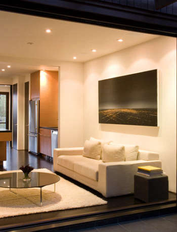
Jennifer Weiss Architecture is a design-oriented architecture firm that is committed to excellence in custom architecture and design for residential, cultural, corporate and academic buildings. We combine rigorous design with construction management experience – a rare combination that leads to a distinctive design process and end product that are aesthetically and intellectually rigorous as well as financially informed.

Our design values are modern: efficiency, logic, beauty, honest expression of materials, and clean lines and forms that allow the architecture itself – the space, light, materials, spatial relationships – and inhabitants to thrive. The result is an architecture that is current but timeless, serene yet warm, and universally rational while also being uniquely reflective of the values and characters of our clients.

In addition to ground-up work, the firm has expertise in major modern renovations of and additions to significant works of architecture by notable architects including Joseph Esherick, William Wurster, Ernest Coxhead, Robert A.M. Stern, and the developer Joseph Eichler. The firm’s work is published in Dwell Magazine, California Home and Design, House Beautiful, San Francisco Chronicle Magazine, and Remodelista, and in an advertisement for Apple, Inc.

With offices in San Francisco and St. Helena, JWA has projects throughout the San Francisco Bay Area, Sonoma and Napa Valley. Jennifer has also had projects in Hawaii and New York.

(Visited 1 times, 1 visits today)

Details

Jennifer Weiss Architecture portrait 3

Contact

Owner

  • Jennifer Weiss

Locations

  • San Francisco, CA

Featured Projects

Jennifer Weiss Architecture portrait 3

Cole Valley House

“Bought that run-down old house? Time for an extreme makeover”

-The Wall Street Journal

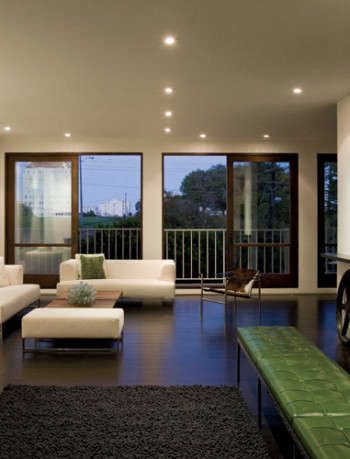
Featured in the Wall Street Journal and Dwell Magazine. Without changing the footprint, the architecture of this house, previously the client’s childhood home, was completely re-conceived: the floor plan and spatial relationships were re-designed to be more aligned with how the clients live, use and enjoy a home, and interact with family and friends. The challenge: to make the house look, feel and LIVE more modern, and more aligned with the clients’ aesthetic and family-focused way of life, within a modest scope.  This careful remodel transformed the house strategically.  The changes to the roofline, windows and floor plan result in a dramatically different home – stylistically and experientially.

See More

(Visited 296 times, 1 visits today)
Photos: Lucas Fladzinski
Jennifer Weiss Architecture portrait 3

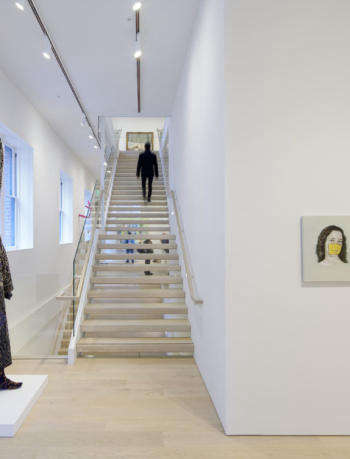
Berggruen Gallery: Hawthorne Street

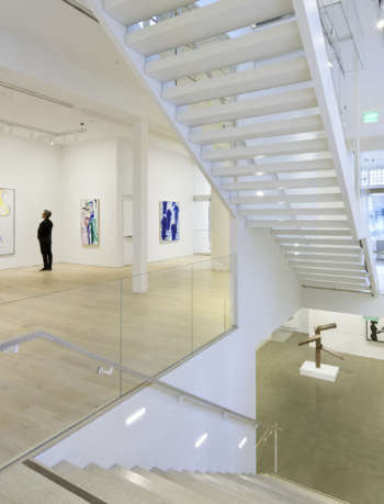
This adaptive re-use project converted a 10,000 square-foot brick historic warehouse building, previously housing a dark nightclub, into a light-filled, museum quality art gallery in the heart of downtown San Francisco. The architecture is intentionally deferential to the artwork, and to the viewing of art.

Sight-lines were rigorously studied, affording visitors powerful connections: with the art, the gallery team, other visitors, and even the city beyond. Multiple scales of space created a variety of art viewing experiences.

The gallery consists of exhibition space, showrooms, and offices distributed over three stories, as well as a grand central staircase made of wood and glass; the lower-level staircase transitions with triple dimension allowing for overflow seating as part of the digital and artist presentation space.

See More

(Visited 296 times, 1 visits today)
Photos: Bruce Damonte
Jennifer Weiss Architecture portrait 3

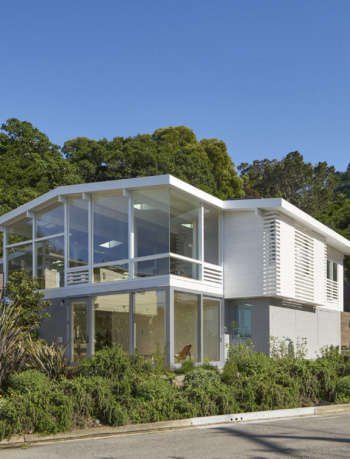
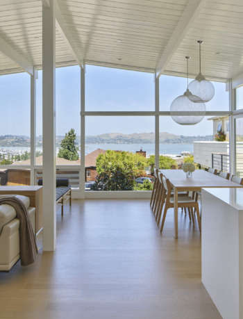
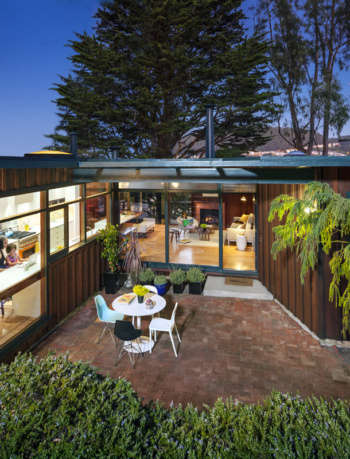
House For an Architect

This extensive remodel of and addition to an existing mid century house in Sausalito surgically removed problematic and unsightly elements, while maintaining the critical lines and concepts of the original architecture.  The design also transforms the experience:  the new house responds to its site formally, and experientially by unveiling previously hidden dramatic Bay and Mountain views.  The project created an accessible and affordable Accessory Dwelling Unit (ADU), the first ADU to take advantage of the City’s new zoning allowances – spearheaded by our client, a partner at one of the top commercial architecture firms in the world, who is a champion for accessibility and affordable housing for all, and in all neighborhoods.  All of this with only 765 sf added, only 85 sf of which was on the main level.

See More

(Visited 296 times, 1 visits today)
Photos: Bruce Damonte
Jennifer Weiss Architecture portrait 3

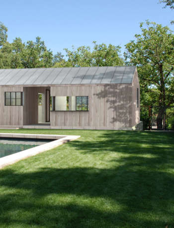
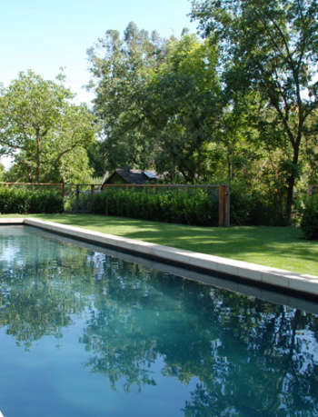
St. Helena Pool & Pool House

“The Pool…goes right into my ‘dream file’.”

-Dominique Browning, The New York Times

See More

(Visited 296 times, 1 visits today)
Photos: JWA
01 jwa wurster
04 jwa wurster

Wurster House

“Weiss’ work is entirely in keeping with one of Wurster’s great declarations: ‘Architecture is for life and pleasure…and for people.’”

-Dwell Magazine

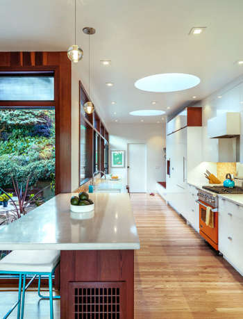
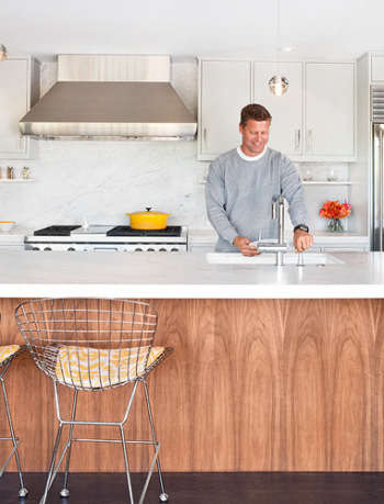
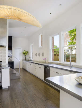
This remodel of and addition to a 1951 William Wurster designed bungalow modernized the kitchen, and increased connections  – visual, physical, psychological – through the house, toward the City and Bay views, and to the existing garden courtyard. All within the guidelines and inspiration set forth by Wurster himself. The kitchen was enlarged by capturing unused outdoor utility space.  Previously dark and isolated, the kitchen is now connected to the main living spaces and to the central courtyard and garden. A mudroom, a family entrance closer to the garage, and a garden-view desk space were also added.  The addition relates to the existing house: redwood accents refer to the interior redwood paneling, circular skylights were inspired by a circular motif found in the existing eaves, and new connections to adjacent spaces (indoor and outdoor) recall key relationships that make the original house sing.  The addition is also intentionally recognizable as new and current – in deference to the original structure, and to provide a more luminous kitchen that the clients desired.

See More

(Visited 296 times, 1 visits today)
Photos: Lucas Fladzinski
Jennifer Weiss Architecture portrait 3

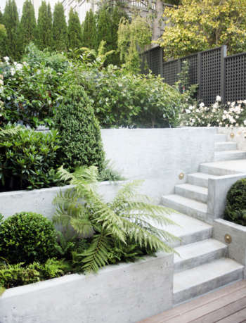
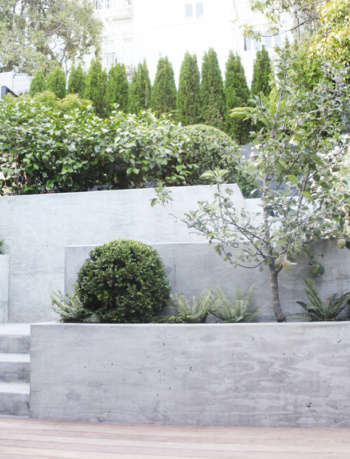
Coxhead House Garden

“…elegant, unobtrusive, and sculptural. All structural elements work seamlessly and blend well—providing both contrast and connection…so that together they form a unified, tranquil, and interesting space.”

– Deborah Needleman, Editor in Chief, T: The New York Times Style Magazine

See More

(Visited 296 times, 1 visits today)
Photos: David Godshal
Jennifer Weiss Architecture portrait 3

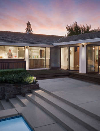
Moraga Indoor Outdoor House

This extensive remodel transformed an existing awkward, dark, ranch house into a modern, light and view filled space for a family of five – without changing the footprint.

The plan was rationalized: the plan was made efficient; the kitchen was almost tripled in size; a new entryway was created by modifying a hallway;  relocating the laundry area made room for a new office, created privacy for the powder room, and allowed for a much needed storage wall for the children. Exterior windows and doors were replaced with wider, taller, stained wood openings.

Phase II will include work to the exterior architecture of the house.

See More

(Visited 296 times, 1 visits today)
Photos: Lucas Fladzinski
Jennifer Weiss Architecture portrait 3

Alta Plaza Residence

“A dark, inward-looking abode gains several rooms with a view”

-Deborah Bishop, contributing design editor to Dwell & SF Chronicle

See More

(Visited 296 times, 1 visits today)
Photos: Laura Plageman

Coverage on Remodelista & Gardenista

v5.0