Icon - Arrow LeftAn icon we use to indicate a rightwards action. Icon - Arrow RightAn icon we use to indicate a leftwards action. Icon - External LinkAn icon we use to indicate a button link is external. Icon - MessageThe icon we use to represent an email action. Icon - Down ChevronUsed to indicate a dropdown. Icon - CloseUsed to indicate a close action. Icon - Dropdown ArrowUsed to indicate a dropdown. Icon - Location PinUsed to showcase a location on a map. Icon - Zoom OutUsed to indicate a zoom out action on a map. Icon - Zoom InUsed to indicate a zoom in action on a map. Icon - SearchUsed to indicate a search action. Icon - EmailUsed to indicate an emai action. Icon - FacebookFacebooks brand mark for use in social sharing icons. flipboard Icon - InstagramInstagrams brand mark for use in social sharing icons. Icon - PinterestPinterests brand mark for use in social sharing icons. Icon - TwitterTwitters brand mark for use in social sharing icons. Icon - Check MarkA check mark for checkbox buttons.
Search

Atema Architecture

New York City
Photo: Fran Parente

Regions Served

  • New York City & Mid-Atlantic

Atema Architecture is an innovative architectural firm based in New York City and focused on commercial and residential projects. We seek clients who share our belief that design is an opportunity for exploration and innovation, that design provides opportunities to create a better world, and that everything we build is a reflection of our values.

We have long experience in effectively integrating sustainable design strategies into our work, and we place a particular emphasis on creating strong collaborative teams with our clients, consultants, and builders from the outset of every project.

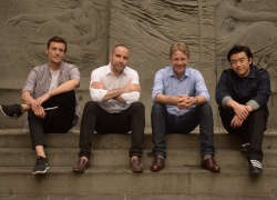
Ate Atema is the founder and Managing Principal of Atema Architecture.  His award-winning firm has created over one hundred projects for commercial and residential clients in the New York area and around the country.

Prior to founding his own firm, Ate was a Senior Architect at Bennett Lowry, designing and managing retail projects and roll-outs both in New York and around the globe for clients including DKNY, CK Calvin Klein, and Anne Klein.  He also worked at Asfour/Guzy Architects, focusing on residential and commercial interior projects.  While in graduate school, Ate worked in the office of Frank Gehry as part of the project teams for the Bilbao Guggenheim Museum and the Disney Concert Hall in Los Angeles.

Ate holds a Master of Architecture degree from the Southern California Institute of Architecture and a Bachelor of Science degree from Boston University, and is a licensed Architect in the state of New York.  He is the recipient of a Rockefeller Foundation grant and has been a featured speaker at the New York Times Cities for Tomorrow Conference and TED.

(Visited 1 times, 1 visits today)

Details

Atema Architecture portrait 3

Contact

Principal

  • Ate Atema

Locations

  • 79 Madison Avenue
    New York, NY 10016

Featured Projects

Atema Architecture portrait 3

Gramercy Park Apartment

Taking cues from boat and furniture design, we transformed this 1,200 sq.ft. penthouse overlooking Gramercy Park into a quietly luxurious and rigorously efficient two-bedroom, two-bath pied-a-terre for our clients that takes advantage of every bit of available space and daylight to create the feel and function of a much larger apartment.

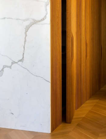
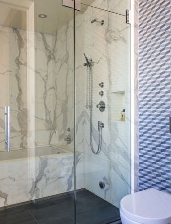
The project is organized around a forty-foot long ribbed oak wall that leads one from the entry hall to the loft-like living/dining room and kitchen with its wide-open views over the park and skyline.  The wall provides a warm textural backdrop to the space and hides doors to a pantry and media rack, storage cabinet, and the master suite.  Functioning as bespoke furniture, the ribbing and door handles are designed to allow the doors to interlock with the wall with glove-like precision when fully opened.  Windows are framed in statuary marble that reflects light and provides additional subtle texture and warmth.  Hidden cabinets throughout provide a range of storage, including for TVs on motorized lifts and skis.  A narrow reveal at the top of the walls hides the heating and air conditioning and incorporates an invisible picture rail.
(Visited 324 times, 1 visits today)
Photos: Fran Parente
Atema Architecture portrait 3

TED Office

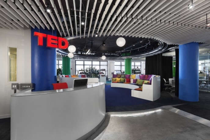
TED, best known for the influential TED Talks website, is an organization that curates and facilitates the sharing of innovative ideas around the globe using new media and technology. They challenged us to envision what an office for the information age could be, and their motto: “ideas worth spreading,” became the DNA of our design.

We wanted to create a work environment that better supports physical well-being, which in turn supports the mental well-being that is key to good idea-creation and sharing.

The typology of the Theater emerged as a highly appropriate “heart” of the office. Their conferences are a form of theater, and as spaces designed for flexibility and idea exchange, theaters reflect TED’s mission beautifully, so we put a black-box theater-in-the-round in the middle of their office. The Theater serves simultaneously as “town square,” reception lounge, and informal work space, and is easily transformed into a presentation space where they host regular talks.

The physical office is less a fixed sequence of programmed spaces with a definable image than a transformable, process-driven, “soft” environment. Central spaces are defined by curtains or glass walls. Furniture is arranged to define team areas, but otherwise work areas are wide open to support TED’s collaborative culture. We developed a custom desk and other furniture in collaboration with Steelcase to clearly define each person’s space and provide options for privacy within a small footprint.

(Visited 324 times, 1 visits today)
Photo: Michael Moran
0703 04 adj
0703 01 adj

Acumen Office 1.0

Our client is a global non-profit venture capital firm who came to us looking for a work environment that supported their horizontal, collaborative organizational structure, but had a more focused, relevant identity, all the while keeping costs modest, focusing on sustainable design principles, and allowing them to take much of their brand-specific elements with them in the future.

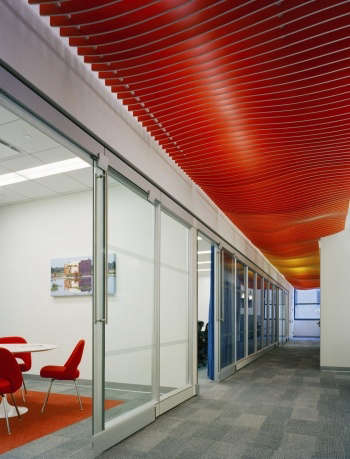
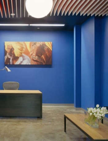
Since we were developing a brand ID specific to Acumen, this became the inspiration for what we would term the Nomadic Project, whose Nomadic Elements would provide high visual richness and specific branding impact for relatively low cost, designed so they could be easily removed and reused in new future locations.  These elements ended up including: the “Saffron Wave” backlit ceiling canopy, whose main components were cut off-site by a CNC mill, then painted, assembled, and installed by a combination of client and architect labor; the fabric ceiling-hung panels; and the custom reception and dining area furniture made of blackened steel and reclaimed antique hear pine.

(Visited 324 times, 1 visits today)
Photos: Michael Moran

v5.0