Here are a few of the rules that Jacqueline Schmidt, David Friedlander, and their two young boys live by.
1. Every object has to earn its keep.
2. When not in use, a laptop should be stowed away.
3. Toys go in canvas bins.
4. Give away what you’re not using—and if you introduce something new, get rid of something else.
The rules are born of necessity: The couple’s two-bedroom apartment in Brooklyn’s Windsor Terrace is a mere 675 square feet. “We want the space to feel like a sanctuary,” Jacqueline says. “It’s important to us that everything have a purpose and a place so that we can breathe freely.”
Finding their apartment was the familiar New York nightmare. But when it came to overhauling it, they were more than up to the task. Jacqueline, an artist/designer, is the owner of paper goods company Screech Owl Design and also the director of design at Ollie, furnished micro-living apartments being developed in NYC, and says figuring out layouts and designing interiors has been her passion since she was a girl. David, meanwhile, is the communications director at LifeEdited, a real estate design consultancy and marketing company that helps clients live the pared-back life. The two, who met on the L train more than a decade ago, briefly tried living in upstate New York and discovered they missed urban life. To get a toehold back in Brooklyn, they set out to find the best apartment for their money. And when that happened to be smaller than they would have liked—and “a dump, but a dump in a great building”—they were ready to tackle the remodel and fully embrace lighter living.
Photography by Matthew Williams.
Above: “Getting rid of stuff is the easiest, most affordable way to create space,” says Jacqueline, who spent the construction months selling and donating castoffs. “Through my work,” adds David, “we knew we could ‘buy’ a lot of space by shedding our possessions.” The couple completely overhauled the apartment: Jacqueline masterminded the floor plan in consultation with architect David Bucovy, who created the technical drawings and took care of building department submissions.
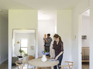
The couple with their oldest son, Finn, are shown here in their bedroom, which is divided from the central dining area by a custom sliding door: It’s sandwiched plywood and runs on a track from CS Tracksystems.
Above: The couple say they splurged on materials rather than furnishings—and strategically placed a large Restoration Hardware Floating Mirror to expand the sense of space. The flooring is rough-sawn European oak, Hakwood Reim from LV Wood: “It’s on the pricey side, but as with all our materials needs, we didn’t have too much space to cover so it was manageable,” says David. The linchpin piece of furniture was a round dining table with a small footprint. After a long hunt, the couple found theirs at Canvas Home (unfortunately since discontinued). As for the Wishbone Chairs, Jacqueline concedes, “They’re not the most practical small-space design because they don’t tuck in easily, but they’re the chairs I love the most.”
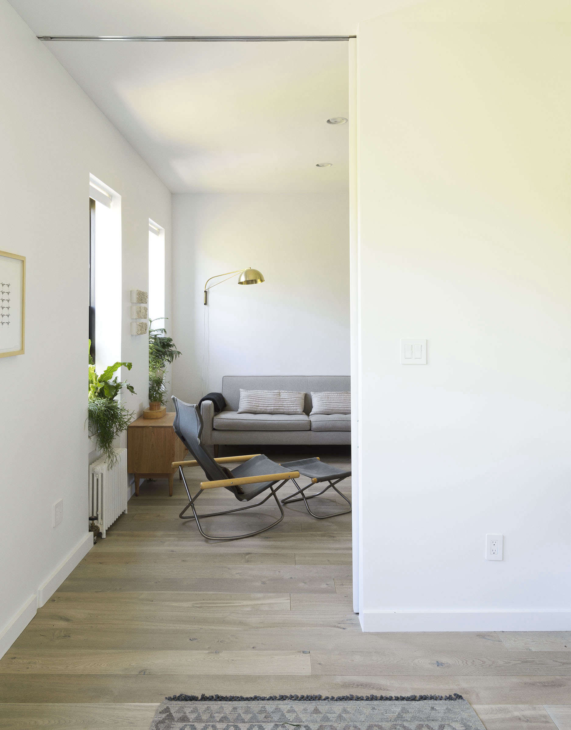
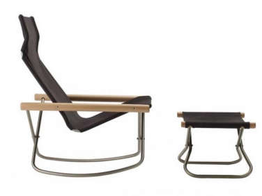
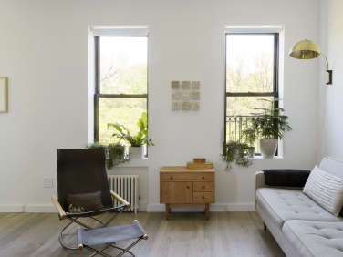
Above: Another sliding door opens to the living room. The Ny Rocking Chair and Ottoman, a 1958 design by Takeshi Nii, are “collapsible and stow away easily,” says David. “perfect for us.”
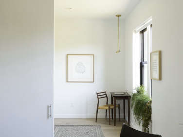
Jacqueline’s space-enhancing design tricks included tall doors, lack of soffits, recessed lighting, nearly invisible built-in storage, and walls painted Benjamin Moore Decorators White, “which reflects light.”

Above: The sofa is a Room & Board design from the couple’s former house and is a placeholder: “I designed the living room around an L-shaped couch to add seating, but with two rowdy boys under age four giving the sofa daily thrashings, it doesn’t seem like the right time just yet,” says Jacqueline. The apartment’s framed art prints are her work from Screech Owl Design. The brass dome light is by Allied Maker.
Above: The couple made creative use of compact furniture: The chest of drawers is Room & Board’s Grove Nightstand in cherry.
The trickiest part of the remodel? “We had to take down a supporting wall that divided the living room from one of the bedrooms,” Jacqueline tells us. “That involved sistering the joists with 24-inch beams spanning the entire apartment. It was a big pain and expense. And it only made our living room two feet bigger, but in a small space, that’s a huge difference.”
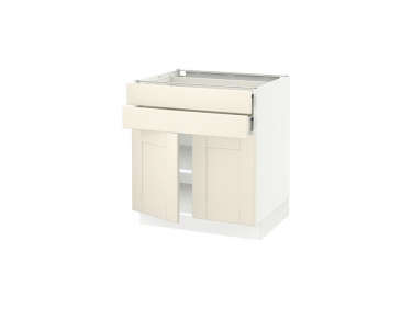
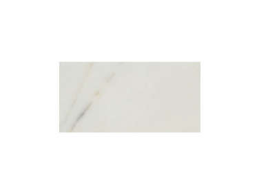
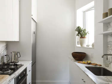
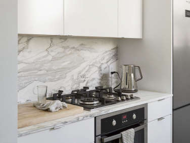
Above: Ikea cabinets meet Calacatta Borghini marble from Ann Sacks in the galley kitchen. The 24-inch-wide appliances—refrigerator, Convectio oven, four-burner gas cooktop, and panel-concealed dishwasher, all by Fagor—were selected for both their design and dimensions.
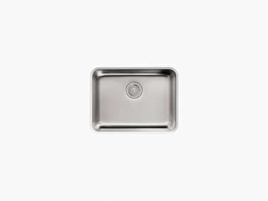
Above: The stainless undermount 23-by-17-inch sink is the Undertone, and the faucet is the Purist, both by Kohler. The tableware on the open shelves is the nesting Hasami line by Taku Shinomoto, which replaced the couple’s ragtag collection of plates and bowls. “I had been eyeing the Hasami dishes for years,” says Jacqueline, “and when we sold our old dishes, we finally had a reason to buy them and actually built the open shelves to showcase them.”
Above: The Ikea cabinets have chrome Tab Drawer Pulls from Mockett, and a butcher block next to the stove is the food prep area. Of the counters, Jacqueline says, “We opted for honed, which we heard was easier to maintain. And they’ve actually been easier than we imagined. When I did my research, I was terrified I’d regret the choice, but our marble is so nice to touch and makes us very happy.” (Read about the pros and cons of marble in the kitchen in Remodeling 101.)
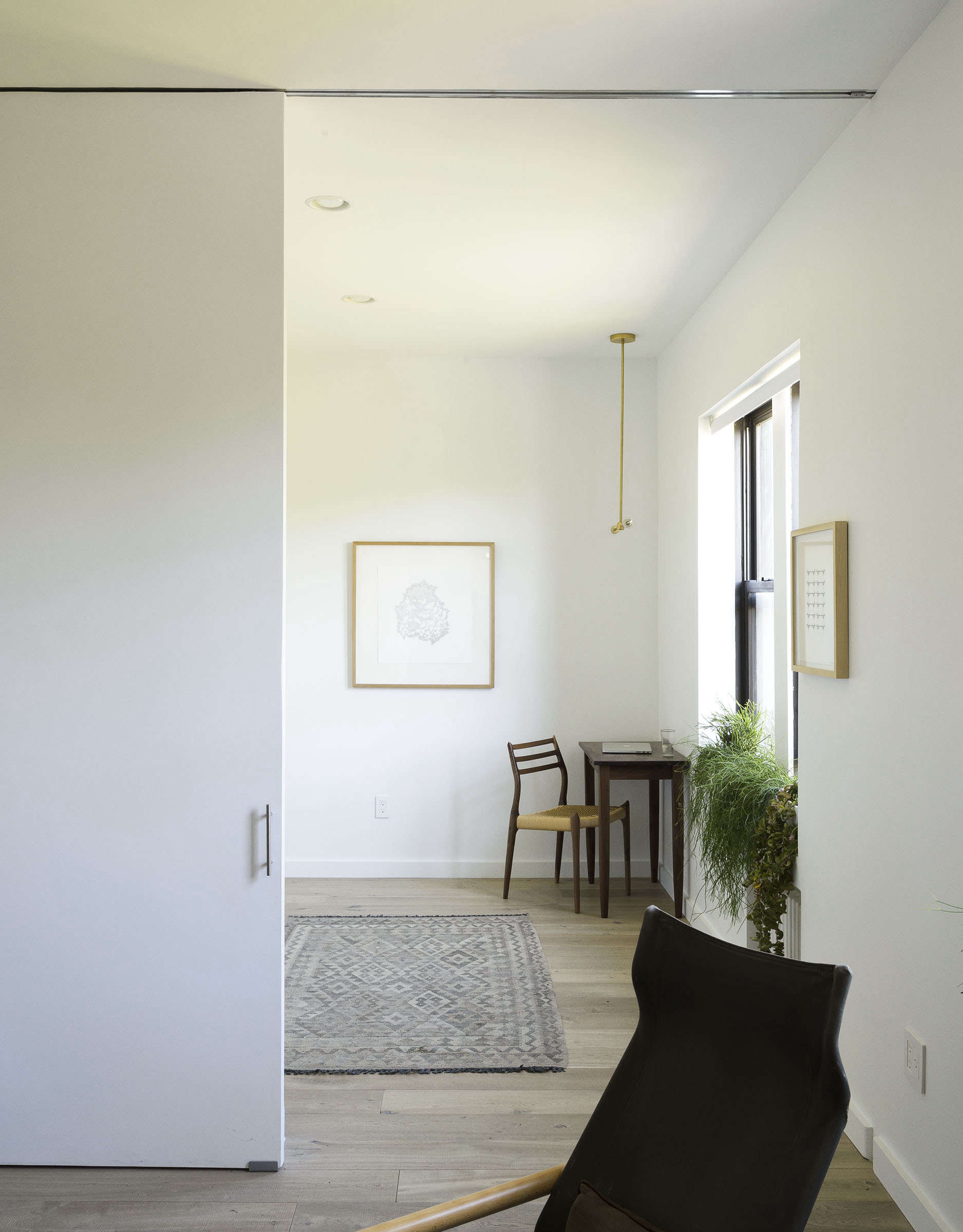
Above: The sliding door to the master bedroom (with a Mockett Slim Handle) doubles as a screen for projecting movies.
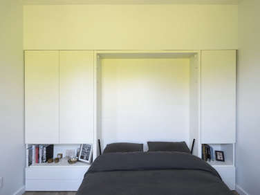
Above: The key to the apartment’s success: fold-down beds in the parents’ and kids’ room. “Through LifeEdited, we had become pretty intimate with Murphy beds,” says David. “We stayed in the LifeEdited showroom apartment in New York quite a bit when we lived upstate, so we knew that Murphy beds are easy to live with and comfortable.”
Their design, the queen-size Penelope by Clei of Italy from Resource Furniture, incorporates bedside closets and drawers. David, who Jacqueline describes as a “uniform wearer,” keeps his entire wardrobe in one of the cupboards—”and he doesn’t even use all of the space”— and Jacqueline uses the other. (She also stows her hanging items and shoes in hall closets off the front door that are the apartment’s storage central.)
Above: David demonstrates the morning routine. The pendant light is Allied Maker’s Brass T.
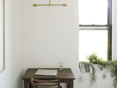
Above: A custom desk and Danish modern chair, the Møller Model 78, serve as David’s home office (he also makes the rounds at a network of local cafes). “Our setup is like living on a sailboat,” he says.
Above: The compact bath is finished with Carrara marble and White Thassos marble tiles from Ann Sacks. The bathtub is Kohler’s Tea for Two model.
Above: To “mirror the park view out the windows,” the apartment’s sills, including the one in the shower, hold easy to care for houseplants from nearby Sprout Home.
Lesson learned from the remodel? “Don’t cheap out,” says David. “Everyone needs to respect their budget, but there’s a lot to say about doing things right the first time. For instance, as a cost-cutting measure we tried to preserve the window in the bathroom. We ended up replacing it after the wall had been framed out, which meant we could only have a small aperture replacement window. We should have done it right the first time.”
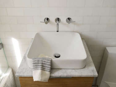
Above: The custom oak cabinet is fitted with a square, above-counter sink, the Vox from Kohler.
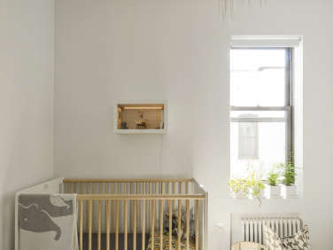
Above: Fifteen-month-old Ryder sleeps in an Oeuf crib in a room that he shares with his 3 1/2 year old brother. A shadowbox by Jacqueline hangs on the wall. Washable canvas bins from Pehr of Toronto hold toys and stuffed animals.
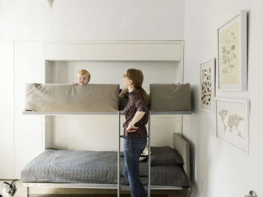
Above: Finn’s bunk bed is the folding Lollisoft from Clei, which disappears into the wall and is surrounded by modular closets and shelves. The hanging bird is a soft sculpture by Tamar Mogendorff.
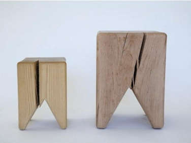
Above: With the bed out of sight, there’s room to play. Stump Stools by Kalon Studio are paired with a Canvas Home store oak coffee table, which happens to be the perfect kid height—and can migrate to the living room some day.

Above: The floor plan makes the most of the apartment’s 675 square feet. The front hallway floor-to-ceiling closets replaced a nonfunctioning dumbwaiter and small coat closet. “People are always shocked to find out the square footage of our place,” says David. “But often what they’re reacting to is how clear the place is.”
Before

Above: Prior to the remodel, the living room had French doors and crown moldings—and a very different look.

Above: Good-bye, pink Formica: A galley replaced this corner kitchen.

Above: The original bathroom had a full tub—and next to no floor space.
Peruse our Small-Space Living archive for more inspiration, including:
- Sebastian Conran’s 11 Tips for Designing a Small Kitchen
- 11 Tips for Making a Room Look Bigger
- The Tidy Life: 7 Daily Habits from the Author of Simple Matters











Have a Question or Comment About This Post?
Join the conversation