LA designer Martha Mulholland is a jack of all visual trades. After the Kentucky native finished her degree in art history (as well as historic preservation and interior architecture) at the Art Institute of Chicago, she worked with auctioneers, clothing designers, decorators, and various big fashion brands such as Tom Ford, Max Mara, and Gucci as a visual merchandiser and window dresser. Needless to say, she can pull together a presentation with a certain panache, which is just what the clients of this 2,100-square-foot Spanish Colonial in Altadena, California, needed when they moved in with a baby on the way. Mulholland worked with them to combine their existing furniture (treasured family pieces from Tennessee, including an 18th-century grandfather clock) with a California modern look that they like–and turn it all into a casual, durable, and child-friendly setting. Intrigued to see how it all looks together? Come on the tour.
Photography by Laure Joliet for Remodelista.

Above: The Spanish Colonial underwent a significant renovation by LA architecture firm Park McDonald before Mulholland worked on the interiors.

Above: In the foyer, the owners’ Shaker chest provides the base for a classic Mulholland vignette of far-ranging pieces. Mulholland found the rug on One King’s Lane; it’s in one of her favorite color combinations: peach, cobalt and ivory. “I like adding light blue to this mix as well, hence the Louis IV chair with its original periwinkle-blue velvet upholstery,” she says. “The lithography in the background adds a bit of contrasting color.”

Above: The kitchen cabinets, painted in Benjamin Moore Amherst Gray, were custom built in a simple Shaker style with oil-rubbed bronze hardware.

Above: The bright bands of color in a photograph by Todd Cole provide a strong focus for the window-lined breakfast room; the cage ceiling pendant is from Shopclass.

Above: When Mulholland looked through the clients’ dishware and crockery, she noticed an abundance of orange and red pieces, which she arranged on the open shelves opposite the breakfast table.

Above: Kumquat branches in a deep orange/red ceramic vase bring an added vibrancy to the display.

Above: The breakfast room overlooks the dining room and has built-in Shaker-style cabinets that serve as a visual extension of the kitchen. Vintage George Nelson steel frame chairs sit around a round oak dining table, a family heirloom the clients brought with them from Memphis.
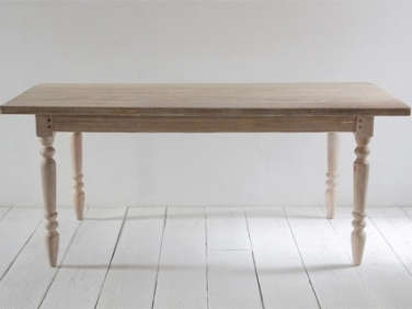
Above: With her background as a painter and props stylist, Mulholland likes to use color to train the eye to focus on specific areas of the room without being overwhelmed. “I love colored walls in a small room or a painted wood floor to make a jewel box out of a living space,” she says. “In larger rooms, I tend to use color primarily in the accessories and textiles, like the emerald green curtains in the dining room.” The Amba Organic Green Curtains are from Premier and the Farm Table is from Nicky Kehoe. The designer spotted a larger version of the brass chandelier at the Black Cat restaurant on Sunset Boulevard and commissioned the designer, Gary Chapman, to scale down his design for the proportions of the room.

Above: “I love emerald green in interiors,” Muholland says. “I feel like it’s the next indigo and jump at the chance to use it. It’s a difficult color to combine with, but I thought that the white walls and neutral woods in this room would make a fitting backdrop for dramatic color.”

Above: The emerald curtains in the dining room create an impact in the large open living room as well.

Above: Midcentury Danish armchairs and nesting tables are arranged in front of the fireplace; a Stanley Moore painting that Mulholland found at an estate sale hangs above the mantel.

Above: In big spaces with several seating arrangements, Mulholland often uses a neutral jute or sisal carpet as a base layer to define the overall space. She then introduces an accent rug to add color and texture, such as the Moroccan Berber that stands under the living room coffee table. “This is also a cost effective option if you want a carpet to fill a large space, but don’t have the budget for a statement nine-by-ten-foot Turkish Gabbeh,” she says. “This way you can get a smaller special piece and have the best of both worlds. For advice on how to choose a carpet, see our Q&A with LA’s Rug King.
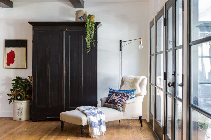
Above: Mulholland anchors a prominent corner of the living room with a Belgian linen–upholstered antique chaise from TL Gurley Antiques and a cupboard from her clients’ Southern heirlooms collection. A wall-mounted Shaded Otis Light by Onefortythree makes the setup perfect for reading.
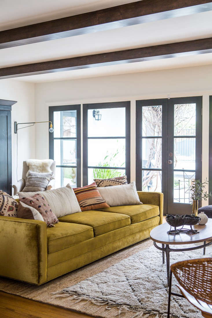
Above: The designer updated a 1970’s velvet sofa by removing the loose cushions and replacing them with pillows made of mud cloth, kilim fragments, and feed sacks for a more bohemian and casual look.
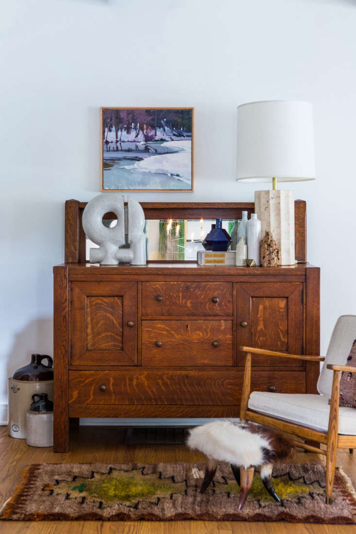
Above: “I love a good vignette–a holdover from prop styling, no doubt,” Mulholland says. “This is just a collection of objects that I thought felt nice together–the limestone lamp base and the driftwood add some natural elements, mixed with a collection of white pottery and the cobalt blue for a punch of color. In an otherwise neutral ensemble, I like how that one little vase ties together the colors in the painting and the shapes in the rug.”

Above: The living room is expansive enough for both a formal seating area around the fireplace and an informal seating area for television watching. The brass console by Sarreid is a Craigslist score.

Above: In the master bedroom, gray curtains and a velvet headboard in ochre provide strong blocks of color against a neutral background.
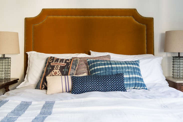
Above: On the bed, Mulholland blends colors and textiles like an artist blends paint. “I found a great vintage ikat pillow [shown far left] that had the tones from the rug, drapes, and headboard in it, plus indigo blue, so I sort of ran with it and created an entire visual story around that one pillow,” she says. “Having all of that texture and pattern keeps the headboard from looking too dense and softens the contrast between the velvet and the white bedding, which could be jarring otherwise.”

Above: The bedroom in the guesthouse overlooks the pool and has a more neutral palette, in keeping with the simple furniture.

Above: Drought-tolerant plants thrive in the side garden.
Interested in seeing another project from the same era? Have a look at DISC Interiors and Lawson Fenning’s renovation of a Spanish Colonial home in LA. And over on Gardenista, see a succulent wonderland in A Magical Glasshouse Garden in Pasadena.
N.B.: This post is an update; the original story ran on March 24, 2014, as part of our Spring Forward issue.






Have a Question or Comment About This Post?
Join the conversation