When graphic designer (and Remodelista reader) Davy Dooms purchased an 850-square-foot apartment located in an Art Nouveau house in Antwerp, his goal was to create a blank canvas. “In all my work projects, I start by defining a working color palette,” he says. “I did the same thing in the decorating and furnishing of my own apartment.”
Dooms took his color cues from a favorite exhibition poster; using a palette of “white, black, brown, gray, and orange; this is the color combination that makes it all seem whole,” he says. The rooms have a spacious feel, due to the high ceilings; Dooms’ main intervention was to update the bedroom suite: He replaced the bathtub with a walk-in shower, installed a new sink, and painted the walls white to match the rest of the apartment. With his new blank canvas, he began layering in the only way he knows how.
Photography by Niko Caignie.

Above: Dooms’ styling inspiration is a mix of Scandinavian and American midcentury. The low shelving to the right is integral to the kitchen island.

Above: A poster from Danish midcentury designer Poul Kjaerholm’s retrospective in 2006 was the starting point for Dooms’ color palette for the apartment.

Above: The kitchen cabinets and island, designed by architect Sofie De Clercq, were a minimalist insertion into the Art Nouveau shell and were installed by the previous owner. (For another look at a minimalist kitchen insertion into a 19th century building, see Minimalist Moves in a Chelsea Townhouse.)

Above: The wood in the midcentury tableware brings color into the otherwise black and white dining room.

Above: Dooms’ color palette–white, black, brown, gray, and orange–comes together in the living room.

Above: In the dining room, Dooms’ interventions were minimal. He rebuffed the existing floor and changed the window treatment.

Above: In the bedroom suite, Dooms installed a wood floor to match the existing ones in the dining room and living room.

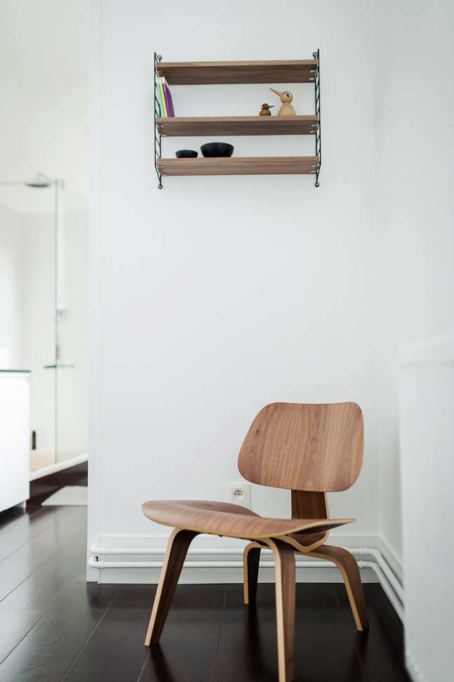
Above: An Eames chair anchors a corner in the bedroom.

Above: A view from the bedroom to the living room.

Above: Dooms replaced the original sink and installed a new sink mirror and black countertop.

Above: The new walk-in shower replaced a bathtub; Dooms built a cabinet around the boiler.

Above L: The bedroom unit was originally painted green. Above R: A view into the bathroom reveals a corner of the bathtub which Dooms removed.

Above L: The original sink. Above R. The location of the bathtub, which Dooms replaced with a walk-in shower.

Above: The sole reminder of the apartment’s green past: a cactus.
The legacy of midcentury design remains stronger than ever. See 725 images of Midcentury Furniture in our Gallery of rooms and spaces.


Have a Question or Comment About This Post?
Join the conversation