Have you heard of Joseph Eichler? If you haven't, let us introduce you to California's most progressive midcentury merchant builder (fun fact: Steve Jobs was an admirer). "The homes and communities Eichler built—modern in both concept and expression and socially sensitive in their planning—bore the stamp of his unwavering ideological integrity and swaggering self confidence," according to the Eichler Network. So what happens when a design-savvy couple meets an Eichler in need of an update?
If you’re Lisa Collins and Mark Adams, you retain the essence of midcentury modernism while updating the interiors to accommodate the imperatives of modern living. Avid gardeners and cooks, Collins (the founding principal of Studio One|San Francisco) and Adams (a photographer) aimed to transform the tired kitchen into an open and clean workspace ("a laboratory or a design studio; a place to create," as they say). Here's their story.
Photography by Mark Adams.

Above: "We kept the original Eichler globe ceiling fixtures as a signature look," Collins says. "The floating shelves are made from reclaimed 100-year-old oak floorboards salvaged from a barn in the midwest. I wanted to offset the slick shiny surfaces of the countertop and cabinets with something textural, natural, and rough. And I collect white bowls, so it was a perfect contrast to the shiny white bowls and dishes."

Above: "We did most of the work ourselves. It took us four days to cut and mount the oak shelves, due to the detailed precision needed," Collins says.

Above: "We love to cook at home and consider our kitchen the heart of our home," says Collins.

Above: "I am a big fan of white mixed with industrial elements and materials in their raw state, so I chose shiny white lacquer cabinets, Caesarstone countertops, and natural salvaged wood for the open shelves," Collins says.

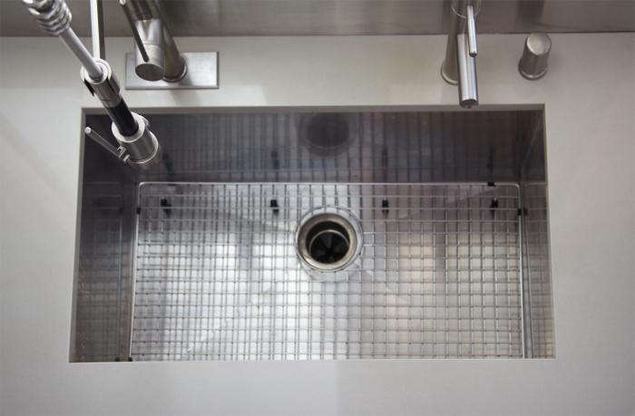
Above: An industrial Pegasus faucet graces the kitchen sink.

Above: The faucets are sculptural in their simple forms.

Above: "I wanted a concrete look for the counters and used Caesarstone Cinder," says Collins.

Above: "The range is Bertazzoni; a great stove with an industrial look at a good price," Collins says. "I am drawn to the contrast of black and white and went for the darkest brown flooring I could find, opting for a hand-scraped yet shiny floor surface, for the contrast." The cabinets do not reach the ceiling, which means that the wall acts as an open partition between the kitchen and living room (this is a classic Eichler detail).

Above: Collins donated the old cabinets to Habitat for Humanity.

Above: "Habitat for Humanity took all our old cabinets, and our neighbor who was remodeling at the same time took our mahogany paneling, which is a classic Eichler finish," Collins says.

Above: The partition used to extend up to the ceiling.
N.B. Inspired by this white kitchen? See 4713 images of White Kitchens in our Gallery of rooms and spaces.


Have a Question or Comment About This Post?
Join the conversation