Contractor Aaron Gordon bought the modest cottage in SF’s Bernal Heights with his own family in mind. But when he approached Red Dot Studio architect Karen Curtiss to modernize it, he had decided to overhaul the house for resale and came to her with a mandate: “I was asked to transform the structure from one bedroom to three without expanding the building’s envelope,” says Curtiss. “It was a dream project.”
Photography by Joe Fletcher via Red Dot Studio.

Above: Built in the early 20th century, the newly whitewashed 1,253-square-foot house–a mere 17.1 feet wide from stud to stud–was originally almost equal parts garage and living quarters (scroll down to see the Before). Applying space-efficiency tactics throughout, Curtiss reordered the ground floor to include room for the main living space.
On the exterior, she introduced new windows (ornamented on the top story with panels of succulents she dubbed “succulintels”), and built a side entry and garage door of western red cedar. Other interesting details include a new concrete walkway and drive inset with front and side gardens. That’s a rain chain hanging over a collection barrel–learn about rain chains on Gardenista. All plantings came from The Succulence in Bernal Heights.

Above: An open kitchen-dining-living room (with a Bertazzoni range) now occupies the ground floor and extends out to the side garden. How did Curtiss create the space? She and her crew were able to excavate and lower the ground floor by two feet and to raise the ceiling two feet by exposing the joists, an ingenious case of using construction to reveal hidden resources.
The team at Aaron Gordon Construction (Chad Greensberg served as foreman) worked on the project over a two-year period, slotting it in between other jobs whenever they could. Gordon, Curtiss says, “gave me carte blanche to design the space and to showcase quality craftsmanship.” Green building was also a priority: The remodel is Build It Green–certified and beats California’s sustainability requirements by over 50 percent.

Above: Curtiss applied a materials palette of wood and industrial elements throughout the house. The kitchen has custom counters and cabinets in a white laminate built by Bob Clausen. The stainless steel sink is by Blanco and the faucet is by Santec.
To echo the house’s wood siding, the interior walls and second-floor ceiling are newly paneled in knotty pine and finished with an undisclosed white paint to allow the grain to show through. “It was a labor of love to get the color right and not too pink” says Curtiss, who chronicled the whole remodel process on Red Dot Studio’s journal.

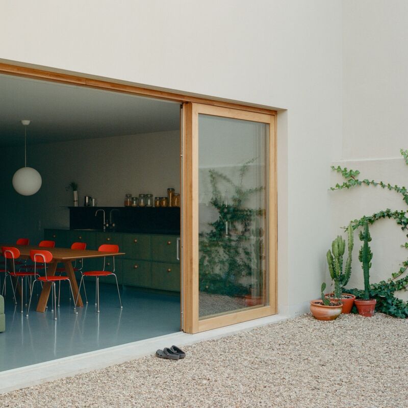
Above: The dining table has Cherner legs and a new laminate top. Dutch doors of red cedar open from the side yard.

Above: A new central skylight on the top floor floods the center of the house with light and expands the sense of space. The stairs are made of ipé wood.

Above: “By opening up to the peak instead of having a dropped ceiling on the second floor, we got two full floors,” says Curtiss. Shown here, the skylit landing that leads to three bedrooms and two baths. At the low side of the peak, the ceiling is seven-foot-six; at the peak, it’s about 15 feet.
“The walls will run right up to the skylight giving the light a surface to reflect on,” writes Curtiss in her construction notes. “One benefit of a small house is we are allowed to have a skylight at the property line, since we’re under 1,000 square feet per floor. This will get us a pool of light right at the stair landing and a feeling of height where the roof would otherwise come down a bit low.”

Above: The master bedroom opens to a steel balcony. A freestanding paneled wall divides the space from the bathroom.

Above: The master bath has a double sink by Duravit over a custom cabinet and two-toned XCR floor, rubber with flecks of cork in it. The fixtures are by Grohe, Hansgrohe, and Kohler.

Above: Vaulted ceilings and new windows make the guest bedrooms feel much bigger than they actually are. How big exactly? ” Divide 17 feet, 1 inch by two and subtract a wall thickness,” says Curtiss.

Above: In the back, the house opens to a compact gravel garden. (Learn inventive ways to use gravel in the garden on Gardenista.)

Above: Floor plans detail Curtiss’s “make every inch count” approach to the remodel.
Before

Above: The original house (shown left, in yellow) had a garage on the ground floor and one-bedroom living quarters upstairs.
Looking to maximize space? Here are more compact design ideas:
- A Low-Cost Family Cabin for a Family of Five
- 13 Radical Tiny Cottages
- Prefab for Two: A 290-Square-Foot House for $24,000


Have a Question or Comment About This Post?
Join the conversation (1)