Set in a newly converted former factory in Dumbo, this Brooklyn loft had everything its owners wanted, including a sleek, well-detailed kitchen. But how to make the wide-open setup feel like home for a young family of four? Husband-and-wife team Marco Pasanella and Rebecca Robertson swept in and, collaborating on structural changes with the building’s architect-developers, Alloy, showed what the best designers can do: they introduced comfort, interest, humor, and a hint of whimsy to the place.
Photography by Matthew Williams for Remodelista.
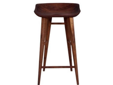
Above: An all-white kitchen is at the center of the open 40-foot-long living space, and fits seamlessly in thanks to touch-latch Corian cabinetry and an inset sink and work area. Designed by the building’s architect-developers, Alloy, headed by Jared Della Valle and Abby Hamlin, the well-detailed kitchen was one of the loft’s selling points for the new owners. The stools are Organic Modernism’s Manu design, a version of the popular Tractor Barstool; they introduce warmth and a visual connection to the exposed beams. The room’s white oak floor was spec’ed by the architects.

Above: A wall of open shelving–introduced by Robertson and Pasanella on the opposite side of an entry they built–displays the couples’ collection of cafe au lait bowls and adds an injection of color and pattern to the setting. A former decorating editor at Martha Stewart Living, Robertson, not coincidentally, is at work with Fritz Karch on a book about living with collections that will be out next fall from Abrams. For a better look at the wall of cafe au lait bowls, see page 288 of our new book, Remodelista: A Manual for the Considered Home.

Above: Hidden on the inside of the island is a microwave and oven. (The stovetop is incorporated into the opposite counter, next to the sink.)

Above: The kitchen is further pushed in a playful direction thanks to kids’ paintings hung with colored washi tape. Note the flatware stowed in ribbed tin cans–another detail spotlighted in our book (see page 285).
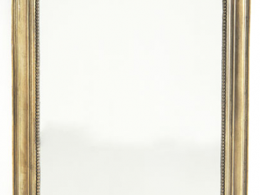
Above: The focal point of the living room is the owners’ eclectic collection of art united in a salon-style grouping with mirrors. Robertson and Pasanella made kraft paper templates of each piece and, over dinner one night, the two couples laid out the templates on the floor and then the wall, fiddling with the pieces for hours to get the arrangement right. They hired one of the contractors to hang the art. The Lake Credenza by BBDW in oxidized maple stands under the collection. The armchairs, draped in sheepskins, are Hans Wegner designs from ABC Carpet & Home. Similar French Gilt Mirrors can be sourced from Wisteria.

Above: The brick walls had been unfinished and dominant–the ceilings are 13 feet high. The owners were inclined to paint the brick but nervous; Robertson and Pasanella unhesitatingly agreed. They went with Winter’s Gate from Pratt & Lambert (“much more affordable than Farrow and Ball”); it’s a pale gray that reads as white and brightens the space dramatically.
Above: “We organized the main room by using furniture to define living, dining, and study areas,” says Rebecca. The dining area is sectioned off from the living room by a low two-sided bookcase designed by Pasanella. Vintage armchairs in cognac leather from 1st Dibs and an African stool create a satellite seating area adjacent to the library.

Above: Made of oiled black walnut and Cor-Ten steel topped by a 1.5-inch-thick slab of soapstone, Pasanella’s bookcase is 36 inches tall and extends for 12 feet. It was fabricated by Official, LLC of Brooklyn. Pasanella, by the way, is the owner of one of our all-time favorite wine shops, Pasanella & Son Vintners in New York’s South Street Seaport; he’s also a celebrated designer and writer: he documents his journey through the wine world in his book Uncorked. Have a look at his and Robertson’s own loft here.
Above: A light that doubles as sculpture, the Lindsey Adelman Custom 7-Globe Branching Bubble chandelier is the dining area’s focal point. The antique oak table is from Ochre; it’s surrounded by vintage aluminum dining chairs, similar to the classic Emco design but made by Good Form of Youngstown, Ohio. “The palette is very tonal,” says Robertson, “we used a lot of gray and this helps to knit the whole loft together.”

Above: Another Robertson/Pasanella touch: zebra wood radiator covers fabricated by Official, LLC.

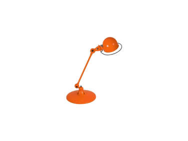
Above: An alcove opposite the dining area has been cleverly put to use as a library, thanks to an extended kitchen wall and shelves added by Robertson and Pasanella. The yellow lamp is a vintage Jielde from France (still in production, the Jielde Loft Desk Lamp is available from Horne, as is a special Remodelista edition of the Jielde Signal Desk Lamp in bronze). The curtains are unlined heavy gray linen–made in India and $14 per yard from one of the fabric warehouses on 39th Street–installed on a hospital track.

Above: Where to put the piano? Robertson and Pasanella solved the riddle by building a nook that gives “the piano a place to live as well as to be celebrated.” Working with the loft’s architects, they inserted the piano niche (note the inset point light), which fronts a new bedroom (see below).
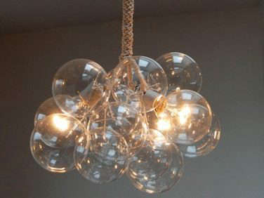
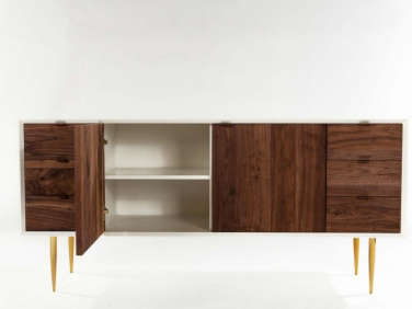
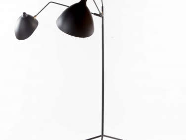
Above: Stairs next to the piano lead to a family room and roof terrace. Bisected by sliding glass doors, a fire exit, and the stairs, the small, boxy space was Robertson and Pasanella’s biggest challenge: “How to use it? There’s no bathroom upstairs and it’s exposed to a lot of light, so its didn’t work well as a bedroom.” Their inspired (if not exactly inexpensive) solution? They paneled walls, floor, ceiling, and door in white oak, transforming the room into a bespoke urban cabin. The Bubble Chandelier with a gold finish is by Pelle of Brooklyn. The Serge Mouille-style light is the Praying Mantis from White on White. The walnut cabinet is the Siena 4 from White on White.
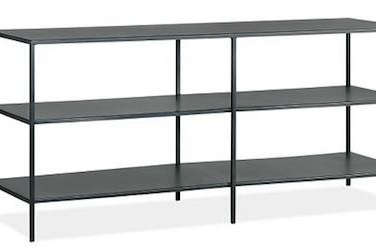
Above: The kids’ Lego Star Wars creations are tidily displayed in the family room on Room & Board’s steel Slim Media Console.

Above: Under the stairs, the designers carved out a child’s bedroom. The wall is painted with chalkboard paint and a headboard is playfully sketched in: “saving space but keeping it fun,” says Robertson. Open to the stairs thanks to an upper-story window, the room is indirectly lit by a skylight.
Above: The guest bathroom is papered with Little Whales by LA company Pottok Prints.

Above: Serenity reigns in the master bedroom, which has a wall of Cole & Son Woods wallpaper. Curtains were initially part of the plan, but after Robertson inserted Hunter Douglas blackout shades, everyone liked the room as is.
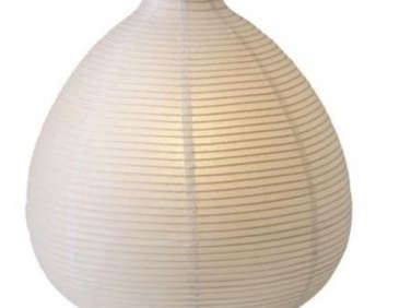
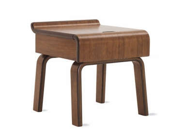
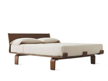
Above: The bentwood bed is the Case Study Alpine Bed from Design Within Reach with companion Case Study Alpine Bedside Tables; the bedside lamps are Ikea’s rice paper Väte design, $9.99 each.
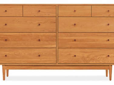
Above: A TV needn’t be intrusive–a small model rests opposite the bed atop the Grove Six Drawer Dresser from Room & Board.

Above: Another of the loft’s original attractions: in lieu of a bathtub, a marble-tiled shower for two. The vintage chair is a French captain’s seat from a ship.
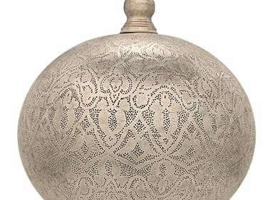
Above: The loft’s elevator initially opened directly into the living space. To lend the setup a more human scale, Robertson and Pasanella sectioned off an entry, which is small but regal thanks to a wall of hand-painted silvery wallpaper made for the space from family company Gracie in New York’s D & D building. The pierced silver light is the Filigree Sphere from Terrain; the bench is from Ikea.

Above: The loft’s layout was conceived by New York architect-developers Alloy; Robertson and Pasanella collaborated with the Alloy team to introduce a few structural additions, including an entry foyer and bedroom inserted under the stairs.
More lofts? Tour some of our favorites here, including A New York-Style Loft in Barcelona and our Steal This Look on Fashion Designer Vanessa Bruno’s Paris Loft. More wallpaper ideas? Browse our suggestions here–and don’t miss, Instant Architecture: Trompe l’Oeil Wallpaper.





Have a Question or Comment About This Post?
Join the conversation (25)