Icon - Arrow LeftAn icon we use to indicate a rightwards action. Icon - Arrow RightAn icon we use to indicate a leftwards action. Icon - External LinkAn icon we use to indicate a button link is external. Icon - MessageThe icon we use to represent an email action. Icon - Down ChevronUsed to indicate a dropdown. Icon - CloseUsed to indicate a close action. Icon - Dropdown ArrowUsed to indicate a dropdown. Icon - Location PinUsed to showcase a location on a map. Icon - Zoom OutUsed to indicate a zoom out action on a map. Icon - Zoom InUsed to indicate a zoom in action on a map. Icon - SearchUsed to indicate a search action. Icon - EmailUsed to indicate an emai action. Icon - FacebookFacebooks brand mark for use in social sharing icons. flipboard Icon - InstagramInstagrams brand mark for use in social sharing icons. Icon - PinterestPinterests brand mark for use in social sharing icons. Icon - TwitterTwitters brand mark for use in social sharing icons. Icon - Check MarkA check mark for checkbox buttons.
You are reading

Architect Visit: Herringbone House in London

Search

Architect Visit: Herringbone House in London

March 30, 2015

In our DIY-enthused culture, there are some who might think they don’t require an architect’s design skills even for a ground-up construction. A project like Chan + Eayrs’s Herringbone House in Islington, London, reminds us so clearly of why we do. Despite its awkwardly wedge-shaped, urban-infill site, the elegant four-bedroom house, with its patterned-brick exterior, warm Scandinavian interior finishes, and front and back courtyards, appears deceptively simple and straightforward–truly the mark of good design.

Unless otherwise noted, photographs by Mike Tsang via Arch Daily and Dezeen.

Architect Visit Herringbone House in London portrait 6
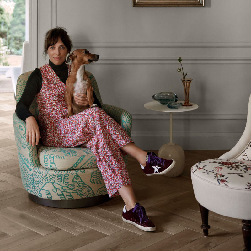
Above: Zoe Chan, cofounder with Merlin Eayrs of Chan + Eayrs, stands before their design. The house–which is currently on the market (see details at Chan + Eayrs and The Modern House) is comprised of two volumes, one of which steps back to created a courtyard. While the use of brick fits into the context of the surrounding Victorian terraced houses, the herringbone pattern is a contemporary update that sets the structure apart from its neighbors. Photograph by Thomas Giddings.

Architect Visit Herringbone House in London portrait 6
Above: Inspired by siheyuan, traditional Chinese courtyard houses, Chan, who was born in England of Chinese parents, introduced two walled courtyard rooms, one at the front and one at the back, as an effective solution for drawing light into the middle of the narrow and nonlinear site.

Architect Visit Herringbone House in London portrait 6
Above: The open layout means that light and air flood through the length of the house, from the front walled courtyard to the combination kitchen and dining area in the back. Photograph by Thomas Giddings.

Architect Visit Herringbone House in London portrait 6
Above: The courtyard turns the kitchen into an indoor/outdoor room. Photograph from The Modern House.

Architect Visit Herringbone House in London portrait 6
Above: A wall of pearl-colored bricks is effective in reflecting light. See Remodeling 101: White Tile Pattern Glossary for ways to use brick and subway tile. Photograph from The Modern House.

Architect Visit Herringbone House in London portrait 6
Above: Cupboards with limed wood doors provide ample storage. Photograph from The Modern House.

Architect Visit Herringbone House in London portrait 6
Above: The brick’s texture keeps the room from looking at all cold or sterile.

Architect Visit Herringbone House in London portrait 6
Above: Wall-to-wall storage in the kitchen doubles as a bench.

Architect Visit Herringbone House in London portrait 6
Above: The two courtyards–this one with built-in banquettes–ensure that light and air flow through the house.

Architect Visit Herringbone House in London portrait 6
Above: A muted palette of whites, grays, and beiges runs consistently from room to room.

Architect Visit Herringbone House in London portrait 6
Above: A sculptural steel stair with open risers is flooded with light from a skylight above. Photograph by Thomas Giddings.

Architect Visit Herringbone House in London portrait 6
Above: A view from one bedroom down the length of the house to another illustrates the effectiveness of the light-producing wall courtyards upstairs.

Architect Visit Herringbone House in London portrait 6
Above: Limed wood brings warmth into the bedrooms while reflecting light.

Architect Visit Herringbone House in London portrait 6
Above: Marble-tiled floors and above-counter sinks add an understated luxury in the master bathroom.

Architect Visit Herringbone House in London portrait 6
Above: A pedestal mirror in brass.

Architect Visit Herringbone House in London portrait 6
Above: The palette is soothing and serene.

Architect Visit Herringbone House in London portrait 6
Above: Cracked porcelain cabinet knobs introduce subtle texture to the pale palette of the bathroom.

Architect Visit Herringbone House in London portrait 6
Above: Herringbone brickwork is a classic used in a new way.

Architect Visit Herringbone House in London portrait 6
Above: Eayrs and Chan in a bedroom window. The two introduced maximum glazing and a horizontal coursing of the brick pattern to delineate the floor levels. Photograph by Thomas Giddings.

Architect Visit Herringbone House in London portrait 6
The floor plans detail the architects’ inventive use of the wedge-shaped site. Above L: The ground floor shows the two walled courtyard gardens at the front and back of the house. Above R: The three-bedroom upstairs level.  See more of the architcts’ work at Chan + Eayrs.

Can you Spot the Difference Between Herringbone and Chevron?  If you’re looking for more examples of artful brickwork, see 5 Favorites: Bricks Made Modern. And over on Gardenista, we show you What to Grow on a Brick Wall.

This post is an update; the original ran in April 2014 as part of our Warm Minimalism issue.
Subscribe 172

(Visited 715 times, 1 visits today)
You need to login or register to view and manage your bookmarks.

Frequently asked questions

What is the Herringbone Brick House in London that Zoe Chan designed?

The Herringbone Brick House is a residential project designed by Zoe Chan of Atelier Chan Chan. It is located in London, United Kingdom.

What was the design inspiration for the Herringbone Brick House?

The design inspiration behind the Herringbone Brick House was the concept of a herringbone pattern, which can be seen in the brickwork and woodwork throughout the house. The aim was to create a playful and surprising interior, with different materials and textures used in unexpected ways.

What are some of the standout features of the Herringbone Brick House?

Some of the standout features of the Herringbone Brick House include the herringbone brickwork on the exterior, the unexpected mix of materials and textures throughout the interiors, and the use of natural light to create a bright and airy space.

What was the biggest challenge in designing the Herringbone Brick House?

One of the biggest challenges in designing the Herringbone Brick House was working within the constraints of the small space, while still creating a sense of openness and flow. The team also had to work with the existing plumbing and electrical systems of the building, which presented some challenges.

What sets Zoe Chan's approach to design apart?

Zoe Chan's approach to design is characterized by her playful and unexpected use of materials and textures, as well as her attention to detail and focus on creating a sense of intimacy and warmth within each space. She also emphasizes the importance of sustainability and working with existing resources whenever possible.

Can I visit the Herringbone Brick House?

The Herringbone Brick House is a private residence, so it is not open to the public for visits. However, you can view photos and read more about the project on the Atelier Chan Chan website and other design websites.

Have a Question or Comment About This Post?

Join the conversation

v5.0