Commissioned to remodel an 1840s Brooklyn brownstone for a Swedish-American family of four–Jakob Trollbäck and Lisa Smith Trollbäck and their children, August and Stina–architects Solveig Fernlund and Neil Logan transformed the first floor into the beating heart of the house. Wanting to create an open, loft-like space that contrasts with the rest of the structure’s hallways and rooms, the architects took inspiration from Mies van der Rohe’s use of built-in storage cabinets as an alternative to walls. Fernlund and Logan also solved the trickiest riddle of the room–where to place the staircase–by turning tradition on its head and building an open-tread stair at the back end of the space; their stair design, like the first floor itself, is at once low key and undeniably grand.
N.B.: The architects ran the firm Fernlund + Logan when they worked on the remodel in close collaboration with Jakob Trollbäck–it was their fourth residential project for him. They have since opened their own offices: Solveig Fernlund Design and Neil Logan Architect.
Photography by Matthew Williams for Remodelista.
Above: The wide-open kitchen revolves around a modernist picnic table and mobile-like Ingo Maurer light, the Zettel’z 5 Chandelier, clipped with pieces of paper decorated with drawings and notes. The combination of white walls, modernist wood furniture, and pale floors lend the design a Scandinavian feel.
For another indoor picnic table we’re coveting, see Architect David Chipperfield’s New Designs for e15.

Above: The table’s bench seating is inset with shaggy seating cushions. It was purchased at ABC Carpet & Home in New York.
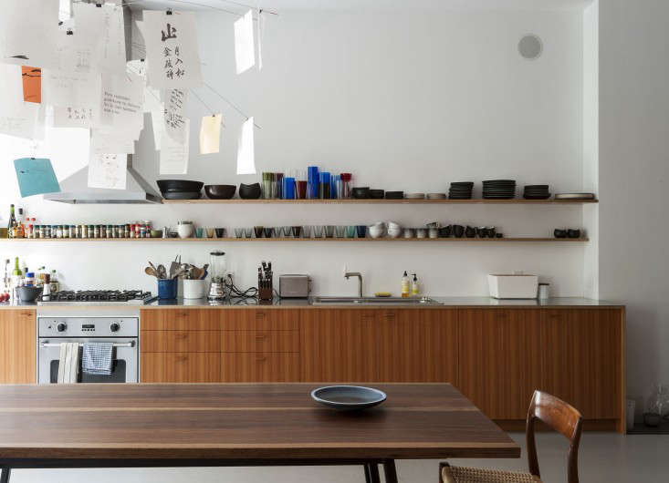
Above: The kitchen work area features cabinets of Douglas fir laminated to multi-ply birch plywood and an elegant, wafer-thin stainless steel counter that’s also laminated to the ply. The range and hood are both Viking designs. The sink is from Italian company Alpes Inox–see our post Race-Car-Style Appliances for Compact Kitchens–and the faucet is by Bulthaup.

Above: A detail of the stainless steel countertop. A signature of the architects is to leave the striped edges of the plywood exposed.

Above: A large custom cabinet of Douglas fir laminated onto birch multi-ply sections off the kitchen from a small living room area by the entry. The kitchen side of the cabinet conceals the refrigerator and freezer as well as storage shelves behind closed doors.

Above: The cabinet knobs are custom made of Douglas fir.

Above: A Sub Zero refrigerator is tucked into the end closest to the sink.

Above: Shallow shelving designed for glassware.

Above: The other side of the cabinet is divided into open shelves that section off the living area, which functions as a casual parlor.
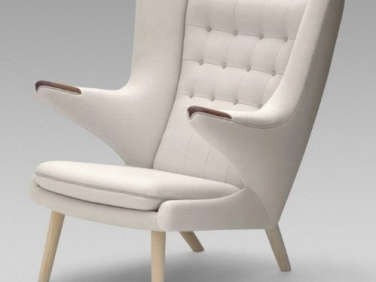
Above: The front entry presents another built-in divider, a coat closet made of Douglas fir. The armchair is Hans Wegner’s 1951 classic Papa Bear Chair.

Above: The living area is used for practicing and playing music.

Above: The staircase has open risers that are made from old floor joists removed from the house and glued together to get the desired width. The open riser design allows the whole space to be light filled and oriented to the French doors. The down staircase, meanwhile, connects the first floor with the garden level of the house. The floor itself is newly installed oak that’s painted in Benjamin Moore Platinum Gray enamel. It has radiant heat and is made from best-grade wood to prevent it from warping due to the heat. For more on the subject, see Remodeling 101: Things to Know About Radiant Floor Heating.

Above: The picnic dining table is used for kids’ art projects as well as for family meals and dinner parties. French doors open the kitchen to a terrace and ground floor garden.
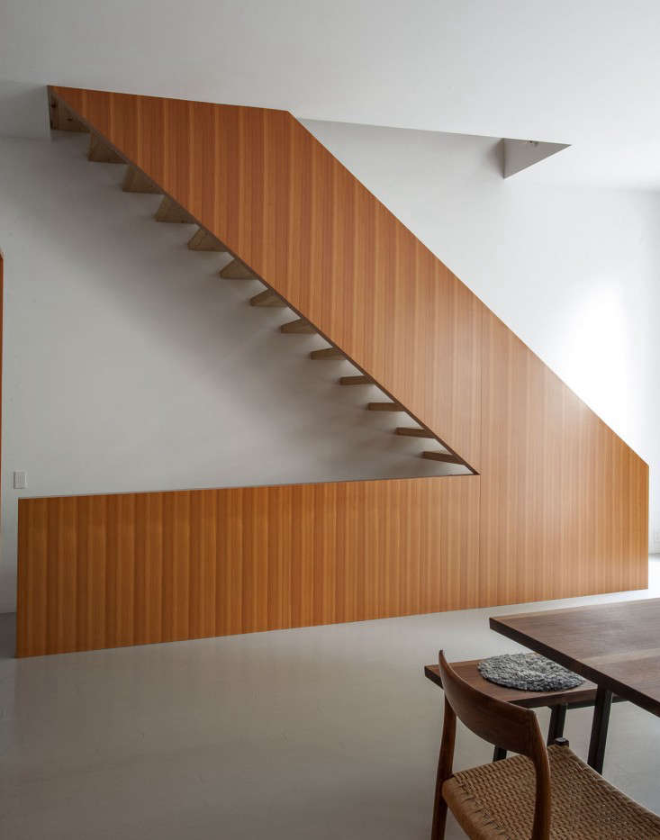
Above: Rising from the back of the kitchen, the stair presents a dramatic V-shaped profile.

Above: The stair has a rail that’s wrapped in Spinneybeck leather. It’s stitched in place and the seam runs on the underside where fingers are placed. It took two tries for the fabricators to get the design right.

Above: A new kitchen terrace extends over a ground floor garden patio. The long weathered table is surrounded by French Tolix chairs.

Above: A floorplan of the newly opened-up first floor shows the use of built-in cabinets as room dividers. The brownstone is 24.5 feet wide and the first floor is 980 square feet.
To see the brownstone’s attic bathroom, turn to pages 238-241 of the Remodelista book. Also check out another Fernlund + Logan project at Architect Visit: Fernlund + Logan in New York. And for more inspiration, browse our photo gallery of Scandinavian design.
Looking for more kitchen ideas? See our past Kitchen of the Week posts.
This post is an update. It originally ran on November 21, 2013, as part of our Crowd Control issue.




Have a Question or Comment About This Post?
Join the conversation (18)