How to draw natural light into the center of an apartment? Long, narrow spaces with limited windows pose a perennial problem for New York’s urban dwellers. When Melissa Baker and Jon Handley, founding principals of New York’s Pulltab Design and members of the Remodelista Architect/Designer Directory, were asked to transform a duplex in Tribeca for a couple with two young children, they took full advantage of the fact that it occupies the fifth and top floor of the building. In addition to providing their clients with a new roof penthouse and garden, they also designed a giant circular skylight that hovers like a benevolent moon over the kitchen and dining area at the center of the apartment. More light, more air, and a sculpture overhead–problem solved.
The architects are available for the next 48 to answers any and all questions about the project. Ask away!
Photography by Mikiko Kikuyama.

Above: The skylight brings much needed additional light into the open dining room and kitchen. Hired to perform a complete renovation, from architecture to interior design, Pulltab worked closely with their clients, one of whom is a former art director at Martha Stewart. Naturally, color palette was thoughtfully considered: “Adept at color, our clients wanted to avoid a white-box feeling,” Handley says. The final choices were influenced by the muted and subtle historical colors of the HBO series John Adams. The kitchen walls are painted with Skimming Stoneby Farrow & Ball, and the kitchen cabinets are spray-lacquered to match Hardwick Whiteby Farrow & Ball. The room beyond is both an office and a guest room.

Above: “We established early on that the floor was to be a clear-grade, solid walnut–American black walnut,” says Handley. “This was an important starting point.” The long view to the front of the building shows three windows that draw in crucial natural light.
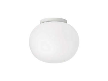
Above: In the kitchen area, additional lighting is provided by recessed spotlights and Flos Glo Ball ceiling-mounted fixtures by Jasper Morrison. “The lighting design gives the client many options,” Baker says. “They can have only the Glo balls on for a softer feeling, or all the lights at their brightest for working. All the lighting is on dimmers, that’s a standard for all of our projects.”

Above: With many collections to display, the client requested a combination of open shelving and closed storage cabinets. She gathered her white Ironstone china collection over time at flea markets, antique shows, and from Red Chair Antiques of Hudson, New York. The white Calacatta Extra marble countertops and mosaic-tiled backsplash offer a subtle contrast to the Hardwick White cabinets.

Above: Black-and-white photographs by Bernd and Hilla Becher
form a gallery wall overlooking the dining table. The door on the left leads to the laundry room and, on the right, to the children’s room and stairs to the penthouse.Above: White Artek Bar Stools by Alvar Aalto fit neatly under the kitchen island, where the Calacatta Extra marble countertop has been detailed to cascade down each side.

Above: A custom chandelier by Lindsey Adelman hangs beneath the skylight. Beyond the dining area, full-height cabinets become architecture as they form a reading nook in the children’s bedroom and playroom area.

Above: “The millwork is very much part of the architecture,” Handley says. “The cabinets add a clean line and edge to the spaces while also creating continuity from one room to the next. A bonus is lots of storage, of course.”

Above: The moon-like skylight is a subtle, glowing presence. “What you see from the other end of the apartment is a light-filled kitchen,” Handley says. “It’s not until you’re standing under the skylight that you really sense the scale and drama–you look up and see a beautiful cylinder of light terminating in the ever-changing sky.” A circa 1900 portrait of a cowboy and two official state portraits of Vladimir Lenin, purchased from Steven Sclaroff, preside over every meal.

Above: The glass-fronted shelving was inspired by a century-old wood lawyer’s cabinet that the architects own.

Above: Baker and Handley worked closely with a cabinetmaker to devise hardware that would allow the cabinet fronts to lift up and slide back like garage doors using a simple track-and-peg system. Handley explains: “We liked the idea of small, horizontal doors delineating the rows of shelving, rather than a large door where you see the shelves behind the glass.”

Above: The office/guest room features a Murphy bed built as part of the extensive cabinetry, parts of which are accessible from the living room, hallway, and kitchen. A skylight brings natural light into the room and a recessed light with a cover runs up and over the desk, eliminating the need for a lamp. “We liked the idea of subtle, diffused light,” Baker says. “It keeps the desktop clear for working and the wall behind free to be used as a tacking surface.”

Above: The ceramic centerpiece on the dining table is by Karen Karnes and the series of number prints on the far wall (discovered by the client at a thrift shop)
is by Robert Indiana.
Above: The stairwell walls and treads are made of the same American black walnut as the floor. “We wanted the stair and floor to feel like they were folding up, drawing your eye to the penthouse,” Baker says.

Above: The architects developed a recessed handrail detail with their contractor. For practicality, the rail and the panels below it are Corian, which makes it easy to clean–a perfect detail for an apartment with kids.

Above: A view of the rooftop garden and the city beyond from the penthouse. The concrete pavers were custom made in Pennsylvania to Pulltab’s specs. All the skylights, including the large circular one, are operable and motorized. Although the “benevolent moon” appears as a circle, it’s actually elliptical in shape because its opening is cut on a bias facing north.

Above: The floor plans of the renovation show the fifth floor (bottom) and penthouse (top).

Above: And axonometric drawing illustrates the relationship of the new penthouse addition to the large drum skylight.

Above: A cross-section drawing details the way natural light comes into the space below.
Before

Above: The beginnings of the renovation.
Ask the architects questions in the comments section below.
Interested in seeing how other New York architects solve natural light challenges in the city? See Architect Is In: Seeking Sunlight in Chelsea. And if you’re looking for intel on marble countertops, go to Remodeling 101: Marble Countertops.
For another eye-opening remodel, go to Gardenista’s Outbuilding of the Week: A Study in Black by Designer Alexandra Angle.




Have a Question or Comment About This Post?
Join the conversation (45)