Brooklyn-based Elizabeth Roberts describes a recent remodel in the heart of the historic district in Park Slope as “a formal house for an informal couple and their children.”
When jewelry designer Page Sargisson and her husband, Peter Robbins, a businessman and potter, first toured the prominent corner building, it was divided into several apartments and in need of a complete overhaul. “I remember saying, ‘This is going to take a lot of work,'” Roberts says. “There will be so many conversations about how you’ll live in this house.” After looking at dozens of other properties, however, the couple made the plunge. Their wish? “They wanted to keep some of the funkiness and not make it too pristine, perfect, and impersonal.”
Read on for details of the remodel (to see more of the project, go to Elizabeth Roberts Design).
Photography by Sean Slattery.

Above: “The biggest intervention was the kitchen, which was a tiny space,” Roberts says. “We combined two rooms to make one large, light-filled space and did a lot of 3-D renderings before arriving at the final plan. This is where the family spends most of their time.”

Above: Roberts and her clients found the vintage sink, which is set into the soapstone counter, at a salvage yard.

Above: Robbins, who is a woodworker, made the kayak frame suspended from the ceiling. The couple splurged on the range (Lacanche) and economized on the refrigerator (GE).

Above: Roberts installed four large, salvaged historic pocket doors with trim to match the existing.

Above: A custom walnut cabinet in the breakfast area provides ample storage opportunities.

Above: The historic staircase connects the parlor floor to the next level.

Above: “In the living room bay seating area, we stripped away the paint to expose the wood,” Roberts says.

Above: “We painted the wood of the ceiling to make the room quieter and hung a David Weeks chandelier,” Roberts says.

Above: A detail of the window seat.

Above: Robbins designed the porcelain doorknobs; the images on each of the knobs indicates the function of the room or cabinet that it accesses; a bathroom, in this case.

Above: “We took every single tile off the wall and rearranged them in this bath,” Roberts says.

Above: A detail of the vintage tiling.
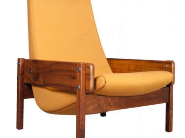
Above In the third floor master bedroom, a Vronka chair by Sergio Rodrigues from Espasso anchors a sunny corner; the rug is from the Rug Company.

Above: A Nelson pendant illuminates the master bedroom.

Above: A small guest room.

Above: “The wood cabinets in the children’s bathroom are lockers from an old train station that we found at a salvage yard,” Roberts says.

Above: A view of the children’s bath; a swinging saloon door leads to a urinal.
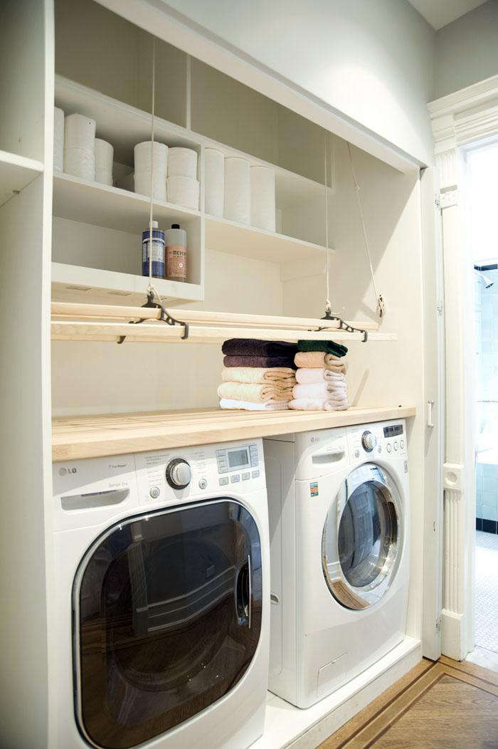
Above: The laundry area features a Sheila Maid Ceiling-Mounted Dryer that can be raised and lowered according to need.



Have a Question or Comment About This Post?
Join the conversation